

CHARLOTTETOWN – A brand new boutique hotel, the Holman Grand, is opening later this month in the city. As the final touches are being added to the rooms, atrium and lobby and exterior, it’s causing quite a stir amongst Islanders. It was supposed to look like a heritage restoration of a department store from the 1850s with visually appealing upper floors. Instead, its façade has been muted and the upper floors look like they were built for a government agency in the late 1970s.
Overseen by Homburg Development, the project has morphed from conception to delivery. How then, did this come to be? Let the following photos be your guide and decide for yourself.
First, a wee bit of background
The hotel is named after the original Holman Department Store that provided many shopping and socializing opportunities for Islanders over the years. Homburg successfully challenged building height restrictions and standing at 7 storeys, it is now one of the tallest structures in Charlottetown, which means the hotel is visible from many vantage points in the downtown area.
Conception
From the outset, Homburg seemed committed to preserving the original façade of the building which had been covered since the 1960s. Stones and bricks were removed, numbered and catalogued so that they could be reincorporated into the building. Here is the original facade of the department store, in all its glory, prior to deconstruction. Two distinct building fronts can be seen, on the left is a 2 storey mostly sandstone structure and to the right is the mostly red brick 3 storey one.

Passers-by walked by many a day, watching workers taking part in this pain-staking process and after all of of the hours they devoted to this historical preservation, very few stones and bricks were kept. An advertisement released in the Guardian newspaper this month explained that: “The decades […] had not been the kindest to these original materials”. Everything but the original sandstone arches were ditched and new building materials were ordered. The old windows were discarded, but not before they were reproduced faithfully.
Here is the image of the hotel that was released before construction began. The 2 facades are still distinct, there is two toned aluminum-like upper floors with pleasant-looking signage.


Delivery
Overtime somehow, this original vision was swept under the rug and a new version began to form. Sandstone was abandoned in favor of lots of red brick and two-toned aluminum was traded in for monochromatic beige, as depicted below. The street level facade has much less architectural flair and the upper floors bring to mind a government institution built in the ‘70s, when style reflected function.
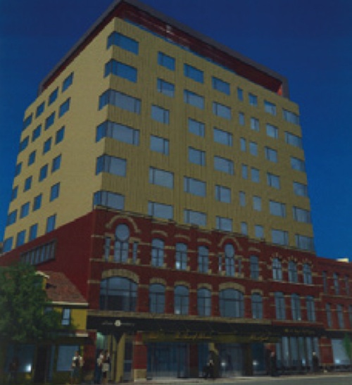
It is really unfortunate that the lack of color, depth and absence of nuanced building details on the upper floors creates such a drab envelope of a building. Homburg has also opted for a change in signage design, going for a more modern platform-like sign which juts out of the building at a right angle and is supported by cables. The awnings are also no more.
No ugly ducklings in other cities


Other builders have recently managed to create buildings of similar size with much more visual appeal. The two examples below hail from Toronto and show how a mix of building materials, colors, textures and varied roof lines help to draw the eye from feature to feature (the Vinegar lofts and the Bohemian Embassy). Unfortunately, the eye can take in the Holman Grand, in its entirety, in one fell swoop.
Photos by Melanie Labelle, Peter Rukavina and from The Guardian, Holman Grand, Queen City Vinegar Co. and Bohemian Embassy.
4 comments
Oh, dear God. What a horrendous-looking building.
However, as a Torontonian (who reads this blog out of an interest in Atlantic cities) I’ve got to point out that the Bohemian Embassy condo building in Toronto that is mentioned at the bottom of this post is actually really, really atrocious looking. That rendering makes it look way nicer than it is.
The Vinegar Lofts are great, however.
Further reading at Peter Rukavina’s blog: http://ruk.ca/content/how-did-charlottetown-end-new-hotel-covered-beige-aluminum-siding
There’s a real problem with bait-and-switch developments. The renderings often look nothing like the final product and often even the materials change from what is specified in the development agreements.
This happens all the time in Halifax. It is not unheard of to have a development agreement that says “sandstone” and a final product that precast or a mix of concrete block and foam decorative elements.
Unfortunately city councillors and others involved in the process either don’t care or somehow don’t appreciate the difference in quality of materials. Sometimes the developers also complain about having to spend more, but I don’t believe that using basic, attractive materials would make new construction infeasible. We’re talking about brick, maybe any kind of stone as an accent material, glass curtain wall, and metal panels. Not marble-clad palaces.
Charlottetown is a very attractive place and should demand a higher quality of construction. Hopefully they will implement stricter requirements for materials (design is trickier) and will include financial penalties for developers who do not comply.
As Matt indicated above, the Bohemian Embassy represents a failure of the development process, not a success. It should only be used as a precedent of what not to do.
I would point to Bishops Landing and or the Barrington Block on Granville Mall in Halifax as good local precedents or many other Toronto and Montreal examples for how to incorporate heritage properties into new development.
The argument that developers use–that materials cost too much and that is why they cannot deliver good buildings–is total crap. Not that I’m opposed to anyone making money, but buildings like this have a greater responsibility to their context. If they cannot perform, they should be allowed the greater height and density.
Truly a shame. I feel bad for you Charlottetown. You deserve better.