
EDITOR’S NOTE: Spacing senior editor Shawn Micallef is in Germany this week attending the International Transport Forum. He’ll report throughout the week on workshops and seminars.
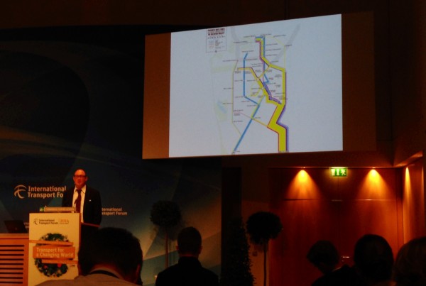
LEIPZIG, GERMANY — Spacing’s European Bureau has been pleased a major theme at the International Transport Forum has been open data (or big data, depending on the context) and, often, the link between transit and inequality, a connection that is often made by presenters, whether world bank types, civil servants, or academics. I watched a presentation by Eric Rodenbeck, head of San Francisco design firm Stamen that produced crowd sourced maps of the controversial private bus networks running between San Francisco and Silicon Valley, ferrying tech workers between their homes in rapidly gentrifying neighbourhoods (in already incredibly expensive San Francicso, a phenomenon I linked to Toronto’s own brewing housing crisis a few weeks ago in the Toronto Star, but applicable to all Canadian cities with rising home prices). These new private transit networks have proven to be visual flash points in San Francisco but the private transportation network itself — those bus routes — remained obscured as tech companies like Apple and Google provided only limited data that didn’t sufficiently illustrate their scope.
Enter the Zero1 Biennale in San Jose that commissioned Stamen to do a visualization project of the network, enlisting bike couriers and others to track places they saw the buses or found the various corporate logos stenciled on sidewalks, indicating this is where a bus stopped (the whole process is documented here), and used the Four Square location updates of bus riders themselves to track them. The data showed where the routes were, but in a cheeky move they designed a map to look like an official transit map, making a stronger connection between the private — public tension inherent in this debate (the map is above, but see a better version of it here). In his presentation Rodenbeck said the map shows one could, theoretically, transfer from the Apple Bus to the Google Bus at the Van Ness stop. Relating this data to the everyday lives of average commuters in San Francisco is the trick.
Also of note for anyone interested in digitizing geographic data was the use of Field Papers, open source software (also designed by Stamen) that lets you print out maps that can be used to record data and observations, later uploading it all into a digital map. Possibly of use to all the unofficial city cartographers who want to use crowd sourced (or self-sourced) geographic data for further uses.