
EDITOR’S NOTE: On Canada Day this year, Spacing’s creative director Matthew Blackett published a map of a fictional City of Canada in the Toronto Star. This is a follow-up post. You can buy a print of the map at the Spacing Store.
I began to think about the concept of the City of Canada in 2010 after I had published two transit maps in Spacing magazine that re-imagined Ontario and the Maritimes as cities. In both cases, I used the existing highway networks as my guide for the routes. These two maps were the jumping off points for me to start thinking about a national map.
In 2012, I began researching Canadian city populations, provincial highway networks, and local geography. I sifted through the transit maps of over 100 international cities to find styles and elements that I could incorporate into my map. I dug into sections of the country in fits and starts — I would peck away at the research and illustration for a month but then not return to it for another three months. That cycle continued for about three years. As the map took shape in the fall of 2015, I shared it with friends and colleagues to receive some constructive criticism.
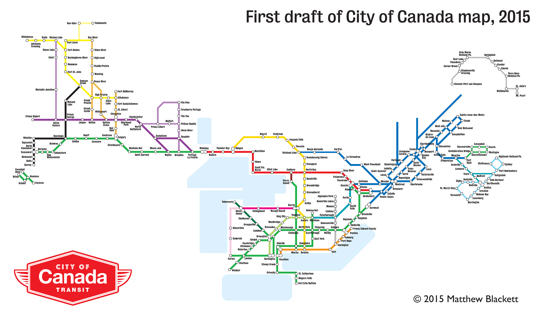
My biggest challenge at this point was finding a balance between a straight-up schematic map (that ignored the physical shape of the city) or one that vaguely took on the shape of the country. For it to be slightly recognizable I added the Great Lakes. I loved the idea of a city having a series of small lakes in it, but I found them awkward. I also felt that the size and placement of the lakes was limiting the number of towns and cities that I wanted to include in southern Ontario. I didn’t go back to the drawing board, as the say, but I gave the map a series re-think.
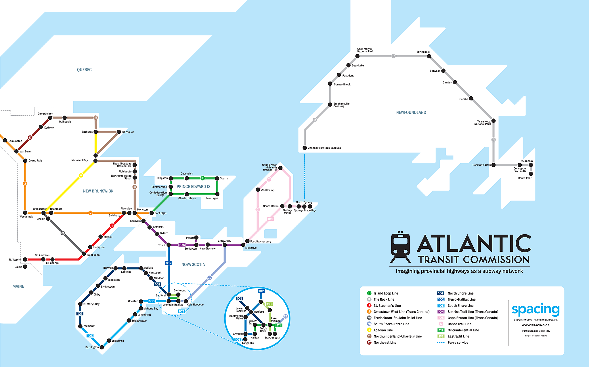
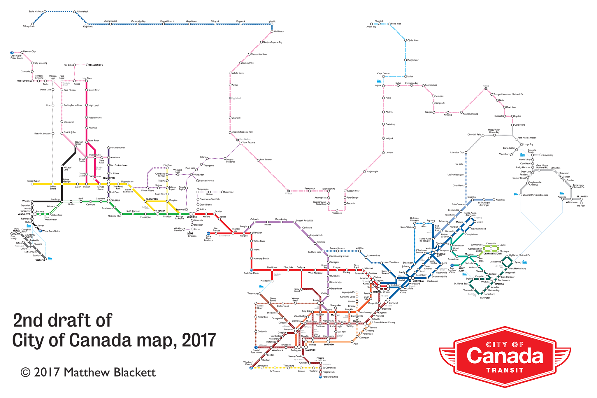
If I couldn’t use the Great Lakes as a design element to signal ‘this is Canada’, then what else? Eventually, I settled on a few things: I removed any elements that represented a river, lake, or ocean — instead, I would indicate a ferry connection with an icon and a thin, dotted, cyan line. I also decided to add routes in the north. I realized at the time it was silly not to have included places like Whitehorse, Yellowknife, and many communities scattered through the territories. It also allowed me to use the shoreline of Hudson Bay as the visual indicator that ‘this is Canada’.
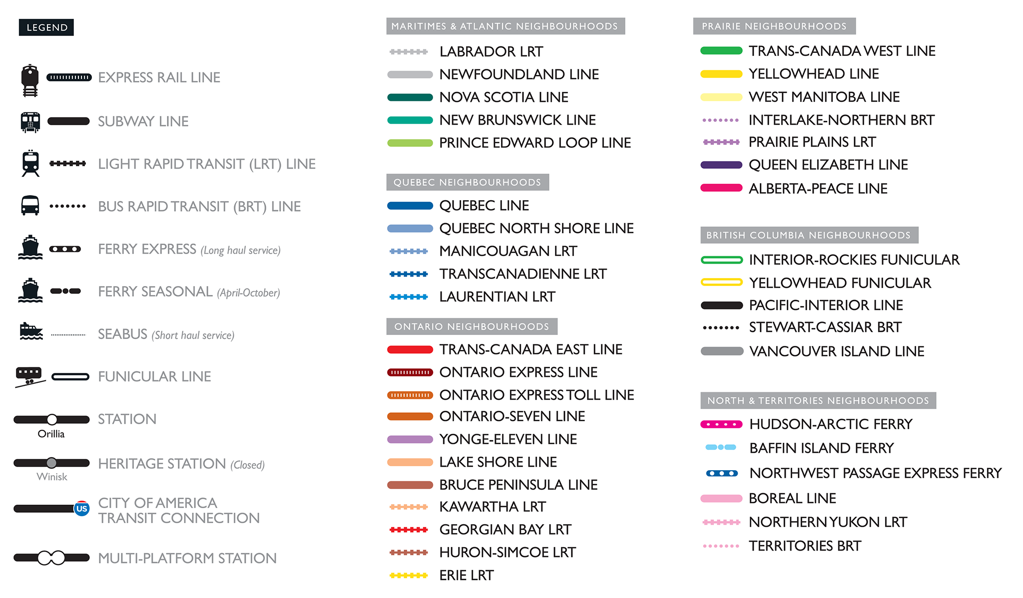
The first draft of the map had been, more or less, a subway network and not a true transit network. The map went from having about 100 cities/stations in the first draft to over 200 in the second version. As I worked away on an updated version I began to use some of the population data I had previously gathered. With the addition of so many smaller places, I used this data as a guide to select which type of transit vehicle technology would be used along each route. It went from a strictly subway map to a network that now includes buses, BRTs, LRTs, express subways, commuter trains, funiculars, and a variety of ferries.
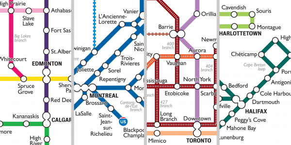
Some other design changes included a switch to the Gill Sans font for almost all of the station names, while capitalizing the names of major ‘neighbourhood’ stations in a bold version of the Bureau Grotesque font. I also began to add the transit connections to the neighbouring City of America by manipulating the iconography of the US Interstate Highway sign symbol. Here’s a close-up of Toronto-Hamilton-Niagara-Southwest Ontario with those design elements updated.

When constructing the routes, I took note of the names of highways and unofficial monikers connected to specific regions. It helped me when it came time to add a legend and to create names for all of the lines and assorted route branches. Little did I suspect when I began to make this map that I would get a decent geography lesson. Paying attention to these details is why there’s a Yellowhead Line in the Prairies, a Manicouagan LRT in Quebec, and a Stewart-Cassiar BRT in British Columbia.
By the summer of 2017, the map was about 95% completed to my satisfaction. I did a bunch of copy-editing of the station names, especially for the communities across the north. I added a few more stations, mostly connections to the City of America lines, and finessed the legibility of station names that overlapped any coloured lines.
In early 2018, I began shopping the map around to the major newspapers to gauge their interest in publishing the map on Canada Day. I eventually settled on The Toronto Star, thanks in part to the support I received from Julie Carl, an editor at the Star. The map and a Q&A with me appeared on June 30, 2018, in the Saturday edition of the paper.
In total, it took six years to complete the map. And I suspect I’ll continue to play around with it for years into the future.
CLICK ON MAP TO SEE LARGER VERSION
![]()
One comment
As a certified transit nerd, I love absolutely everything about this. Thanks for sharing.