

 When my sister and I were kids we would ride around Windsor in the back seats of our parents’ cars and rate Christmas displays as we passed them. If Lola Magazine used to do shotgun art reviews, ours were BB-gun reviews. Just a quick number between 1 and 10. Artistry, elaborateness and feats of suburban ladder wrangling got the high numbers. Low marks were given things just bought at the store and plunked on the lawn – today we would give a 0 or 1 to those tacky inflatable snowmen.
Yonge Street is worthy of high ratings right now, starting at the Bay Store. You can’t tell in this photo, but those white blurs on the side of the building are snowflakes falling. They installed — or hung rather — hundreds of LEDs on the side of the building, turning it into a huge temporary screen that makes the building seem to move, and might be the only falling snow we see this season.
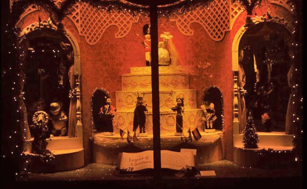
At one point in the cycle the iconic four Bay stripes appear. This probably makes it an advertisement, but one done very well and subtlety. The Bay feels like a slightly frumpy crown corporation sometimes, so those stripes seem so very Canadian — people still buy those winter coats with the four stripes — so they look winterish and don’t seem out of place. I suspect if some of the advertisers in Dundas Square were a little more artful in their campaigns — maybe focusing on their logo, or just doing something more thoughtful and location specific than whatever the not-so-timeless campaign-of-the-day is, the aesthetic critics of the square’s surroundings might be satisfied, though those concerned with Ad-Creep might still not be very happy. The Bay also did a good job on their window’s this season, making a stroll along Queen quite nice right now (and as always, Holt Renfew up on Bloor has magnificent displays –little tableau’s of fictional scenes of mildly slutty but kind-of-hot aristocratic ennui).

 Up at Dundas Square, there is a lovely abstracted LED Christmas tree made up of multi-shaped balls that change colour. Every time I’ve been through the square over the last few weeks it’s surrounded by people taking pictures of it and with it, which is enough of a public endorsement for me: Toronto approves. They could have taken the traditional route and brought in a big Douglas Fir, which would have been nice, but not strange and unique like this.
Strung up above the square are these exploding LED stars. Difficult to photograph with all the light behind them, but they are weird and wonderful and full of movement. It’s always a risk to try something new, especially with something so traditional as Christmas — like when singers do their own take on the Star Spangled Banner at baseball games and get booed — but it paid off here.
On Saturday at noon they’ll be showing White Christmas on the big LED screen too, if you feel like standing in the cold watching Bing Crosby.

 The creative risks continue further up Yonge Street, with the darkly-coloured displays that span the street. They’re polarizing, people love or hate them and I’ve heard people rant passionately either way. The straight lines banded together, the choice of colour, and how they’re hung are unlike anything I’ve seen elsewhere. No reindeer shapes or Santa’s or fake wreaths — just abstract colour all the way from Alexander down to Queen. It reminds me of walking in Cardiff, Wales, a few years ago just before Christmas. The display strung over the high streets there were similar, but more old fashioned. They blinked and were made up of the usual green and red colours, but they had some kind of silent melancholy air to them — probably because I kept thinking about how Cardiff was once a depressed coal town, and these 1950s displays were the only brightness in otherwise dreary black dust covered times. Toronto isn’t Cardiff, but the Yonge lights capture, and update, that stiff-upper-lip happiness somehow. Or, they just might be neat lights, if you choose not to impose Welsh history on them, which might be a good idea.

 Walking Yonge is quite enjoyable because of these lights, especially the part just south of College Park. The bars of light here look like the were blown into the trees, and they hang at all angles. I’ve heard people say the Yonge lights look cheap, but I think that’s just people getting used to the new look LED lights give off — they’re fuzzy looking and don’t have the sharpness of the old incandescent lights. Once people get used to them, people will like the Yonge lights much more. And in a time when most things are decided around a boardroom table, letting Yonge Street go a little weird and messy and Santaless should be applauded. Or at least strolled and rated. So far, 8 out 10 on our most arbitrary of scales.
12 comments
Shawn, just admit it, you love outdoor ads. Ad-creep is ad-creep any way you light it.
I saw the Bay LED display and didn’t act angrily towards it like I normally do towards ad creep. For a large display, it is rather nice and does not actually cheapen the intersection. My only concern with its installation is whether it will inspire other buildings to do the crappy ad-creep. The set-up looks rather quick and easy and is simple programming.
I can’t wait to check this out in person.
I know they’ve been using LEDs on the Danforth for the past couple of years and it’s true, they do take a bit of getting used to but the glow they provide grows on you.
As for ad-creep… A world without ads would not be a good thing. The key, as with everything, is in the balance and context. It sounds like The Bay has done something right.
I kinda think a world without ads wouldn’t be so bad… or at least without ads out in the street….. newspapers, tv, magazines, fine.
I hope that the Bay keeps that LED thing up permanently. It’s awesome.
I too think this could be easily turned into ad creep by more…creepy advertisers. However, the thing on the Bay Building is 95% Christmas decoration right now — and come to think of it, even when it becomes an “ad” briefly it is on the Bay’s building itself. Which might be like how we dislike sandwich boards for condo’s blocks away cluttering up the sidewalks, but don’t mind as much if they are for a business or restaurant right there. As for the ease of somebody else dropping some LEDs over a building, we have very firm bylaws in Toronto saying where billboards can go, which I’m sure would be enforced, of course……right?
—
Scott> I’ll admit I don’t see this as a black and white issue. I’ve said before that I don’t care what happens in Dundas Square, and find the unleashed vulgarity sort of interesting. I think Dundas Square would look better if they did consistently better ads — like say, just that Telus Monkey and the word Telus, but not the gunk about how much a Motorola Q is — but that’s beside the point here.
I think if we want to prevent real ad creep from invading, say, the Beaches, Willowdale, Bloor West or our parks and school yards — all the places it doesn’t belong — being polemic and saying All Ads Are Evil isn’t going to win any support. Most people, in my experience, aren’t as passionate about ads, and don’t mind some of it around, but when we talk about it, these same people don’t want it overtaking their neighbourhood, parks or all parts of the TTC. The approach needs to be more thoughtful. I think screaming at Dundas Square ads makes you (the rhetorical you, not Scott-you) look like a radical boy-who-cried-wolf, and people won’t take you seriously when you want to discuss ad-creep in other places, or discuss how funding civic infrastructure through advertising leads to bad things.
I’m personally mixed on the Yonge St. above street light banners. I like the blue/white/yellow combo that Toronto favours…it’s the city’s colours and such. My only issue is the over the street part, I feel it makes the Yonge corridor seems more closed in, like it has a roof over it. Like a mall?
I think something very vertical along the sides would be nice and really emphasise the strong vertical lines along Yonge, especially when one looks south from Yonge/College intersection down the hill and into downtown.
I’m not sure if I saw the same light display as you did on Yonge street, but the first thought that came to my mind was how boring it was. The tree in Dundas Square is cool, but tiny in relation to the space around it (couldn’t they afford a bigger tree?). And everything else just seems kind of generic — not just stipped of any Christmas meaning (be it Santa or Jesus) but stripped of any meaning at all. I mean, are those things from hanging from the lamp posts supposed to be icicles? Far from being different, I think the city played it safe with this display, giving us something generic, bland, and cheap looking (also, it looks awful in the daylight).
I am totally loving Yonge Street this season, and wish they would just make it Christmastown all year long.
This goes to show you that not so deep down, “everyone likes a lightshow.” 🙂
(We even have a banner that says ‘LIGHTSHOWZ ARE THE NEW BLACK.”
(Piece could use some copy-editing.)
The LED fuzziness you’re referring to really applies only to the blue LEDs, and it has to do with the scarcity of blue receptors in the retina and the resolution of the blue wavelengths onto those receptors. Blue lights seem to be hard to place because they *are*: They’re landing on a different depth of your eye. (That’s why blue on orange or vice-versa produces the phenomenon with my favourite word of ’06, chromostereopsis: The blue and orange seem to be different distances away from you.)
I like the Yonge St. LEDs. As I believe everyone’s favourite architecture critic, Christopher Hume, put it in a related Yonge St. context, they’re vulgar without being seedy.
Forget the Bay. The real revelatory stunner is curiously unmentioned in this post/thread, and in fact I only noticed it today–was it just unveiled today? (and in the daytime, yet, unlike the Bay array)–is the top-to-bottom LEDing of the Yonge St Arcade facade opposite Temperance. *Nobody* saw that coming, I’ll betcha.
Now, if *that* becomes permanent, or quasi-permanent, well…
“Chromostereopsis” – that is a fucking awesome word.