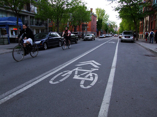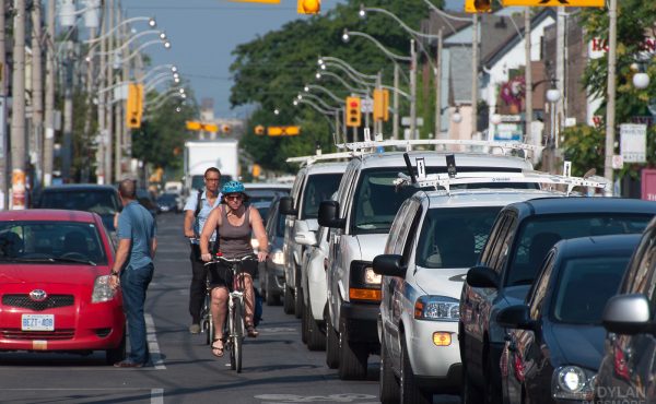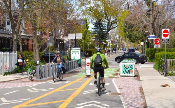
In response to Dale Duncan’s post on August 27th about Toronto’s plan to use sharrows instead of bike lanes on the Lansdowne reconstruction, Spacing Montréal’s Christopher DeWolf has an interesting post about Montréal’s history with shared roads and sharrows. Check it out.
photo by Christopher DeWolf


9 comments
Looks like this would be a great idea on Adelaide between Bathurst and Shaw as well as on Richmond between Bathurst and Niagara. Dozens of cyclists use these streets against the one way every day because they’re so convenient.
The English-language orthography of Spacing’s sibling city is Montreal, without an accent. Or do you write the name of the city in Germany, Cologne, with a K and an umlaut, too? How about MOCKBA?
the accent is sexy.
I think we, everybody, called the 2006 Olympics “Torino” not the English “Turin,” didn’t we?
Also, I’d have a hard time arguing with this logo:
Joe, you’re right: Montreal is the city’s proper name in English. But Spacing Montreal is a bilingual blog and, unfortunately, having a title like Spacing Montréal/Spacing Montreal would be awfully redundant.
I wasn’t talking about the orthography of the title of the blog.
Ahh, then what the hell are you talking about Joe ? (reader from Montréal)
Does Montréal use those symbols on all their bike lanes, or just the sharrow and contraflow lanes?
The double-headed arrow is usually used as a sharrow, and a diamond is used for bike lanes. I would have thought that a contraflow lane should have a diamond, but it looks like Montréal has put the sharrow symbols everywhere.
Sharrows are a sham as they indicate where bikes could be if there was enough room on the road, and give a false sense of security to cyclists beside traffic. There has already been a bicycle accident on Lansdowne, and a proper bicycle path was not created- as promised by Councillor Giambrone- to the residents.
Too bad- the Lansdowne road reconstruction could have included a dedicated bike path to link Bloor to the Gardiner, which would have helped the entire city, and the Take the Tooker campaign. Another opportunity lost for cyclists.