
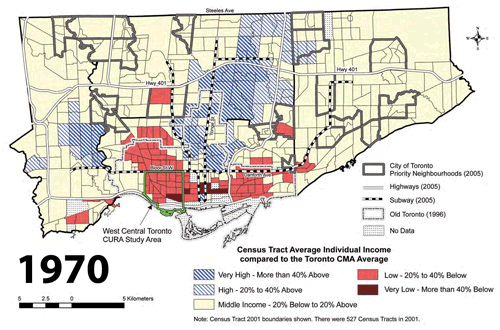
This animated map showcases the datum bookends of the excellent publication The Three Cities within Toronto: Income polarization among Toronto’s neighbourhoods, 1970—2000 by David Hulchanski from UofT‘s Centre for Urban and Community Studies (downloadable from their website). Income levels are shown as census tract averages as relative to the average for the Toronto CMA – the light pink is middle income (20% below to 20% above average), with the most interesting change occurring between that and the darker pink representing low income areas (20% to 40% below average).
The geographic explosion of lower incomes into the inner suburbs of north Etobicoke and Scarborough is almost stunning, but I think reflects a lot of our current received wisdom about the changes taking place in Toronto, in particular gentrification in old inner city neighbourhoods and the consolidation and bulwarking of high income areas. In short, it speaks volumes about housing affordability in the currently valued neighbourhoods of the city, and indicates that those who can afford to are abandoning many of the inner suburbs.
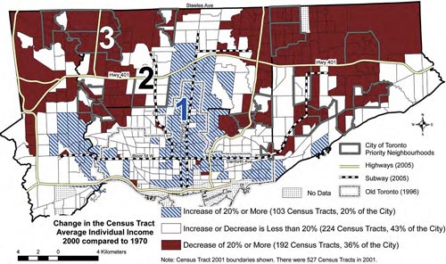
The more famous map from “The Three Cities” report is this one (above), which highlights those areas with the biggest increases (blue hatch) and decreases (dark brown) in average income between 1970 and 2000 – in this case, white areas are considered relatively stable. As you can see, looking at it this way clearly shows both gentrification at work and that the census tracts with the largest decreases in average income are almost all in the inner suburbs.
Hulchanski calls this a dramatic polarization and segregation of the city based on income, and firmly makes the point that we are capable of addressing this trend through better policies on housing affordability and requiring more affordable units in new developments to ensure that mixed income neighbourhoods are the norm instead of the exception: in his words “The segregation of the city by socio-economic status need not continue. It can be slowed and reversed.”
EDITOR’S NOTE: You should also note that Spacing’s Dale Duncan listed this issue (using the Three Cities report) as the City’s “Top issue for 2008” last month.
Crossposted to bricoleurbanism.org as part VI of a series — to view the five earlier parts follow these links:
• Mapping our urbanism part V – watersheds
• Mapping our urbanism part IV – language
• Mapping our urbanism part III – water mains
• Mapping our urbanism part II – extents
• Mapping our urbanism part I – snow ploughing


11 comments
I notice that most of the areas that have become richer are well served by transit, and most of the areas that have become poorer are poorly served by transit. In particular, northern Etobicoke and Scarborough, which have horrible transit service (from downtown, long subway ride + long bus ride). Perhaps investing in transit (like Transit Service, which will improve service in these areas) is a good idea?
To be certain, there are broad issues about the disparity of income distribution and absolute poverty in our society. This is true throughout North America, Canada, Ontario and Toronto.
The clustering of poverty, however, is indicative of different things, in as much as the minimum wage is the same on Finch as on Bloor.
Poverty clustering has several distinct origins.
One such cause is the concentration of socially-assisted housing in large development blocks in particular neighbourhoods.
Note, I don’t mean that the social housing itself is the problem.
But rather, where it is clustered together, generally to the exclusing of other mixed-income housing.
This not only has an effect on a map, but in fact helps to perpetuate and exacerbate poverty.
Clustering people who for systemic or unforunate personal reasons, are unemployed, or under-employed together deprives people of the best tool for jobs and for better paying jobs….. connections.
A neighbour, a friend who has a job, who can tip you off to an opening or put in a good word for you.
This is much more challenging when a majority of people in your building/area are in the same boat as you!
The concentration of poverty also, ironically, tragically makes the neighbourhood less attractive to residents with money, which in turn makes it less attractive to business which might provide much needs services and jobs!
This is why the redevelopment of Regent Park, and soon Lawrence Heights is so crucial and why this program must be extended to other areas like Jamestown in North Etobicoke, Jane/Finch and Malvern
That said, we do need to do more to ensure opportunity and the necessities for every citizen, though a higher minimum wage, tax-relief targeted to the working poor and enhanced social programs like adding pharmacare and dentalcare to the healthcare system.
Interestingly, in a comparison chart near the back of the report, item 51 is “Travel to work by public transit, 2001” – in City#3 this was 33%, for City#2 34% and for City#1 31%.
That would seem to more than justify better transit service in the inner suburbs when you consider item 52: “Number of Toronto transit subway stations within the area or on the immediate edge of the area” – in City#3 this was 16, for City#2 45 and for City#1 42.
All of which seems to fly in the face of accepted “wisdom” about urban form related to transit usage, and higher-order transit…. if you build it they will come? Maybe not, if they’re already using it – this requires justifying transit improvements on a qualitative level rather than focussing on increased ridership – this seems to be something the Province’s new funding strategies do not take into account.
Interestingly, and no one has brought this up in any review of these colour-coded maps, many of the outer areas, particularly those north of the 401, had fairly sparse population in 1970, in fact many of those areas (northeastern Scarborough especially) had no development whatsoever. Take a look at a 1970 TTC route map to see that there wasn’t much service to those areas. Wouldn’t this make this type of comparison rather skewed? If this was taken into account, is it mentioned anywhere in the report? What do the authors have to say about this?
Jonathan>
The situation you’re describing is a tad more complicated and contentious than you seem to think it is.
There is a lot of research out there now that shows that the social capital argument that you’re making (where mixed income communities will enable poor people to mingle with the not-so-poor, allowing them to make valuable “connections”) is seriously flawed. As it turns out, the not-so-poor don’t like mingling with the poor so much, and so those wonderful, life-changing “connections” are never made. Research also points to the fact that those “connections” would not have done much to change the financial situations of the poor people anyway, because generally people are not poor because they are lacking in the kinds of connections that not-so-poor people can provide them with.
Research shows that the kind of redevelopment you are advocating (also known as gentrification), has the effect of making the cost of living go up in these mixed income neighborhoods. So the poor person doesn’t make any more money, but the businesses in the neighbourhood raise their prices because the wealthier people can afford them, and the rent goes up (for individuals and small businesses) because the presence of wealthier people makes the neighbourhood more attractive to other wealthier people and the businesses that cater to them. (Hello, Parkdale).
What you seem to be missing is an understanding of poverty: the root causes, and the ways that it is alleviated. Which I am not going to get into here, except to say that most poor people aren’t poor simply because they lack “connections” to decent jobs. And most poor people do not live in social housing (just look at the numbers of poor compared to the number of social housing units). In fact, social housing is home to a lot of people who are on disability and/or are seniors and can’t work, so how are these “connections” supposed to help them? In many cases, the social supports these people need are their CURRENT friends and neighbours, and the social services in their neighborhoods. Redevelopment breaks up these tightly knit support networks, and displaces and alienates people. The “revitalizing” businesses and services that move into the neighbourhood are not usually the discount retailers and social service agencies that many poor people depend on. Of course it’s not ALL bad, there are benefits to gentrification (or redevelopment, revitalization or whatever you feel like calling it) but I wanted to make you aware of the not-so-rosy view.
So anyway, before you start demanding that we demolish homes and communities and alienate and displace the marginalized and disenfranchised in the name of their salvation, PLEASE do some research.
Further to Jonathan’s comment: one way of mitigating this poverty “clustering” (ghettoes?) of public housing could be the “right-to-buy” schemes they have in the UK.
Under such plans, market-level, public-housing renters can buy their units like a condo. This helps to de-ghettoize the complexes by engendering the pride of ownership while allowing people to get a toe-hold in the market. This could be done in conjunction with a broadening of the Regent Park type redevelopment.
Apparently, one drawback of the UK experience though, is that the least desirable complexes become even worse as no-one wants to buy there. We would need to somehow offset that.
Andrew,
Linking public transit service to income, in the manner in which you did, tells us nothing. Yes there is a casual relationship between the two, but no causality. The same conditions applied throughout the period in question. If the relationship worked it would have precluded the ‘build up’ of the suburbs to begin with. The fact of the matter is that these areas were richer and now they are poorer. At both times they had poor public transit.
As Robin astutely noted, such casual linkages should be questioned. For anyone interested Evelyn Blumberg had an interesting look on the subject in her paper Cars, Buses and Jobs: Welfare Participants and Employment Access in Los Angles (here http://www.uctc.net/papers/544.pdf ). Also “Can Transportation Strategies
Help Meet the Welfare Challenge?” by Wachs and Taylor (http://repositories.cdlib.org/cgi/viewcontent.cgi?article=1000&context=uctc).
IMO, the map is a reflection of the job losses, or missed creation, that went to the 905 region. I think that the closest correlation that one can find to maps posted would be on pages 10 and 11 here…….
http://www.toronto.ca/finance/pdf/taxpolicy_pres_oct2005.pdf
I think the more interesting question is whether the “middle income” has gone up or down. Are poor people better or worse off than they were in 1970?
The gap between rich and poor isn’t necessarily all that important in itself.
Hunter>
There aren’t that many “market level” public housing renters in the “clusters” that Jonathan is talking about. As far as I know anyway, in those developments (Regent Park, St. Jamestown), the units are all subsidized.
There’s also the problem that many of Toronto Housing’s buildings being in a state of disrepair due to years of inadequate funding. How are tenants supposed to take on the burden of a building’s structural problems when they have already proven to be too expensive for the city (and province) to address?
Sexton>
The question is answered in the report: Poor people are worse off, in part because there are more of them. And yes, the gap itself is important, as the report indicates.
From the conclusion:
“Before the late 1970s, few people spoke about a “housing affordability problem.†Poor people were housed, albeit in poor-quality housing, and the middle-income majority could afford what the market had to offer. It is only when the percentage of those in the middle declined that we began to hear about “housing affordability†problems. If the incomes of a significant share of people in a city fall relative to the middle,the gap between rich and poor widens. Those closer to the bottom are more numerous and find it increasingly difficult to afford the largest single item in their budget − housing (either in mortgage payments or rent). This is what has happened in the City of Toronto and its inner suburbs since 1970.
Melissa, proceeds (or “profits”, excuse my french) from unit sales of public housing could go toward the much-needed renovations, or even into a fund for construction of new public housing. Such a formula would make public housing more self-sustaining and self-renewing. If the ratio of market-level residents is too small then maybe a certain percentage of sales could be opened up to non-residents.
Why should the city not try to make the condo/real estate boom work for it, especially when other levels of government are so stingy? Why let the private developers rake it all in for themselves?
A little late, but I think it’s important to note that this is not a phenomenon unique to Toronto. The Brookings Institution did a big report on the state of older suburbs in the US, many of which are becoming poorer and taking on “inner city” characteristics. In some ways the older suburbs are more vulnerable because they aren’t appealing to the professional middle classes (i.e. 1950s architecture). These suburbs are now showing their age and have been bypassed by newer, further-out ones.