
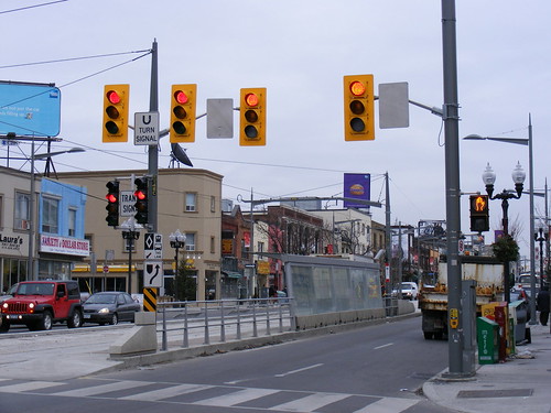
Could traffic lights get any uglier than on St. Clair?
In the Infrastructure Fetish feature of the new issue of Spacing, I wrote a lament to Toronto’s standard one-size-fits-all yellow traffic signal, called “Not so mellow on yellow”. In that article, I argued that the design of the ubiquitous “12-8-8” signal (named for the diameter, in inches, of the signal lights) in Toronto is ugly, and a determent to the urban streetscape. I also discuss some viable alternatives, such as revised colours and mountings for downtown areas, while maintaining high-visibility signals for higher-speed suburban areas.
Here, as a supplement to that article, I wish to present some alternative traffic light designs in North America, some even here in Ontario, that should be used in Toronto where appropriate.
Worldwide, traffic signals are found mostly in one of two basic colours: black, the most common standard; and yellow, the standard colour in about 20 US states, Ontario, Manitoba and increasingly in British Colombia, but uncommon elsewhere but for a handful of Latin American countries.
The Ontario Traffic Manual provides for recommended colours, mounting, and backboard use. The OTM specifies the use of yellow backboards, but as with many aspects of the manual, allows for deviation from its guidelines.
Despite this rulebook, there are many deviations across Ontario. The downtowns of Richmond Hill, Kingston, Kincardine, and Kenora feature all-black signals, which dramatically improve the local streetscape. In downtown Brockville, the signals are coloured dark-green (the same colour as used across the river in New York State as well as in Louisiana), and match all the downtown street furniture. The OTM specifically allows for non-yellow traffic light backings as well, particularly grey and black.
 Downtown Richmond Hill, where they play by their own rules.
This deviation extends to the rather unimportant rear side, or backing, of a traffic light, for which visibility isn’t necessary. Greater Sudbury, York Region, and now several municipalities in Simcoe County use a grey backing. This colour matches the standard metal poles, and acts to not call attention to the rear of traffic signals. Black backings (with otherwise yellow lights) are used in Cobourg around its historic Victoria Hall to improve the local streetscape without otherwise deviating from the OTM standard.
The long-time Hamilton traffic light design standard has been a black casing with a yellow backboard. This design has been updated with a yellow reflective strip around the black casings to improve night visibility. Greater Sudbury has adopted this design, as has Sault Ste. Marie.
Toronto does use some black traffic signals, but so far, they are only for special applications, such as transit and bicycle signals.
Apart from some traffic manuals that specify a particular colour of traffic light, there is no consensus amongst transportation engineers and other officials in the American Federal Highway Works Administration. However, in the US, black is much more popular, though this varies from state to state. As I was researching this piece, I found an article from Birmingham, Alabama, that reports that city officials have been replacing yellow with black to reduce sun glare, as black paint absorbs other sources of light.
As a driver, I have appreciated the mixed colour scheme found in Hamilton and Sudbury (and the reverse yellow-black scheme as seen in the photo of Downtown Philadephia), as I have found both very visible and also visually appealing.
So here are some suggested standards based upon the limited literature and discussion and my own preferences for both improving the streetscape and visibility when driving:
- Downtown, low speed intersections and other inner-city BIA neighbourhoods: Black 12-12-12 casings (all lights the same size). Black mast arms (where necessary) and poles. Backboards where absolutely needed. All-12 inch lights help to maximize visibility without need for backboards, black fixtures and arms improve the streetcape. Permitted under exceptions in OTM.
- Suburbs and high-speed intersections: Black 12-12-12 casings, yellow backboards, with black or grey backing. Maximizes visibility for drivers travelling at higher speeds, filter ambient light, consistent with OTM.
- Pedestrian signal heads: as they do not have any backboards, they should go to all-black to be consistent with traffic signal heads.
Spacing has assembled a slideshow of traffic light designs for further illustration of these points.
27 comments
Besides the aesthetics, the placement of traffic lights is awful in Ontario. They are placed in what is the most difficult spot to see.
The black casings without backboard look okay, but I really dislike most of the other black designs. In my experience they tend to look dirty, more evocative of soot and smoke stains on old buildings than anything else.
I find the yellow more pleasant on the eye and, as it’s closer in tone to the sky, less obtrusive.
One could make the same comment about almost all municipal infrastructure in Toronto. It doesn’t have to be ugly, but it is. For example, I’ve wondered for years why Toronto is unique among major first world cities in tolerating frontier-town wooden poles and overhead wires along its main streets. The only conclusion I could draw is that the vast majority of Torontonians don’t care about urban design and don’t feel ground down by the monumental ugliness of the place. Our politicians seem to delegate design decisions to civil servants with the overriding concerns of making everything as cheap as possible, and staying within the confines of the North American rural and suburban vernacular. So while I’d like to see Toronto become a somewhat less shabby and ugly city, I’m not holding my breath.
Mostly I don’t like those angled bracket arms that the signal lights are mounted to hang over the street. Back in the day most lights were mounted on the light poles or on very short arms, which to me kept them visually aligned with the poles, but as the photos show, traffic engineers insist on having them all on those angled brackets and hanging out over the street, even on a narrow two-lane roadway such as the one in the top photo. And why are there two lights for the U-Turn signal? It’s not like the streetcars are going to be making U-Turns? It’s as if they had extra money for the traffic signals and used as many as possible, just to be obnoxious.
Are there any left in Toronto that don’t have the backing plate? There used to still be one set on the east side of northbound Yonge just above College (Alexander St. I think it was), but it was replaced several years ago.
Bravo. I could not agree more.
Don’t forget to update the poles holding the traffic lights and the streetlamps at the same time so that everything is of a coordinated color and style.
i think all those extra traffic lights along st. clair are over kill, and they cause traffic. i’ve seen it while waiting for the streetcar as drivers get confused
when one light turns green and all the rest are red, and they sit there waiting while all the traffic behind them are honking and screaming to go. the drivers tend to hesitate i wouldn’t be surprised if the rates of accidents have gone up along st. clair.
Rob L: The city has been recently replacing the last of the old left-side “8-8-8” lights with brand new “12-8-8” fixtures all over the city, and I think that all of them are now gone. I also remember the old plate-less lights on Yonge between College and Bloor (Alexander was one), but they were all “fixed” within the last 2-3 years.
I’ve never really liked 12-12-12…it’s aesthetically jarring in low-traffic environments, even when places like Kingston paint them to look more “historical” (would that they’d done that when they redid the signals at Union and University…or rather two of the four signals; the other two are a mix of 12-8-8 and 8-8-8, like they ran out of money halfway through the project or something…)
Also – a set of signals that was recently installed in Cobourg near Victoria Hall features black backings, but the fronts are Hamilton-style (black casings, yellow blackboards). Kind of random; would have looked better had they been consistent with the other set.
Aside from colour, I’ve never understood why Ontario signals are vertical while most other jurisdictions are horizontal. Horizontal improves the visibility a great deal as you don’t have to adjust your sun visor to see the red.
When I went to Montreal for the first time I became I really jealous of their black traffic lights/poles/etc., and more recently viewing downtown Chicago on Google Street View depressed me even more. I don’t know why Toronto’s street furniture has to be so clumsy and garish. I vastly prefer the elegant aesthetic restraint practiced in the aforementioned locations.
Nevermind the colour; I’m with Bubba: why do we need *4* traffic lights for two lanes of traffic? (And that’s not including 2 more lights for streetcars.) That’s at least 2 too many if you believe that a separate light is necessary for U-turns, and I don’t believe that, so really, it’s 3 too many. It would be far less confusing to have one set of lights that included a special U-turn signal. Then you can do away with the stupid “U TURN SIGNAL” sign. In addition, turn the streetcar lights sideways and make them more distinctive and then get rid of the transit signal sign as well.
Toronto’s ugly problem isn’t the colour of streetlights, it’s the overuse of signs and lights in general. Do we really need signs like “PEDESTRIANS OBEY YOUR SIGNALS”. It’s unnecessary, causes confusion (which lights and which signs are important?) and it’s a real eyesore.
Toronto’s Queensway has had a streetcar right-of-way since 1957 or so. But they still continue to use transit traffic signals that are confusing because they are the same design as the regular traffic signals. Cities in Europe and in the United States are using transit signals that are specifically different for transit use. It is time that Toronto and Ontario use transit specific traffic signals, without English words to add to the sign pollution.
See http://en.wikipedia.org/wiki/Traffic_signals#Lights_for_public_transport as a start.
I think that the “streetcar only” lights are very confusing for visitors (or locals who do not often drive on streetcar routes). Many places have a completely different kind of light for streetcars. There’s a whole thread on them at Urban Toronto. http://urbantoronto.ca/showthread.php?9918-Streetcar-and-light-rail-signals&highlight=streetcar+lights
I appreciate good quality urban design, and well planned public realm. Is it wrong if I like chaotic and cluttered streets? I think Canadian cities could have more chaos and less standardized orderly things.
The biggest problem is the overuse of 12-12-12 signals. Toronto seems to have a policy that, if there is a signal with a left turn arrow, it has to have all 12-inch lenses, and so do any other signals for that direction (even if they don’t have the arrow). This isn’t a provincial requirement, it seems to be Toronto only — and it really is out of scale in an urban environment. Recently the City replaced the flashing greens at Woodbine and Gerrard with arrow signals, and they upsized the signals to 12-12-12s at the same time — they are really out of scale for that intersection.
The backplate is supposed to add conspicuity to the signals to make it easier to notice them, but the Hamilton example might be a better way to do that — the yellow backplate makes the signals more conspicuous, but the black casing makes the lights stand out more. I remember the signals along Lakeshore Road in Port Credit all used to have that design. Most of them (if not all) have been phased out since then.
Interestingly, I have heard a story that the MTO used to use black or dark green backplates in rural areas to stand out against the sky, and yellow backplates in urban areas to stand out against other “competing” signage, lights etc. I don’t know how true that is, but the MTO certainly did use them at one point — I remember some on Hwy. 10 north of Port Credit back in the 80s.
That St. Clair example is egregious, even for Toronto. For starters, why does a streetcar need two lights? Can’t it just suffice with one? Also, most places with median LRT lines in the US have a simple and single 8″ light for rail vehicles that can alternate between the different semaphores.
Second, is there a need for two separate left-turn traffic lights right next to one another? Can’t a left-turn indicator be placed below the green light on a 4-light signal instead of having two additional traffic lights?
That intersection needs, at most, three lights. Instead it has six and all of them are ugly.
Sadly, lights are prone to failure and that is why even on a two lane road we need two sets of lights. You will note that all the photos have two sets for the same traffic flow. Ad for the U turn signal it is needed because drivers too often forget about the streetcars when trying to make U turns and if they weren’t restricted there would be more accidents.
It is unfortunate that St Clair looks cluttered because of this redundancy, but even without the lights St Clair wouldn’t look much better. There is far too much going on along it. Too many light poles there are fully two sets of street lights, as can be seen in the photo.
“For starters, why does a streetcar need two lights? Can’t it just suffice with one?”
In case one burns out.
For example, there are two sets of lights right next to each other for the bicycle crossing at Lake Shore and Windermere, but one has the red light burnt out.
I might understand having two sets of lights, in case one set has a burnt out bulb. However, with LED lights, wouldn’t only the individual filament or filaments go out? Shouldn’t there be enough of the LED filaments working?
I would think that should the LED light need replacing, a police officer (who would be at the scene always) direct traffic during the replacement.
How long has the LED lights been in use to see how reliable they are to use only one set for left turns or transit?
I like the old analogue lights in Montreal (you can hear the click-click in the control boxes of the circuitry) — they stand simply on posts, no “arm” hanging over the street (in the downtown core — outside they’ve got those crazy horizontal ones).
Smaller intersections in historic areas should have traffic signals like those used in Montreal:
http://www.flickr.com/photos/spacing/2965599075/
Because they’re smaller and black, they don’t distract from the beauty of the streetscape and the unique buildings. Also note that these signals are not hung. At many smaller intersections, hung signals are pointless and just create more unnecessary clutter.
It’s simply more attractive and makes for a better impression of an area.
And why continue with round traffic lights? Couldn’t square ones or octagon red lights be a nice change?
See http://www.artlebedev.com/everything/luxofor/ for samples.
Here is the relevant section from the Ontario Traffic Manual addressing signal head colour:
“Backboard faces shall be traffic yellow in colour under most conditions. Specific conditions may exist where the daytime target value or visibility and conspicuity of the backboard faces may be enhanced by use of a dark colour such as dark green or black. These situations normally occur where the signal heads are at the top of a hill and have a sky background.”
I just realized that a lot of intersections have 3 (three) sets of regular traffic lights facing one direction (not counting pedestrian signals). Two farside and one nearside. That could mean 3 x 4, or 12 sets of traffic lights (again not counting pedestrian signals). Talk about overkill.
I think that LED lights do not need duplicates, however when the crews are replacing older style heads with LED heads, the crew that does that replacement doesn’t reduce the number of heads. This is because the traffic engineers need to re-specify the lights needed for the intersection.
Part of the reason for adding more lights, may be dependent on the traffic light control box, older boxes may be designed to allow for more sets, but not more lights in a set. Replacing the traffic light control box may be a big and expensive job, so they add more full sets, for transit and U turns, because the control box is expensive, and the light head is cheap in comparison.
Not that they need to be as garishly ugly as the St. Clair ones you show above, but visibility is at least as much of an issue on “slow” downtown streets as in the suburbs. There tends to be a lot of visual clutter in downtown areas, and if the signals are too subtle they can get lost in it all… driving in Montreal I’ve found those backplateless pole-mounted signals quite easy to miss. I once accidentally ran a red light because of that, but luckily it was Montreal so no one cared.
I’ve been thinking about this subject quite a bit over the last couple weeks. Turns out that unless you are in a historic district, New York is mostly vertical yellow signals on standard metallic poles. However, there are two key differences:
– No backboard. This greatly decreases visual clutter. Lights are bright enough with LED that whatever the original purpose of the backboard was (contrast?), it is quite unnecessary.
– 8-8-8. The symmetry of this is far more attractive and also results in a slender signal.
If Toronto just ditched the backboard and went to 8-8-8 I think it would be just fine, with black signals in historic or highly commercial areas.