
If you’ve been reading Spacing Toronto for any length of time you’ll know that I have a fascination with transit maps. So much so, I’ve proposed a few map ideas to the TTC in the past (which is probably why I was asked to design the original Transit City map).
The world’s most famous subway map, designed by Harry Beck, is found in London, England and is considered the world standard-bearer of transit maps. It compresses the sprawling Underground (12 lines, 270 stations) network into a digestible size that is rather easy to understand.
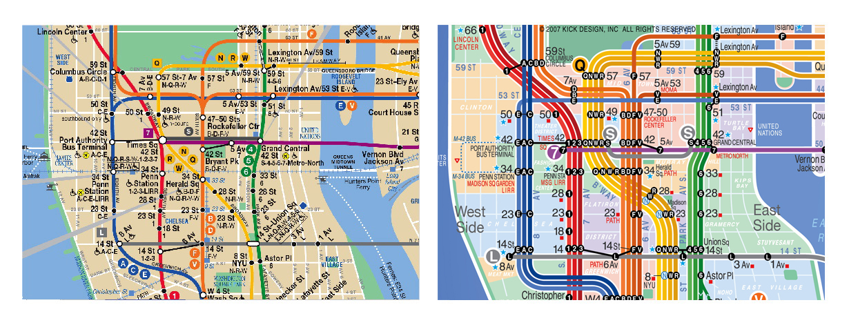
Toronto’s subway map is simple, simply because we have so few lines and only 69 stations. New York, on the other hand, has 26 lines and 468 stations (as a side note: can you imagine what we at Spacing would have to do to make subway buttons for NYC’s subway system?!?). A quick look at a New York subway map reveals that the city has yet to find a comfortable way to display their system with the same ease as London.
In an O’Reilly Radar post, graphic designer Eddie Jabbour explains why he chose to re-design New York’s subway map and all of the minute details that need to be considered during the creative process. One of the more interesting tidbits he points out is that in North American cities our subway networks tend to follow the grid of the streets, whereas in most European cities the subways operate in rail corridors and cannot conform to the winding, medieval street grid. This means that North Americans usually have a greater understanding of where they are once they’re underground.
The other interesting point he made is that some people are intimidated by the subway in New York. And the one tool that most people turn to in order to alleviate that intimidation is the subway map. And if the system map is not designed in a truly user-friendly way there is a good chance that the a new rider is being pushed away from riding the system.
The article is an informative read; after you’ve perused it I’d like to hear how the TTC can improve the maps that it provides to riders here in Toronto.
21 comments
The 3 Scarborough RT is currently BLUE on the subway/RT and route maps. It would probably stay that colour when it is converted to light rail. 1 Yonge-University-Spadina is YELLOW, 2 Bloor-Danforth is GREEN, and 4 Sheppard is PURPLE. The Bay Street streetcar subway, used by 509 Harbourfront and 510 Spadina has no designated colour, unless one considers it to be RED.
But then what colours (and numbers) would the other new rapid transit lines be?
“The article is an informative read; after you’ve perused it I’d like to hear how the TTC can improve the maps that it provides to riders here in Toronto.”
Has the TTC released any concepts for what the map will look like with the YUS extension? There’s not a lot of room to fit those stations and I don’t have confidence they will get it right, at least on the first try.
While people are thinking about maps, it will be useful to remember that there are many different TTC maps:
There’s the regular route map.
There’s the night service map (included on the regular map).
There are the neighbourhood maps for each station.
There are the maps included on timetables for each route (most commonly accessed these days online).
There are the strip maps (the one that famously became “A Warmer Soupy Butt”).
There’s the “You Are Here” maps.
There are the overhead line maps in selected stations (notably on the Sheppard line and at St. George).
There are the maps in languages other than English.
There are maps used for diversion and service change notices.
I have probably missed some, but the point is that a rethink of “maps” means the whole family of maps.
After reading the linked article, and remembering the debacle of the area maps (recently reissued but still disasters), I cannot help thinking that the TTC will say “yes we must do something” and then give the job to the same hopeless folks who have been doing it all along. This is a vital piece of “customer service” (is it in your report, Matt?) whose importance the TTC simply does not understand.
This is extremely fascinating and this New York redesign is fantastic! He’s definitely whittled down the design to the bare necessities and still ensured its readable and clear.
One particularily difficult think with New York – as he mentions in his post – is its geography and history. Unlike London, Paris or Tokyo the city is bisected by large waterways and act as major dividers of the city (The Thames is nothing compared to the East River!). The identities of Brooklyn, Queens or The Bronx are going to be necessary for understand the system and navigating it since most signage on train refer to them as “Brooklyn-bound”, “Queens-bound”, “Manhattan-bound” or “Bronx-bound” for all the lines that leave Manhattan. He’s done a great job of maintaining this geography and keeping it easy.
Also New York was once 3 different private subway companies competing with each other and so you have these strange and convoluted system where two lines have stations just a block away but don’t connect. That kind of jumble is a nightmare to navigate sometimes but also to illustrate successfully.
I’d use his map over the MTA-issued one.
Not so much the route maps, but the station area maps continue to disappoint. Also, I’d like to see the return of single-route, flyer-sized paper maps hanging for passengers to take behind the driver.
As for the system map, I agree with pretty much everything in the NYC example and would like to see these principles applied to the TTC. I’d also like to know the experience and systems used by TTC staff to do this: the prevailing assumption is that the wrong staff are assigned to this task.
Thanks for sharing the link Matt. In London, i was always trying to match up the subway map with the street “grid” to find my way around which makes me think that while the design is great for residents, tourists were missing something. Now i’m not a design expert, but i’d think any map should be user friendly for all.
In New York, the grid definitely helps but the way the routings are described in the map and in text can cause confusion. Again as a tourist, you wouldn’t always know where the terminus of a line was and you may end up going south (towards Brooklyn) rather than north (towards the Bronx or Queens).
Long story short, the map isn’t to be viewed in isolation but should be one piece of the navigation pie and designed to work together with other forms of communication.
In Toronto, we have the ‘best’ of both worlds – simplicity in our street grid and our subway lines. That being said, the map isn’t the problem. Although i wonder how it can be edited to include a longer University-Spadina line and the streetcar and Transit City lines when they are done.
Great post about a great post. The Jabbour map is gorgeous and would be a nice update. Still, I find the New York subway to actually be reasonably easy to navigate, for the following reasons:
– the map is a fair blend of simplicity and geography. 95% of tourists remain within lower and central Manhattan and the current map does just fine at getting them around with its enlargement of these areas.
– don’t forget that unlike @!#!%#! Toronto, the maps in New York are complemented by exceptionally clear and easy-to-use line maps in the subway cars. This really helps with understanding the local/express splits. Visual and audio announcements also supplement the maps.
– the station signage is very consistent and clear, so as long as you know what letter or number train you want you should be able to find it.
– the trains themselves are clearly labelled with their line designation and destination. “A – 8th Ave Express – To Inwood-207th St”.
The caveat is that late at night and especially on weekends, all hell breaks loose and the maps and signs become useless due to construction. Of the 24 active subway lines (no longer 26 after budget cuts forced some mergers), it’s pretty common for half of them to undergo hard-to-understand changes during these off peak times. For an example, click this link:
http://bit.ly/cBcsCP
Try understanding that when standing on a 100 degree subway platform, staring at a taped-up 8.5×11 piece of paper and understanding only Swedish or Italian. In those cases no map is going to be of much use, and that is the real design challenge.
As far as I know, the London subway map is not proportional (doesn`t match the geography or the street network).
I think the Paris subway (or the whole public transportation system) map has the legibility, the proportionality and the integration with the bus and regional train network.
The TTC needs to start by being more accurate with the existing map. YUS is quite compressed, whereas BD looks stretched. It produces an odd-looking map, especially when you look at the placement of Kennedy station, which is well south of Eglinton on the existing maps. This then distorts the SRT by showing a large gap between Kennedy at Lawrence E, followed by a much smaller gap between the latter and Ellesmere (even though the stop spacing is actually identical). They’ll have to shrink YUS a bit more with the opening of the York extension (and can squeeze a bit more space by placing the text for Union station inside the U, as opposed to below it), but will also have to shrink BD significantly. As for the Sheppard LRT, I assume they’ll continue it on the map with a thinner purple line, and a round transfer denotation at Don Mills. The same thinner lines can be used for the other LRTs, though I don’t know what colours would be used, since none are a continuation of an existing line like Sheppard. I imagine new colours such as orange, pink, etc will be used.
I would like to see bus and streetcar routes – and their stops, as well as subway station alternate exits, on maps of the city that are sold by Rand McNally, Perly etc. Even the TTC’s own ride guide does not show where the bus stops and alternate subway station exists are! This is standard practice on European city maps, see for example http://www.berlin.de/stadtplan/map.asp. I’d also like to see at least the 192 Rocket shown on the maps that are in the subway cars, with a dotted line from Kipling to a symbol indicating the airport. Perhaps other bus connections could be shown, too. The Toronto in-car subway maps are almost laughably simple, so could easily tolerate a bit more information.
@Leo Gonzalez – The reason for the compressed YUS line is that the map is made to fit the ad banner space above doors, which also means it fits the back of the TTC system paper map when it’s folded up. Also, in the new subway cars that will have the LED maps above the doors will continue to have the compressed YUS. What they’re going to do when the Spadina extension is finished will be interesting to say the least 😛
Also, since there has been some discussion with regards to the actual scale of the subway systems, here’s a good web page with a comparison between all the major ones in the world: http://fakeisthenewreal.org/subway/
The neighbourhood maps for the TTC’s stations leaves something to be desired. One only has to look at one of Montréal’s station website to see what their neighbourhood map looks up, the same map is at the entrance as on the website.
Click on http://www.stm.info/English/metro/a-m55.htm for an example of Montréal station website and for the neighbourhood map at http://www.stm.info/English/metro/Cote-des-Neiges.pdf for the PDF.
“The reason for the compressed YUS line is that the map is made to fit the ad banner space above doors”. Yes, I realize that. What I am suggesting is that they should also compress B-D (and consequently, Sheppard), and ensure that the different lines align properly. With the existing map, Kennedy station is aligned with St Clair Ave instead of Eglinton Ave. I realize these maps cannot be made to scale, nor can they be a perfect representation of their actual route. But the design of the existing map seems to be a result of indifference or incompetence, because on earlier iterations (ie 1980s maps), Kennedy station was aligned correctly with Eglinton.
Here’s a youtube video on New York’s subway colors and names: http://www.youtube.com/watch?v=yZ83UhBJFP0
click on above.
This is a fascinating article. Also, it’s the first time I’ve been able to see the “Kick” map in full (it’s presented in part in Metro Maps of the World and in other places), and it’s also useful to have the side-by-side comparisons with the official MTA map.
I don’t think the New York example is as relevant to Toronto, though, at least when it comes to the subway map. The level of complexity is completely different. New York has many different lines, multiple routes operating along “trunks”, express and local patterns, different service patterns at different times of the day, many routes that are not tied to a single street, and areas of the city where lines come together in plates of spaghetti that can be overwhelming to unfamiliar riders. Toronto has four lines, one small-scale and low-impact service variant (AM peak short turns at St. Clair West), all trains make all stops, and much of the network is closely tied to a simple street pattern and geography (Yonge, Bloor/Danforth, and Sheppard).
The Spadina (and Yonge?) extensions will be a challenge to fit on the schematic map, as commenters have pointed out. The bigger problem, though, will be having to replace all of the bells-and-whistles LED maps on the new Toronto Rocket trains. It is one thing to have to replace all of the existing maps (the TTC does that periodically anyway); it is another to have to completely replace, rewire and reprogram all of the LED maps — 24 times per train, on a fleet of 70 trains, or 1,680 replacement LED maps.
Of the TTC’s conventional (i.e. widely-distributed) maps, the Ride Guide is more in need of clarification. The Ride Guide used to have one line for each route, but this was changed so that all service on a street was represented by a single line. This is fine for areas of the city where service patterns are fairly straightforward. But for areas with a more complex route pattern (say, Thorncliffe Park–Leaside, Malvern, or Downsview–York University — or much of York and Peel) this can make it more difficult to follow routes. Perhaps this could be shown by showing individual (colour-coded?) lines for routes, or by preparing separate neighbourhood- or ward-level maps (see London and Paris – although those cities’ surface route networks are even more convoluted).
Another possibility is in how the TTC differentiates between types of “express” routes. We have rocket-type routes with limited stops throughout; we have express branches of main routes that operate with limited stops on all or a portion of the route, and possibly local stops at the extremity; we have the premium express routes that are local at the start and end points and non-stop in between; we have GO bus routes that might have all of two or three stops in 416 and otherwise run non-stop on the DVP and 401; we have routes that essentially have a local stop pattern (509/510/512) but are mapped as “rapid transit” routes because they are in the median. The Ride Guide doesn’t differentiate this as well as it could, and doesn’t offer any guidance as to stop patterns or locations. I find the San Francisco map to be a better example (although it is not as good at showing interface with the subway).
Let’s compare those Montreal neighbourhood maps with the TTC’s latest attempt:
Shows surface routes, stops, and a list of routes serving those stops. Surface routes are separated by direction of travel, and turns are shown clearly.
Downplays the subway alignment, which is not all that important to riders that have just gotten off a train.
Station exit locations are reasonably conspicuous but are small enough that they can be used to actually locate the exit (rather than being a blob that takes up the entire block)… and they show the relation of underground passageways.
Shows major points of interest only (and all buildings are labelled), and shows address numbers on most streets to enable users to find less important locations.
The maps are oriented around perceived north, not true north.
On the single-route map angle, it’s interesting what’s happening here in Waterloo Region. Bus route maps (free to grab at terminals and on buses) consist of a geographically-accurate map with every single street illustrated, and every stop (and its EasyGo electronic-schedule number) precisely indicated (PDFs here: http://grt.ca/web/transit.nsf/DocID/C45901AEE9FFE0AF8525746C00522521?OpenDocument ). However, we do have a trial going on where the routes in Cambridge have a new style map: a thematic layout of the route on a simplified map, paired witha table listing each stop’s location and its EasyGo number (PDFs here: http://grt.ca/web/transit.nsf/DocID/17B830751F69A6DB8525746C0067D743?OpenDocument ). The schedule tables are also more streamlined, and in total they take up much less paper, but it can be a bit more confusing to read.
It’s interesting to see how this will pan out in future, as we have a light-rail line planned, more BRT set to come, and a simplified route layour to serve these more efficiently.
@ W.K. Lis: The best remark I ever heard about the Sheppard line just after it opened was a father explaining to his son on a platform, with a completely straight face, that this was the “Plum Line”.
I love to confront visitors to Tokyo with this map: http://www.flickr.com/photos/kzaral/3373021846/sizes/l/
It is surprisingly usable once you wrap your head around that many lines serving a population the size of Canada”s within a 30km radius.
For the Montréal Métro section of my website, I have redesigned a few times the current pretty bland Montréal subway map.
For example, there is what they had planned for the 1980’s back in the 60’s, (that plan was selected to illustrate one of the posters of the Canadian Center for Architecture’s “The sixties – Montréal thinks big” exhibition in 2004).
Or there is a speculative map of what Montréal could have done by revamping it’s streetcar network (PDF) instead of building a subway system.
And, in the style of a classic Paris Métro track topology map, I have made a track map of the Montréal subway system (PDF).