


Cross-posted from No Mean City, Alex’s personal blog on architecture
![]()
A night about design, and it turned into a civic pep rally. That was the Toronto Urban Design Awards ceremony last Monday night, when the city handed out prizes to the best buildings, landscapes and urban planning ideas of the past two years. After all the negativity of the Port Lands debate, and the silliness of Doug Ford’s Wild Waterfront Kingdom, the awards showed just how much smart work is coming out of local designers – and what a smart job of city-building that the city of Toronto has been doing. PDF of winners here.
Host Matt Galloway set the tone, and it was unceasingly enthusiastic. “We’re too quick to run this city down, and other people are too quick to run this city down,” he said. “We shouldn’t let them.” And he suggested the winning designs spoke to the potential of the city and the way it’s already, productively taking shape. The award winners included some truly great projects.
One winner, the best midrise building, was 60 Richmond – a Jenga-like apartment tower by Teeple Architects that is remarkably creative and equally green. (I wrote about it last year here.)
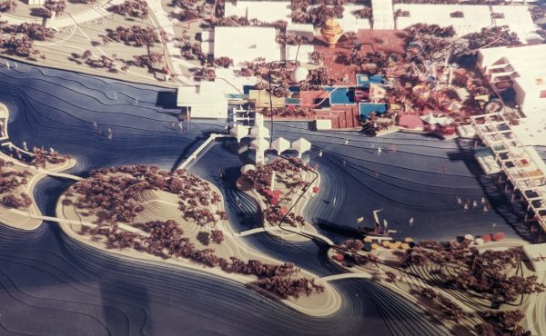
Another, in the “large places” category, was Sugar Beach on the waterfront, by Claude Cormier. (I’ve had my say about that brilliant park, too, here.)

You may notice that both of those were commissioned by city agencies: Toronto Community Housing, and yes, Waterfront Toronto.
Both have gotten a bad rap in the past year, despite strong records of getting things done. I hope this is a useful lesson for those on city council’s gravy-hunting wing.
On a related note, the biggest applause of the night came with an award for the Fort York Cycle and Pedestrian Bridge, led by Montgomery Sisam. Yes, that’s the one that was planned, costed, bureaucratically okayed – and then killed at the last minute by a sneaky committee motion by Mayor Ford’s allies. It would have been a dramatic connection between Fort York (a crucial site that has been, as the jury says, “brutally isolated” by infrastructure.

I hope it comes back, in some form.
In a broader sense, these awards, given out every two years, mark a positive change this time in the city’s design culture. Robert Freedman, the city’s director of urban design, puts it this way, and I agree. “Context” has been a watchword of the city’s best designers since the 1960s, and I am seeing a broadening influence of that idea – really a sensibility, blending contemporary gestures with a respect for what’s come before.
Today, after many decades of design experimentation, we appear to be regaining a shared, city-design ethos. Over the past decade, Urban Design staff have been distilling these design values into a series of guidelines for various scales of structures from townhouses to tall buildings. We’ve been pleased to see that more and more of the Award submissions appear to be following these guidelines. We also see fewer buildings and landscapes presented as stand-alone objects, with much more emphasis on context and the spaces between buildings. Good city design does emerge through individual efforts when we share a common sense of what constitutes good urban design.


4 comments
What’s happening with the winning design for the north building of St Lawrence Market? Is it moving forward?
Wondering if I am the only one who hates the Salvation Army Harbour LightBox? I just found it hostile to the urban environment. The design would be excellent if it were a hydro station, but for a chapel at busy downtown corner, I’d expect something more intimate and humane.
These were the winners? Ouch! Bad decade..
Todd, I firmly disagree. Sugar Beach is a beautiful public space with incredible attention to detail down to three colours of granite paving, a space that exceeds many similar urban design efforts I’ve encountered in American and European cities and in urban design books. The same thing with Sherbourne Common and its interesting pavilion. The Summerhill shops restoration shows exemplary attention to detail in both restoring and enhancing the heritage buildings. 60 Richmond is an icon that received worldwide attention was relatively affordable to build and environment-friendly. The Printing Factory lofts are both a sympathetic and sleek conversion of a factory to residential, keeping its character at the forefront while adding an interesting new component.
The TIFF Bell Lightbox is a beautiful new cultural facility, one of the best in the presently dominant new Modernist style. The West Toronto Railpath has beautified and animated a dead space along the rail lines in the west and is used throughout the day and into the night by pedestrians, cyclists, joggers, dog-walkers, and by people socializing. These are all projects meeting or exceeding world standards, and it’s important to celebrate them with awards and enjoying them in person if possible
The jury’s comment on the need for variation in Regent Park was important. Even the townhouses in the photo would be better with tastefully-chosen variations in brick colour. The Salvation Army Harbour Lightbox is the only subpar building on the list, and its choice surprised me. There’s just too much empty wall around the intersection, and it looks oblivious and unresponsive to its context of being on the corner of a signalized intersection. It looks like the worst of Modernism from the 1960s. Illuminating? Any building with windows should do that. An intersection corner demands much more response to the street than those brick walls.