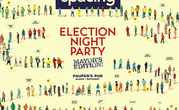
WHAT: Release party for Spacing’s summer 2013 (Toronto edition)
WHEN: Tuesday, June 25th, 7:30pm-2:00am
WHERE: The 3030 Bar, 3030 Dundas St. West (@ High Park Ave) in The Junction
COST: $8 (gets you copy of mag), $5 for subscribers
RSVP: Feel free to RSVP on our Facebook listing
MUSIC: DJ Shirley Tempo
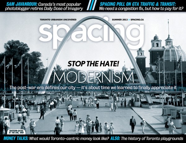
The post-war era defines most of the architecture in Toronto — it’s about time we began to appreciate it. And you can do that by showing up to our 28th release party to get your hands on a copy of our newest issue.
You can also grab some of our new merchandise — check out this post that describes the new products you’ll soon find on our online store.
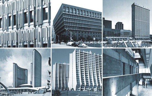
In the Summer 2013 issue, our contributors explore a variety of topics related to Modernism and its affects on Toronto’s urban landscape. As Senior Editor Shawn Micallef writes in his essay on Toronto’s mod architecture, “To stand in the middle of Nathan Phillips Square today, after its recent renovation, is to realize how all of Toronto’s Modernism should be treated…. This is how all buildings — the old and not-so-old ones — should be revered: with love, a facelift every couple decades, and some new accessories that give a nod to the contemporary but maintain the building’s inherent style. Yet many Modernist structures in Toronto don’t get this treatment. So much has been left to crumble and fill with debris. The details that made modern spaces and buildings space-age-fantastic have been untended: artfully placed recessed lighting has been left burnt out or smashed in, and extinct fountains are now dry pits collecting detritus. As well, thousands of exquisite Modernist bungalows on residential streets — the era’s equivalent of bay-and-gable Victorians — go unnoticed by most. It’s no wonder Modernism is not universally loved.”
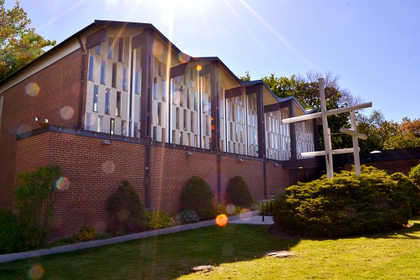
- Church of St. Luke Lutheran in Bayview Village
Staff writer Graeme Bayliss examines how churches and synagogues abandoned traditional design and embraced Modernism to attract new believers. Bayliss writes, “The shift from traditional Western religious architecture, with its elaborate ornamentation and utilization of expensive materials, to the generally simple and unadorned Modernist style was not precipitated merely by a change in architectural vogue — after all, when it comes to cultural trends, the sensitivity meter of religious institutions typically operates on a delay of decades. Rather, it was part of a concerted push by religious leaders to shed their elitist image and demystify their practices.”
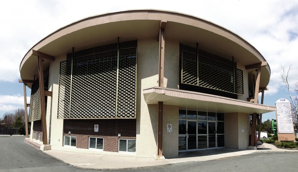
- The Royal York Medical Centre
Thomas Wickes looks at how Etobicoke’s growth coincided with the building boom of the post-war era. This meant everything from residential homes to medical centres to gas stations were built in the Modernist aesthetic. He writes, “Today, these areas such as Etobicoke and North York or Scarborough are often dismissed because they don’t impart an ideal sense of place. In fact, they’ve left a legacy we’re still struggling to deal with: low density, poor transit, and a lack of amenities. For better or worse, Etobicoke’s post-war neighbourhoods have come to define these dilemmas. While it would be a stretch to say that all architecture from the mid-century era is of a fine calibre, that doesn’t mean there aren’t worthwhile discoveries to be made. You just have to know where to look.”
Some of the other features you’ll find in the summer 2013 issue:
- Sam Javanrouh, Toronto’s most popular photoblogger, is retiring his web site Daily Dose of Imagery this summer after 10 years of posting a photo every single day without interruption.
- Senior editor John Lorinc explores how the City of Toronto and other municipalities are experimenting with new ways of reaching out to local residents during public consultation initiatives.
- Erica Simmons casts her eyes back over 100 years to when “child savers” crusaded by creating such forward-thinking projects as playgrounds. At the time, this was revolutionary and constituted a grand social experiment by the local level of government.
- Graphic artist Marc Ngui was challenged by Spacing editors: if Toronto had it’s own currency what would it look like? Whose image would appear on the bills and coins? His results are one of the most unique visual contributions to the magazine in years.
- Spacing was a partner in the Green Line design competition — we highlight the winners and finalists from this great initiative
- Map artist Andrew Alfred Duggan has created a map of Toronto’s bike lanes and trails that will surely become an essential piece of mapping for the local bike riders
If you do not subscribe to the magazine, you can sign up on our online store now and receive 40% off newsstand prices. It’ll be delivered right to your home or office. And nothing better supports Spacing than having a large, dedicated group of subscribers.