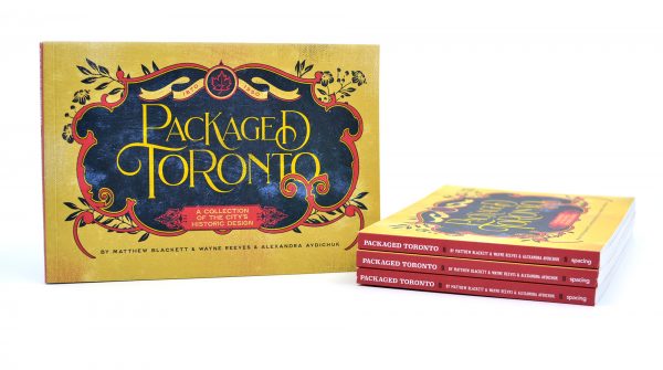
Packaged Toronto is the newest book from Spacing — it focuses on the graphic design and packaging of products, pulled form the City of Toronto’s museum collection of over 150,000 objects — made in Toronto between 1870-1950. Read details about it or buy it on the Spacing Store web site.
I’m a sucker for typography. So much so, I even had a font made of my own hand-writing. I love examining fonts to the point that I will blurt out esoteric comments to anyone with me, such as “Look at the cool serifs used on that sign!” or “Check out that ‘K’ — I love the arm on it!” It’s charming if you’re into graphic design, but ‘totally weird’ (as my wife says) if fonts are not your cup of tea.
During my research for my newest book, Packaged Toronto, I was blurting out a lot of things about the typography used on the vast assortment of products found in the City of Toronto’s museum collection. Below, I’ve pulled aside a few examples of typography that I enjoy. A special shout-out to Carl Shura of ERA Architects who provided design analysis of the objects in the book and geeked out with me talking about type and fonts.
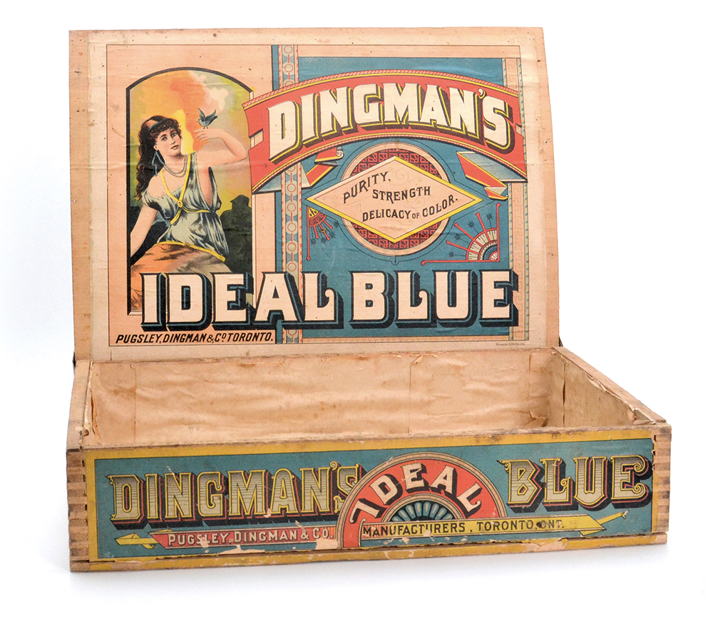
Dingman’s Ideal Blue soapbox
Archibald Dingman (1850-1936) was the driving force behind Pugsley, Dingman & Company, formed in 1884 as a manufacturer of “electric soap, blackleads & blues.” In 1891-92, he built Dingman’s Hall (now the Broadview Hotel at Queen and Broadview) as Riverdale’s commercial and social focus. After his factory burned down in 1902, he moved west and drilled Alberta’s first commercial oilfield in 1914.
This box (circa 1910) was used within retail stores as a display for the soap bars. The lid would stay flipped open (as shown) to show off individual items. I have a real soft spot for the font used on the lid for both ‘Dingman’s’ and ‘Ideal Blue’. I love its boldness, the swirl in the L, and its subtle serifs. It such a good font that there are many similar versions in use today seen in logos and signage.
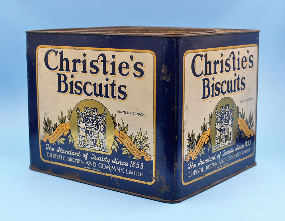
Christie’s Biscuits tin
The square tin states that the biscuits were Made in Canada / By Appointment to / Their Excellencies / the Governor-General / & Viscountess Willingdon. Freeman Freeman-Thomas, 1st Marquess of Willingdon, served in Canada from 1926-31, giving us an early date for this tin (the coat of arms is not his).
The tin is adorned with ‘gold’ and features typographic and hand-lettering in combination with illustrations. The most interesting ‘type-play’ is the orthographic ligature — the joining of the S and T letters in the word Christie’s. The ligature was first registered as a Canadian trademark in 1956, but was in use decades earlier.
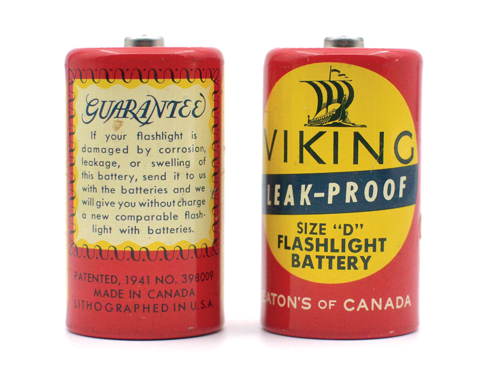
Eaton’s Viking batteries
The greatest influence in early Canadian package design history came from the Timothy Eaton Company. For much of the first half of the 20th century, Eaton’s products were muted and consistent, yet stylish and practical. The Viking battery, an artifact from the late 1940s, is one of the first Eaton’s products to project an individual personality.
Canadian design researcher and Emily Carr professor Bonne Zabolotney (who wrote an essay in the book on Eaton’s impact on Canadian package design) says the battery design uses “iconography and type to equate the exploratory and brave nature of Vikings with the emerging technologies that harnessed energy and power. Here the history of electricity and the 20th-century expansion of electric appliances are bonded with the persona of the brave and solitary Viking explorer.”
I particularly like the use of different weights of Futura throughout the product. It’s seen in the guarantee description (Futura Book), patent information (all-caps (Futura Book), the words “leak-proof” (Futura Condensed Bold), the words “size ‘D'” (Futura Medium), and the words “flashlight battery” (Futura Bold). The fact that the designer(s) could make the word “guarantee” look readable and attractive in an all-caps script font speaks to the high-quality of craftsmanship on display here.
I could go over literally every object in the book and fawn over the use of type. Instead, I’ll leave that up to you.