
By Daniel Rotsztain and Mark Sherman
With the recent Supreme Court ruling upholding Ford’s slashing of council from 47 to 25 wards, and the upcoming update to Toronto’s Official Plan, we think it’s the ideal time for Toronto to reassert its independence in the only way it seems we constitutionally can: a new logo.
Well … an old logo.
The pre-amalgamation Metro Toronto logo is a ribbon of interwoven lines, loosely overlapping to create six evenly sized and spaced loops. Each loop represents the independent cities that made up the Metropolitan Toronto regional government: Scarborough, Etobicoke, Toronto, North York, York, and the Borough of East York. The logo is gracefully balanced, suggesting that each of its constituent parts rely on each other and are greater together.
The Metro Toronto logo is one example of a peak of Canadian design culture, when the Centennial and Expo 67 urged designers to imagine the future. The results were elegant geometries expressing aspirations of transparency, efficiency, and interconnectedness.
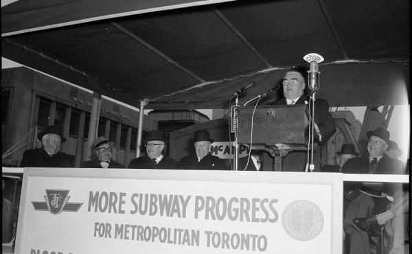
The Municipality of Metropolitan Toronto was a fourth level of government between municipal and provincial, dealing with regional issues, like arterial roads, sewage and water facilities, the TTC, parks, and housing. For all its success and efficiency as a model of regional governance that maintained effective local representation, amalgamation was forced onto Metro in 1998 by then-Premier Mike Harris. Despite a local referendum rejecting amalgamation, the controversial restructuring dissolved the region’s formerly independent cities into the megacity we know today.
While the megacity contains the constituent parts that made up Metro Toronto, the entries in a competition to determine Toronto’s new logo all contained variations on the same theme: New City Hall, stylized into a lopsided “T”, with the word Toronto slapped on the bottom in chunky letters.
No shade to New City Hall. The swooping curves of Viljo Revel’s modernist masterpiece launched Toronto firmly into the 20th century, its spaceship-inspired council chambers still inspiring awe despite being dwarfed by 21st-century glass towers.
But New City Hall has no place as Toronto’s logo. What should be a unifying symbol, emblematic of our aspiration for a municipal government that represents all corners of the city — from Etobicoke Creek to the Rouge River and both sides of the 401 — is instead inward looking and bureaucratic, an embarrassingly myopic view of the supremacy of the central old City of Toronto above all else. City Hall is not the heart of Toronto. The heart of Toronto is its residents, and representing them should form the basis of our city’s symbol.
The good news is: we do not need a new logo, or to hire design consultants or hold a public competition — we already have a great one. The Metro logo elegantly and effectively represents all six corners of this place and its people. The Metro logo reminds our government of its ultimate aspiration: to be a voice of all Torontonians.
The brilliance of Drake’s nickname “the 6ix” highlighting Metro Toronto’s six formerly independent cities is its invitation for anyone who lives in the city, no matter where, to participate in its identity. No wonder the moniker was adopted so quickly.
Ford’s 2018 slashing of Toronto City Council to 25 seats was a kind of Amalgamation 2.0, further watering down local representation. We have an opportunity to take the high road with our response, reasserting our aspirations for effective local representation and reminding the province that the government represents its people, not just itself.
As Toronto prepares for an update to its Official Plan, it’s the perfect time to update its image.
Reintroducing the Metro logo would be efficient and quickly adopted, as it’s already all over the city. Any infrastructure built before 1998 dons the symbol: bridges that cross the city’s ravines, pavement poured throughout its streets — even crosswalk call buttons — still wear the Metro logo with pride.
Reinstating the Metro logo would ground the city in its past, while symbolizing our commitment to create an inclusive Toronto for everybody.
Do you agree that Toronto should re-instate the Metro Logo? Sign and share the petition!

4 comments
The (old) new logo shows the path taken by City Hall when dealing with any matter!
Flip the old logo on its horizontal axis to get rid of the “6 question marks” look.
Colour each symbol for diversity.
https://fark-usrimg-850.nyc3.digitaloceanspaces.com/a/ay/fark_ayk8kCw7GrKjVP881S86LMKMw-M.jpg?AWSAccessKeyId=HBAYEKZHGUB4NAYQBVSQ&Expires=1633924800&Signature=h64qeASzr6JE7YOdhXq8bY3zVno%3D
I can’t see any value to this, considering all the costs associated with new stationery, signage, etc. There are other things we need to be spending money on, like affordable housing, for one thing.
The new logo is much more elegant than the old one. However, it’s pretty clear that it hasn’t been adopted by Torontonians as their symbol and that is a major flaw.