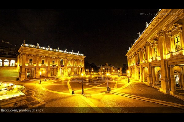
What makes a place like the Campidoglio in Rome, pictured above, inviting and memorable? While elegant Renaissance buildings and a design by Michelangelo certainly help, two basic elements are critical to this famous public space: scale and enclosure. It is small enough that from any point in the square people can recognize and connect with other people on the other side of the square, creating a social atmosphere. This social space is bounded, contained, by its surrounding buildings. Great urban space is three dimensional: vertical edges define and contain the spaces.
Many urbanists – including Prince Charles, Jan Gehl, Camillo Sitte and Christopher Alexander – think enclosure is fundamental to making outdoor places comfortable and welcoming. In cities, the right amount of enclosure is key to making people feel secure. Psychologically, edges provide a sense of protection: a wall or fence creates a barrier between you and other people. Leaning or sitting against a wall, your back is no longer exposed. Instead of worrying about who’s behind you, you’re free to observe and interact. Indoor spaces also benefit from edges. In living rooms, furniture is generally lined up along walls. When you sit down there’s an edge at your back. People at parties form small circles, often at the edges of rooms. Not too many people stand in the middle of these circles, with their backs to other people. Not only is that anti-social, being in the middle makes most people uncomfortable.
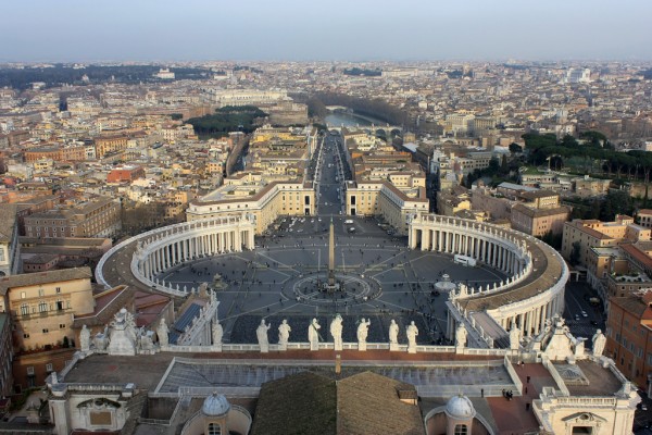
The same basic principles – edges and proper scale – that makes living rooms comfortable and social also apply to outdoor space. Three dimensional space has to first be created by vertical edges. These can be walls, the edges of buildings, pillars or a line of trees. These edges are so important that some structures exist solely to create large outdoor spaces. A famous examples is St. Peter’s Square in Rome. The Vatican and St. Peter’s Basilica form one side, while a colonnade – a long row of pillars – was constructed specifically to enclose the Square.
St. Peter’s Square is a huge space that can hold tens of thousands of people. Most urban places this large, no matter how beautiful or well designed, would feel desolate. There simply wouldn’t be enough people. As a major tourist attraction and pilgrimage site, St. Peter’s Square is a rare example of a massive public space that feels busy. The much smaller Campidoglio, perhaps thirty metres across, needs a much smaller number of people to stay lively. Lively places attract more people, while empty places repel people.
The first rule of good public space is to make it the right size. This generally means creating small public spaces, which can stay lively with small numbers of people. Most public spaces – even very good spaces – don’t have the draw of St. Peter’s Square. The second rule of public space is to enclose it with edges. Not necessarily on all four sides, but enough to define a three dimensional space. One of the great arts in placemaking is finding a balance between enclosure and permeability. Neither St. Peter’s Square nor the Campidoglio are completely enclosed, but the human brain fills in the gaps.
The Campidoglio and St. Peter’s Square are both masterpieces: many design elements contribute to their success, but proper scale and enclosure are at the core of these great places. Thinking about scale and enclosure helps us understand why some public spaces work and others fail. Large spaces can feel lonely and empty. Tiny spaces can feel cramped and confining. Too little enclosure feels desolate and discomforting. Too much enclosure severs space from its surroundings. Two common mistakes plague modern cities: spaces that are too large and too open.
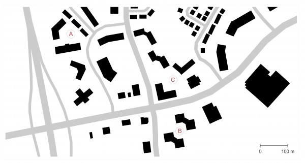
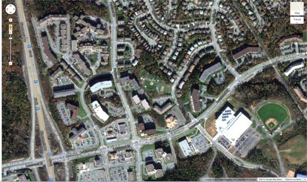
Clayton Park West has both problems. Instead of enclosed places, the area around Lacewood Drive is simply made of leftover spaces. Very large leftover spaces. The picture below shows part of Clayton Park West, with building footprints in black and roads in grey. Most of the buildings are aligned loosely with the roads, but they aren’t placed to create urban spaces. Buildings partially enclose a handful of spaces (labelled A, B and C), but the spaces are too big – between fifty and eighty meters across – to stay busy and inviting. A Pattern Language suggests most public spaces should be smaller than 18 metres across, and no bigger than 20 metres across.

A lot of the space is parking. A lot of space is filled with small patches of forest. Some of the space is just formless and empty: lawns; walkways and driveways.
Some of the lawns are likely ‘amenity’ spaces, outdoor spaces for multi-unit buildings that are required by the zoning by-law. The idea is great, to provide residents with some shared outdoor space in-lieu of having a private yard. The problem is that many spaces are too big and too exposed. They lack enclosure and are poorly scaled. Public areas that lack enclosure are generally avoided. In too many new developments the public realm is simply whatever slivers and blobs of space are left over after streets and buildings are built.
Creating places where people feel welcome and comfortable is important for communities of all types and sizes. Although great examples often come from great world cities, placemaking should be a priority everywhere. The simple idea of creating enclosed spaces, that are the right size, is applicable in cities, towns and villages. There’s lots of details to a great place, but the basics – enclosed spaces – have to be in place from the start. Buildings are the main things that encloses space. Since buildings are really expensive to build, and very permanent, putting buildings in the right spots is key. Trees can also be used to frame and enclose spaces, but they take decades to reach the proper size; mature trees are valuable and worth designing around.
The message is simple: enclosure and proper scale are necessities for good public places. They should be in a design from the start.


