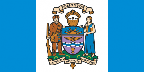
A group of local creatives (progress unlimited, Foolscap Studio, Drawing Room, MADE, Spacing Edmonton, and 1650 collective) have collaborated with Aurora Flags on a citywide design challenge to express the diverse stories of our City through flags. The idea stems from the Designing Downtown Pecha Kucha Night 17 (Oct. 5, 2013) presentation by Roman Mars, host and producer of 99% Invisible. With the soft launch of Colour Your Flag, we would like to share with our readers and potential entrants some historical context to municipal flags in Canada.
It should come as no surprise that many people may not be aware that the City of Edmonton has a flag. This may be in part due to the relatively young history of city flags in Canada in comparison to our American counterparts. The only Canadian city flags that predate the 1960s belong to Ottawa (defunct 1901), Montreal (1939) and Saskatoon (1952). This quickly changed with the adoption of the Canadian maple leaf flag in 1965 and subsequent reactionary flags by several provinces during that decade. Since then, over four fifths of municipal flags in Canada have been created after the 1980s for external events, anniversaries or special celebrations. Despite this short past, Canadian city flag design has largely been informed by traditions in civic heraldry dating back from the mid-19th century.
- heraldry (noun): the system by which coats of arms and other armorial bearings are devised, described, and regulated.
Unlike American cities, most Canadian cities have assumed a coat of arms that may have been granted by an English or Canadian authority. And since heraldic designs have traditionally been transferred to flags, that is what most municipalities ended up doing when the opportunity came. A look at the old national flag and many provincial or territorial flags reveal that they, too, incorporated elements of their respective coat of arms into the flag design. This historical trend may have set precedence for the City of Edmonton when the recently late Artist and Professor Norman Yates (known for his mural at the University of Alberta) crafted the original 1966 flag.
You will notice that several changes have been made to the flag over time, which had caused some contention for the original flag designer:
“When preparing to donate a signed copy of the flag for a local fundraiser in 1986, Professor Yates went to City Hall to get one, and found that it significantly different than his 1966 original. The city had no official records to indicate how or why the design had changed but suggested the original design was forgotten over time and that when the flag was ordered again in the 1970s, it took on a design including the original arms. In a hearing in 1987 to determine the flag’s fate, the city decided on a more updated version of the city arms suggested by the city’s visual identity committee. After the hearing, a disappointed Yates commented that the new Athena resembled a “modern-day Bo-Peep”. He added that the new flag was a bad decision and placing the name of the city on the flag seemed provincial; he felt his original flag was truer to good flag design.”
– Canadian City Flags, North American Vexillological Association (NAVA)
But what qualifies as good flag design? The worst ranking flags of the 2001 NAVA state/provincial flag survey are, like Edmonton’s, those bearing detailed seals or coat of arms which make them difficult to distinguish from one another. The emergence of graphic design in flag making provides opportunity to promote good flag design principles as defined by NAVA. This new trend has seen variable levels of success to better reflect identity (Canada flag 1965) or city mergers (Toronto flag 1999). How can we bring meaningful symbolism to our citizens? Perhaps, as we discuss #yegflag, would it be possible to combine certain elements of the two practices?


