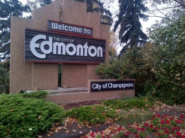
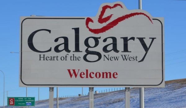
Fueled by a manic combination of civic pride and shame, Edmonton Council is reopening discussions on the look of the city’s entrance signs. Although the sign and slogan may be underwhelming, I believe that they are arguably better than Calgary’s pixelated hat slapped on a highway sign. But that’s not really the point: frankly, I think the entrance signs should not be the focus of this debate.
For anybody driving into Edmonton, the time spent looking at the city entrance signs would be at most two seconds. The approximate time spent looking at the roadscape along Gateway Boulevard, on the other hand, is 25 minutes. And what a depressing drive that is. Notable features include awful landscaping, South Edmonton Common, cheesy decorative poles, and a proliferation of junky billboards and portable signs. There is a glimpse of urban vibrancy once you stop at Whyte Avenue. But that sanity lasts briefly only to be confronted after by a car dealership, an underutilized End of Steel Park (with no adjacent sidewalks to boot!), and fast traffic roads that would deter most pedestrians.
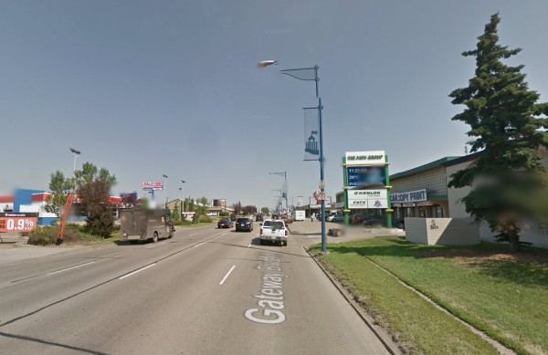
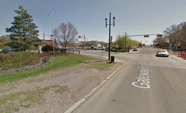
Surely, if we wanted to instill a good first impression of Edmonton for visitors and residents in hopes that they will stay or come back, would we not be better off focusing on improving the streetscape of Gateway Boulevard rather than a solitary landmark?
Alternative scenario
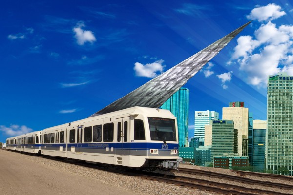
Thankfully, the trip heading downtown is not so bad for those taking transit from the airport. Considering the Albertan habit of annexing lands, the entrance sign would need to be highly mobile to reflect constant boundary changes. Perhaps we could attach Gene Dub’s proposed entrance pyramid to the LRT once it reaches Edmonton International?
