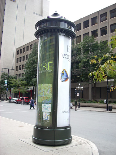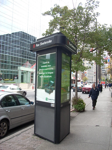
Most people will say that the idea of an 11.25-metre tall billboard sitting on a sidewalk is offensive to them. But the seeming lack of general opposition to the Astral Media “Street columns” and “MegaColumns” makes me wonder if people are becoming apathetic or just unaware of street advertising.
People in Montreal are faced with other forms of advertising more blatant or tiresome. Ad trucks seem more ridiculous. Bus shelter ads get a ton of your attention when you’re waiting ten minutes for your ride. In comparison, these columns can seem restrained, with a borough map on one side (taking up one third of the old columns, half of the new “megas”).
At the same time, the amount that cover the city is surprisingly large. According to the Astral Media website, there are more than 235 Street Columns (introduced in 1993) and 24 MegaColumns (of a 2005 vintage) across Montreal. While the former rose to a more human scale of 4.7 metres, the new ones top out at 11.25 metres. These new ones are only found in the downtown core, and have a design that (to quote the website) says “modern elegance”. Truth be told, though the maps are handy at times, the columns are just one more piece of unneccessary street furniture. They block sidewalk flow and the 24-hour backlighting is a waste of energy. That said, is it fair to say that people have accepted them? Is it their stylish design or are people just not paying attention? Much more of a fuss has been raised over ads on garbage bins in Toronto.
The question to ask then is this: is it worth fighting against street ads? Cities love them as it’s easy money in their pocket. It could be argued (though I would disagree) that it’s no different from store displays on the same street that cry for your attention and money. Citizens should keep watch though. Every time you think they’ve run out of surfaces to place ads…


6 comments
To understand why there hasn’t been a public backlash against these things, I think you have to consider the possibility that many people actually like them. They are somewhat elegant and they strike a decent balance between private interests (the ads) and the public interest (the maps). The reality is that, without the advertising, there probably wouldn’t be any maps whatsoever. At least these columns are fairly restrained.
(I think the argument against wasting energy is an empty one, too — even if you had ad-less maps, they’d still have to be backlit.)
Although I do agree with most criticism of ad creep, I also find that it ignores the feelings of many people towards commercial advertising on public space, which is that they are willing to tolerate a certain amount of it as long as it works well within its environment. There’s a reason that Times Square is a tourist attraction, after all.
If you look back at the cityscape of 50, 60 or 70 years ago, you’ll find that advertising was a lot more ubiquitous and a lot more insidious than it is today. Billboards and wall ads covered the blank surfaces of just about every building; and every streetcar, delivery truck and newspaper kiosk was plastered with ads. If you were to take a long-term view of the whole issue — I mean truly long term, not just within our lifetimes — you’d probably find that the amount of advertising in Montreal’s public spaces is a lot less now than it was a century ago.
Hopefully this won’t earn me the scorn of all my fellow Spacing contributors, but I think that opponents of ad creep take too much of an absolutist position against advertising. In a perfect world these columns would have maps and art, not maps and advertising. The Métrovision screens in the metro would show news clips and short films, not news clips and car ads. But we have to make some compromises.
In the case of street furniture, there’s a line that needs to be drawn between what’s reasonable and what’s unreasonable. These columns, I think, are perfectly reasonable. Those billboard trash cans that were recently removed in Toronto, the ones that were obnoxiously designed and totally dysfunctional, were unreasonble.
Some advertising should be tolerated. There’s no point in fighting everything — save the real fight for the truly egregious invasions of advertising in the public realm, like when entire metro stations are branded, or when large chunks of public parks are handed over to private promotional events, or when the latest TVA reality show is advertised on your metro pass.
I posted about these on the Spacing Toronto Wire on a past visit to Montreal.
http://spacing.ca/wire/?p=1104
I think that, in addition to the fact that they look reasonably nice, what makes them more acceptable than the Toronto ad pillars/maps is that the maps are actually useful – they are customized for the exact location and orientation of the pillar. People are more accepting if they can see the pillars have genuine usefulness (as opposed to Toronto, where the generic maps were obviously just a cover for advertising). Also, the big ones seem mostly placed on wide sidewalks where they don’t really interfere with people walking, which means they’re easier to ignore.
When I lived in Warsaw in the mid-1990s, large pillars (kiosks?, about 2-3m dia.) were on most major corners which provided a place for postering. Mainly I remember the monthly Opera and Symphony schedules taking a central place in addition to movie posters and other theatre and music events. Toward the end of the period new pillars were being installed with ads on one side and announce posters on the other. They weren’t lit; streetlighting was enough to make them clear at night.
I agree with Chris (though I couldn’t care less what’s advertised on my bus pass). They’re elegant, they’re functional (both as maps and as signposts for landmarks), and the advertising is not terribly intrusive. So long as they have maps to help tourists, I’m willing to deal with the advertising.
I have to say that I don’t find these so bad. About 15 years ago there was an “intervention” art project that included works in things like this and bus shelters and it was kind of neat and they do have the maps and street names on them. There is much, much more offensive forms of advertising around the city.
The columns are nicely designed and the maps are useful.
But the argument against them comes down to whether you believe the city should be providing space for advertising to exist on the streets. Is there not already enough infrastructure from the private sector to provide all the advertising space needed? If you’re okay with all that, you have to ask if you believe you’re getting good value in return for your eyeballs?
You also have to consider if the City sought any public input into type of street furniture, placement, accessibility, pedestrian issues, sensibilities to local aesthetics, etc. Cities rarely take these steps.
I believe those maps are NOT so financially cumbersome that a city cannot afford to purchase them. And that the outdoor ad industry can be in complete control of the design and functionality. These decisions have a large impact on the streetscape and the public, until very recently, have had little say in the process.
And lastly, are you comfortable with a private companies provide public services?
I’m totally comfortably with ads in our culture. I’m just disappointed in how poorly our local governments engage the public in the discussion how to shape and build our streetscapes.