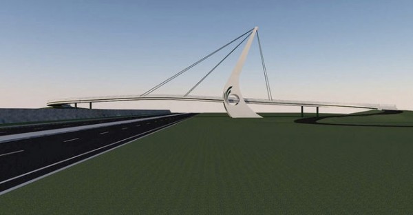
As the arguably least impressive portion of Ottawa’s ceremonial route – which rushes dignitaries from the airport to their various destinations downtown, via the Airport Parkway, Bronson Avenue, and the much more picturesque Colonel By Drive – the stretch of road that runs behind South Keys plaza was in definite need of a little attention. As the first impression of both our city and the capital of our country, this unceremonious section of Ottawa had largely been overlooked as the entryway into both our neighbourhoods and nation. So when it was decided that a pedestrian bridge was needed to link people to the transit hub at South Keys, it must have been seen as a golden opportunity to build a landmark ‘gateway’ into the city – a chance to both welcome and impress with Ottawa’s own triumphal arch of sorts.
But the Airport Parkway pedestrian bridge has been nothing but a headache for the city ever since. With the project now on hold after continuous construction delays, due to concerns over the quality of the concrete and most recently, the firing of the design firm due to structural insufficiencies, the bridge seems cursed and the people are angry. It has become a game of wait-and-see, as residents wait patiently to hear how much more it will cost and what can be done to save the project from becoming a post-historic concrete ruin, before it even had a chance to be a bridge.
Yet perhaps there is a silver lining to this storm cloud of a construction project. For while the tower portion of the current design looks like a poor Calatrava knock-off, I must give the city credit for at least trying to have a design that could almost be called, dare I say it, interesting. But the blatant attempt at branding, by carving the city’s ‘O’ logo into the side of its form work, is just plain awful. A logo, which belongs more to the 90s than a built piece of infrastructure and architecture, has no place being included in the design of a bridge, which would, in any other case, be assumed to have a longer life expectancy than a brand logo. Can we not have visitors and residents alike know that they are in the right city by getting a glimps of a beautiful bridge, rather than a giant ‘O’, complete with peacock tail? Good design alone should be enough to create an appropriate and impressive gateway into Ottawa, which is a beautiful and elegant city to begin with.
So perhaps, now is the time to literally go back to the drawing board and design a bridge that is both structurally sound, as well as a little more tasteful… or at the very least, figure out a way to fill in those two giant holes.
Ottawa already has many beautiful bridges – why can’t we get this one right too?
Image: Ottawa Citizen


3 comments
I have friends and relatives in that neighbourhood. Their concerns are more concrete, if you’ll pardon the pun: they simply want the bridge built so that they can do more of their shopping and cinema-watching without having to use their car.
Agreed. The emphasis on pedestrian infrastructure is often on architecture at the expense of practicality and access. Here in Toronto, the much delayed recently completed City Place bridge looks nice, but takes twice as long to cross because of the lengthy sideways ramps needed to access it. Most people would use direct stairs if they had also been provided but this was never an option as the discussion particularly in the media, was about the architectural statement. The proposed winding Fort York bridge, delayed due to cost overruns is more of the same.
In defence of the author, she notes how questionable architectural flourishes complicated the design. While not stated explicitly, this would likely increase costs and lead to delays.
Did you ever consider that the ramps were put in place to make the bridge accessible to people with disabilities?