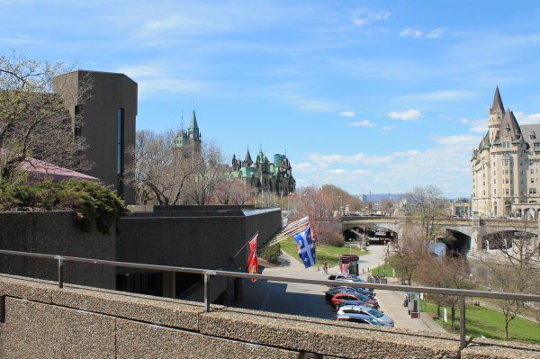
The grand upper level terrace overlooking the canal is the strongest clue to the building’s original intention to be a key piece in the master plan to create a civic centre for the city centred off the canal rather than the more ceremonial Elgin Street or tranport-focused Mackenzie King Bridge. Unfortunately the rest of the plan was never implemented leaving the NAC as the only one facing the wrong way. The driveway and parking space also kills the intention of the building’s continuity with the surrounding landscape. I’ve argued that much of the NAC troubles could have been resolved with thoughtful landscape redesign.
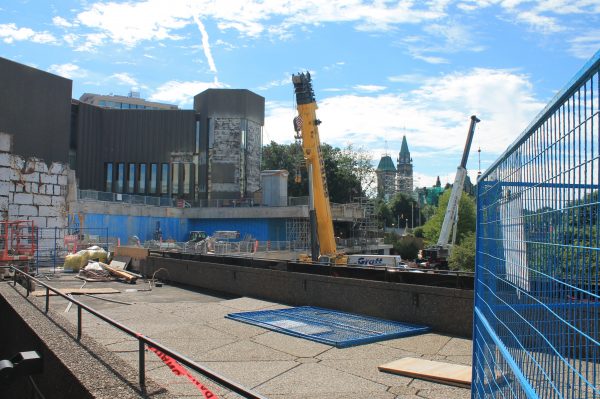
The grand upper terrace was probably the most used of the rooftop landscape. It was a popular event space with tents set up through most of the summer. It appears most of the landing has been cut back to be replaced with interior glazed space. Though the tower gains an extra story in height by dropping the floor by one level, it seems lost without the exaggerated horizontal of the cantilevered terrace.
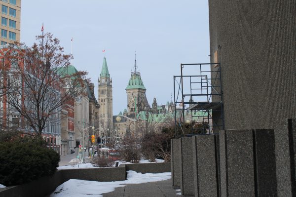
The roof terrace over the fourth stage area along Elgin street probably had the city’s best view of Parliament. The labyrinthine meandering around the rooftop landscape, suddenly opens around a turn to reveal this sightline that suits to Neogothic buildings far better than a Neoclassical axial view (eg. the Capital from the Mall in Washington).
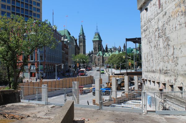
It is not clear how much of this view will be preserved after the renovations. But at best it appears it will become a dead-end, rather than a point along the path.
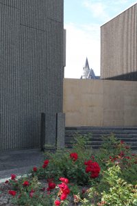
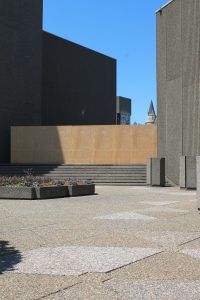
The construction hoarding makes me wonder about what will happen to some of the other spectacular views the building framed.
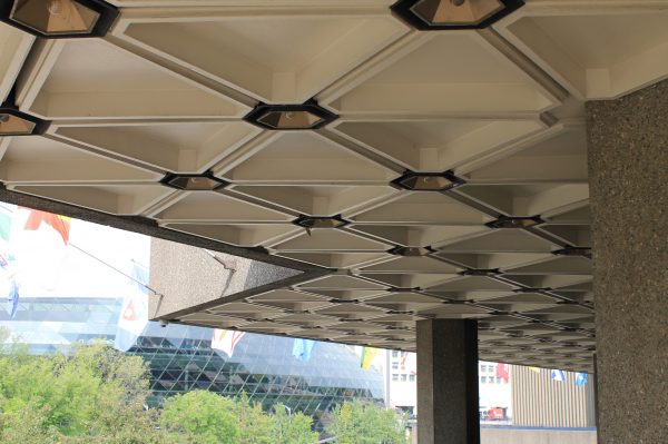
Concrete lovers will probably agree one of the most beautiful expressions of concrete construction is the waffle slab. The NAC has a gorgeous hexagonal grid that seems flawless. The exterior grid when reflected through the windows maps perfectly onto the interior ceiling and aligns with the concrete floor slabs outside and stunning terrazzo floor grid inside. By contrast, there are some pretty sloppy moments in the grid of the glass curtain wall of the Shaw Centre across the canal that drive me a little crazy.
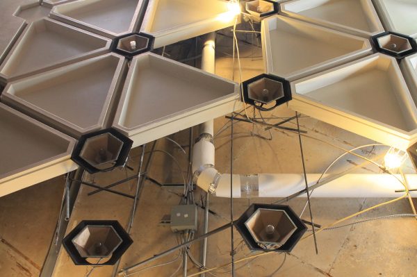
OK, so they were not a “pure waffle slab”. I guess I always knew it but I did not want to peek behind the curtain. They are precast panels for a suspended ceiling that hides the electrical, etc. rather than poured-in-place concrete that form the structural integrity of the slab while minimizing the amount of material required. I will place this is the same category as Mies’ I-beams and the somewhat contradictory statement of revealing the construction by faking it as an aesthetic add-on. But the idea of being able to “read” the logic and structure of the building still stands.
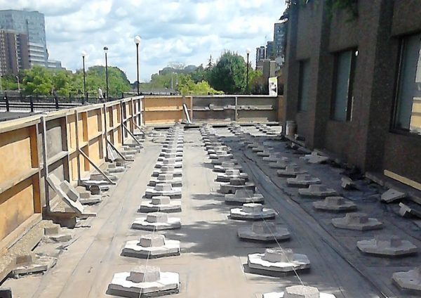
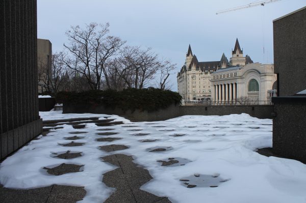
The same is true of the iconic triangular floor tiles. I got a peak at the substructure last year when they were doing some renovation on the pathway that has become the re-routed main entrance during construction. Here, drainage and waterproofing means the tiles are lifted up off the roof by these spacers. The cool thing is you can see the thermal transfer through snow patterns in the winter.
—
Photos by Sarah Gelbard

3 comments
So much we’re going to be required to miss…
Or maybe we can embrace the fact that much of the building will be left intact, and the new addition will greatly benefit accessibility, and has been very thoughtfully designed by a great architecture firm.
Heritage aside, it looks like a perfectly fine design that should address some of the issues with the existing building including accessibility. That doesn’t mean it is the only possible solution to those problems. I’m not against renovating the NAC but I think it would have been possible while remaining sensitive to the spirit of the original design and greater effort into preserving the defining characteristics of the building. My problem with the renovation is that few people would consider it an appropriate treatment for a designated building of say, Victorian heritage — especially not for a building of this scale or importance. The new design significantly alters the appearance and experience of the building.