 For the second time, The Pugly Awards let you give the thumbs up, or thumbs down, to Toronto buildings completed in the last year.
The Pugly Awards were established to raise the level of architectural and planning standards with the goal of giving Toronto a more beautiful face.
The Puglys are different. They are awards that are judged, not by architects, developers, planners and the like, but by the public…people like you, who want to make our city more beautiful.
Nominations for the 2006 Pugly Awards include all commercial, institutional and residential buildings that are greater than 50,000 sq ft completed / registered in 2005. The Pugly Awards will be presented to the creators (architects, planners, developers) of the good, the bad and the downright ugly buildings in the former City of Toronto.
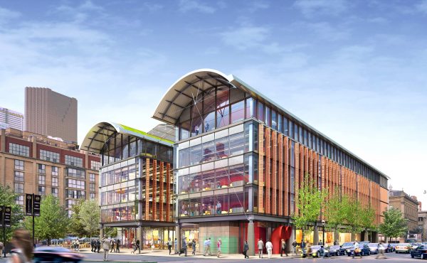
The awards will be given out on June 6th at the Gladstone, so vote now. Last year some horrible buildings, like the French Quarter below (a building so awful it doesn’t even fit on the lot it’s built on), got “thumbed up”. This year there are some very good buildings to vote on, so perhaps the results will skew in favour of the Radio City’s, 18 Yorkville’s and U of T’sCentre for Cellular and Biomolecular Research (the building with trees growing inside on the upper floors).


13 comments
I’m a Torontonian in the midst of a one year stint in Shanghai. Going back to view the Pugly selections after having been here for over 9 months, I was stuck by how bland and homogenous Toronto architecture is. Granted, a lot of them were just condos, but I was struck how they were all just boxes. Square or rectangular boxes of glass or brick. Not very inspiring. It seems everything is being done to maximize square footage, thus the box. While Shanghai has its fair share of ugly buildings, there is at least a great deal of variety. Even your standard verticle rectangle condo tower will at least have an interesting roof. The office buildings are simply fantastic, with all sorts of unusual shapes and profiles. At least the institutional buildings in Toronto are starting to get interesting. But we still have a ways to go.
The folks at the Toront Urban Forum have some problems with the selection and even the correctness of the photographs used on the Pugly site:
http://p083.ezboard.com/ftorontoskyscraperforumfrm3.showMessage?topicID=1581.topic
I need to submit an application even to do nothing other than *view* posts on that forum? What-effing-ever. Learn how the web works, people.
What’s so bad about the French Quarter I? Yes, it’s pseudo-French design, but it’s a relatively small building and still pleasing to the eye. (Pugly voters wouldn’t have chosen it otherwise). Just go a few doors down Lombard and you’ll find plenty of examples of uninspired and ugly buildings.
Stand across the street, at the Gas Station — French Quarter doesn’t fit the site, the corner nearly hangs over the intersection….the size may be right for the area…but it’s some kind of horrible Soviet building that was gussied up after the fall.
The French Quarter the kind of fake applique-historical shit that Toronto condo buyers love. Of course the same people who buy all those awful condominiums would vote for it!
Jeez, it’s across the street from a Salvation Army hostel, kitty-corner to the Fred Victor housing, on the same street as the former morgue – now a women’s shelter. It’s not a gas station, just a small eleven-story residential building, but it’s a BIG improvement to the area.
Why focus on this long-neglected corner anyway? Pick on the Pantages hotel/condo, the monstrosity going up at College Park or those REALLY UGLY condos at Bay and Elm (just to name a few).
Why is RoCP (Residence on College Park) a monstrosity?
You gotta be joking. The size, the design – all those tiny little units sitting smack up to the former McLean-Hunter building. It’s just the latest addition to the ugly wind-tunnel Bay Street’s become.
I live in Spain and from what I know of Toronto buildings, they are great compared with ones here in the costa!
I can only agree with Ron, in my opinion there is nothing wrong with French Quarter. But the condos on Bay and Elm are really ugly, although, the clear winner should be the Radio City. I consider the really design disturbing.
I like the French Quarter! I think it has an interesting look to it and helps to spruce up the area.
I don’t think the French Quarter is all that bad either. I think it’s actually a nice building to look at when driving along Richmond from the DVP. It definitely helped spruce up the neighbourhood!