

The Toronto Community Foundation announced this morning, “significant new funding, achieving a major milestone in its “Arts On Track†initiative to renovate Museum, Osgoode and St. Patrick subway stations.”
Christopher Hume does not seem all that impressed with the Opera House.
Countdown lights are being considered at intersections in Toronto.
And Olivia Chow introduced a bill to put sidegaurds on trucks to help reduce the chance of a cyclist being sucked under these large vehicles.
18 comments
Maybe the TTC could concentrate on maintaining the stations it has instead of putting in fancy new art schemes that it will just neglect and let rot.
To be fair, the TCF is one getting the money together for this project. The TTC is just “benefitting” from it.
But that being said, the stations need to be maintained to a much higher level of quality. So many needs for the TTC, and so little cash to distribute through the system.
The TCF will raise the money for the renovations, and five years after the renovations are installed they’ll be dirty, neglected, and in need of repairs.
I wish it weren’t so easy to be cynical about the TTC, but the TTC can’t even do simple things like replace ceiling panels when they’re done with repairs, yet we’re supposed to welcome all these donations that will be wasted?
The TTC just has no taste.
I am still waiting for a reasonable explanation on why cheesy new stations are needed when, as thickslab and Matthew rightly state, maintenance is a priority. Has anybody noticed how the powerwash given to the walls in Osgoode Station has gone a long way to sprucing it up? Now if they just polish the floors once the construction is done, it’ll be perfectly acceptable to receive the Opera crowd.
Likewise, Museum is bright and fine. I shudder to think of some stupid mummies wrapped around the pillars…
After spending some time down in NYC’s system (complete with rats the size of cats and ultra-thin platforms) I came back with a renewed respect for Toronto’s metro.
I agree with Thickslab > The TTC just has no taste.
And I wonder why sometimes. Its probably becuz it is run by engineers. I think Pitfield was right when she said the TTC needs to be thought of like a business. The need a good marketing department, dedicated station maintenance crews, and a bunch of power-washers.
If anyone wants a good example of how the TTC has no taste, take a look at St. George station: a hodgepodge of signage that’s impossible for people unfamiliar with the station to follow. Dirty walls, decrepit tiles, and signage with five — count ’em, FIVE — different typefaces. That’s not counting the hand-written scribbled signs that one sees all over the TTC, or the service change notices taped (!) to the walls with packing tape.
I could go on and on. There are so many things, from the big to the small. The TTC is ugly, and it doesn’t need to be. It doesn’t cost a fortune to make sure signage is consistent and that stations are cleaned properly.
The TTC needs someone who has experience in both graphic design and interior design to work full time, and to function as the person who *must* approve all renovations and signage.
Re: power washing, I remember reading a report on the TTC site a few years ago that was in response to a request from some councillors to clean the dirty concrete walls at Yorkdale and Lawrence West stations. In response, the staff stated that stations are power washed twice a year. Somehow I doubt from my experiences in riding the TTC over many years that’s ever been true.
Oh, and Matthew, when you write this:
Its probably becuz it is run by engineers.
You’re 100% completely right. I don’t think there’s anyone who works for the TTC who understands, much less cares about, how the system looks.
I usually think of Christopher Hume as a moody misanthrope but his analysis of the Opera House is bang on. The Richmond and York street sides were probably crying out for the most visual stimulus, but instead they have been given the dumpster and loading dock treatment.
Unlike Hume, though, I think that ‘functional’ architecture can be done well, as long as we remain true to our pedestrian roots. For example, the workers’ cottages of Corktown and the laneway housing on Croft street possess very simple, functional architecture but they are so intimately scaled and meant for a walking public that they can’t help but be charming. After 1950, however, ‘functionalism’ became just a different way of saying ‘we’re making a concession to the automobile’. Too many buildings in our downtown core meet the street with a gaping garage door, or a loading area for easy truck access, or have paved over the small front lawns of turn-of-the-century houses to permit private parking. This is the sort of ‘functionalism’ that ruins the aesthetics of great cities and, in this respect, Toronto scores lower than a lot of so-called auto-metropoli like Los Angeles.
I once heard that the green yellow signs at St. George were a trial run for a more visually friendly sign system in the TTC, complete with icons for each station, etc. Apparently there was no money to continue it but they left St. George in prototype mode anyway, thus contributing to the jumble. It sure wouldn’t take much to spruce the whole system up though, especially considering that the TTC already has a kick-ass font that is easy to read and aesthetically pleasing.
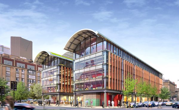
I also believe that Christopher Hulme is dead on. We have been waiting for this building forever and although I have no doubt that the structure is fantastically functional it hardly lifts the heart to the sky – unlike the ballet school building on Jarvis which is fabulous and a joy to behold. The earlier dream was shattered and budgets and bureocracy are responsible for the rest. I think we should have adapted Union Station. Well not really but it must be said that there is an imposing building that deserves a break !
Bob: The green and yellow signs were indeed a test of a more visually friendly sign system. The TTC spent more than $300,000 to get a professional with a great deal of experience in designing wayfinding systems to create the new system, then promptly ignored every single one of his recommendations.
TTC Font is criminally underused on the system these days (even though it screams TTC and is easily recognizable to anyone who has spent even a week in T.O.).
I’m not sold on the designs for the stations and feel they may only add to the clutter of our system (especially the hodge podge plans for Museum which I think is embarassing). The current Museum station may be slightly bland, but it’s clean, functional and one of the best examples of the Bloor-Danforth era stations (despite being on the YUS).
The power-washed Osgoode looks great. Just power-washing the whole system would do far more than these renovations.
I would have to agree that it makes more sense to maintain what they have instead of spending so much on beautification. Some money in that area does makes sense, this sounds crazy.
Paul
These subway designs are conventional and utterly boring! Why do we Torontonians keep putting up with mediocre design?!! Why shouldn’t we have at least a few metro stations that rival those of Paris, Madrid, Montreal, Stockholm, Prague, London and Moscow? These cities are famous for the beautiful architecture and public art in their subway systems. Toronto needs to get over is self esteem issues. We deserve the best and we simply should not accept anything that is sub standard.
The TTC is constantly trying to attract more passengers. How long will it take them to come to their senses and realize what any successful business person knows: that you attract customers with an appealing product. This often means extra effort and higher costs for the metro operators but it pays off when a metro is much more than just a means of transport but something that residents can be proud of and tourists seek to discover. This is what all the cities with great subway systems already know. What the TTC desperately needs is a top business executive with an international outlook who will transform the system from its current desperate state into a into an internationally lauded system.
To see some pictures of beautiful subway systems around the world, see here:
http://www.mic-ro.com/metro/metroart.html#Toronto
Good lord, if we’re going to spend money redesigning these three subway stations, I sincerely hope that we are going to aim higher than the designs that were submitted last year.
These stations should be mind-blowing and amazing. I hope we don’t end up with a third-rate makeover. We have so much mediocrity in the city already. What we currently have is incredibly depressing, but the silly, uninspiring designs that were submitted are really depressing too.
If we’re going to go to the expense and effort of revitalizing these stations, please let’s do it right for once.
Found this while googling “TTC dirty walls”
Most Subway stations I have seenare a DISGRACE!, but I don’t think anyone at TTC is listening.
I wrote a year ago about York Mills station, for an example (..been filthy for years, especially north end of platform..as if someone paint-balled it )…nothing has changed (but I haven’t been there for a few months so who knows..).
To me CLEANLINESS of the system is of utmost importance…It instills a sense of pride in your City.
I can understand how a worker, strugling to pay his mortgage, feels his salary is more important. But I feel the common good of the city, and the well-being of millions of pasengers, is MORE important.
I wouldn’t cost much to clean the walls and floors OFTEN, not once or twice a decade.