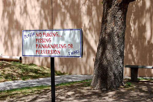
ALBUQUERQUE, NEW MEXICO — The title of this post is from a sign I found along the main drag of Albuquerque yesterday. I wanted to use “I guess I took a wrong turn at Albuquerque”, an oft-used quote by Bugs Bunny that I loved in my youth. Albuquerque is so random and in the middle of nowhere that I was always interested to find out more about the city. Yesterday I got up close with Albuquerque’s downtown.
I only spent a few hours in Albuquerque so my observations are quick reactions mostly centred around the city’s core. I was surprised to find that I quite liked the urban design and streetscaping. The following are a series of photos with a tiny bit of commentary. You can see all photos on Spacing’s Flickr account.
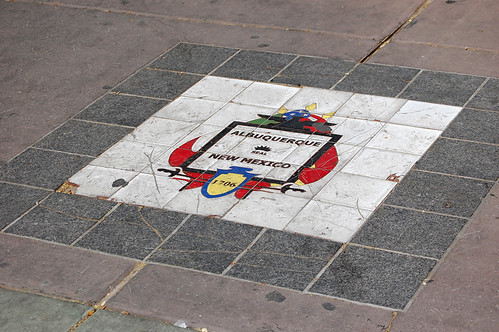
Albuquerque has done a nice job of making its downtown core unique. There is nothing outstanding; no Gehry building or truly iconic skyscrapers. But I found that its use of colours and shapes left a lasting impression on me. One of the interesting bits of details was the use of tiles on sidewalks. There were numerous designs — the one above is simple and elegant.
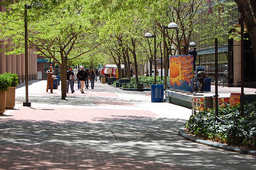
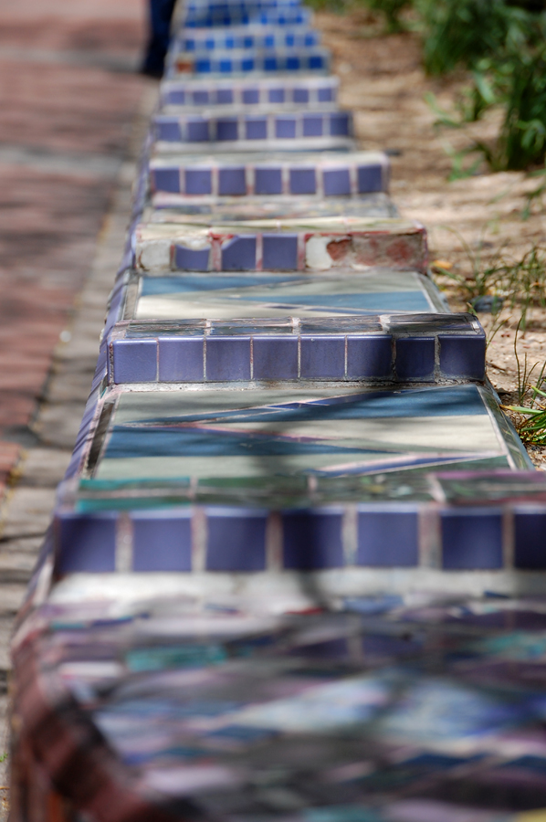
There is a pedestrian mall, known as the Crossroads, that is about 200 metres long and leads to the city’s civic square. Office buildings and a few restaurants occupy either side, while street vendors hawk their goods. A decent tree canopy shades the mall while small garden beds add another layer of greenery. The garden beds have some nice designs worked into them (see below, including three photos stitched together).

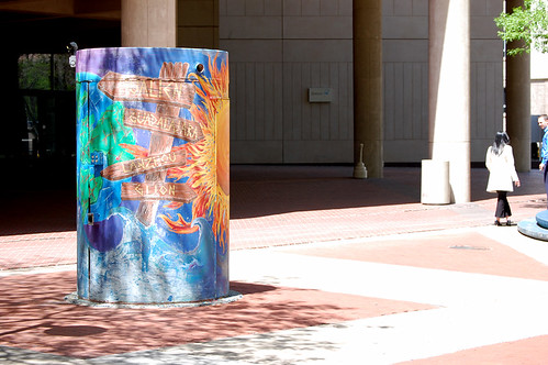
I have no idea what this thing is (above), but I like that instead of leaving it as a grey, metallic eyesore, they gave it some colour. I suspect it used to be a public washroom.
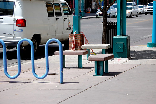
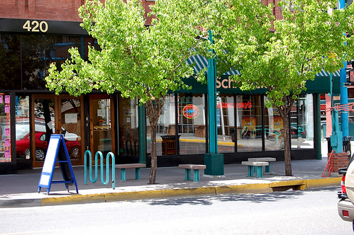
The sun was intense (for me) and I got to use these nice benches conveniently located under a set of trees. The benches appeared at almost every intersection.
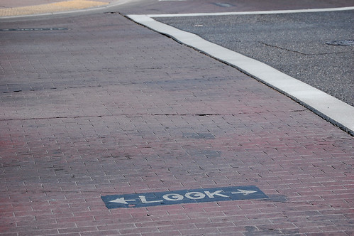
I liked the use of cobble-stones to indicate a crosswalk, not to mention the PSA embedded into the road.
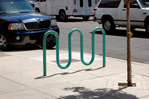
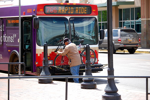
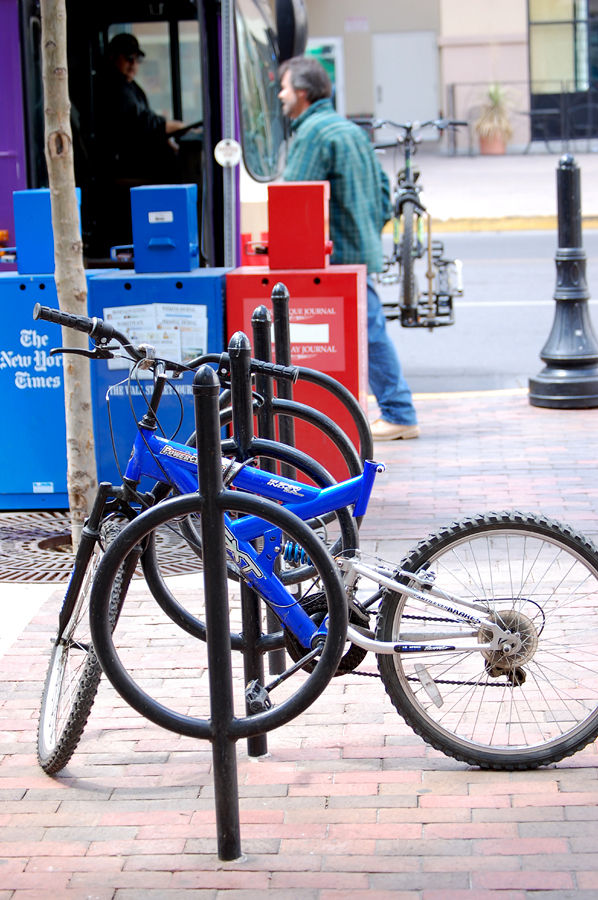
There were numerous bike lanes leading into downtown Albuquerque and there seems to be a bit of bike culture in the city. This is a common bike rack found throughout many US and Canadian cities. The buses have bike racks on the front (below), just like Toronto, while they also seem to like our ever-popular ring-and-post design (two photos below).
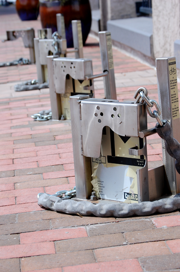
I also found these unique bike locks (below) in Albuquerque’s main train and transit hub. I don’t know how they work since I couldn’t find a bike locked up to one, but they are certainly intriguing .
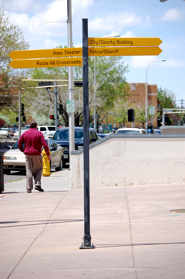
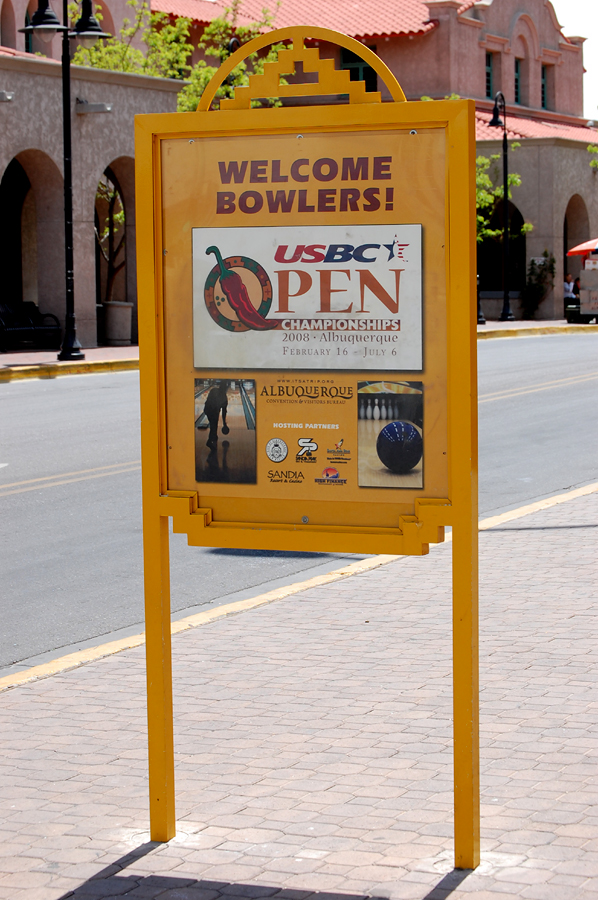
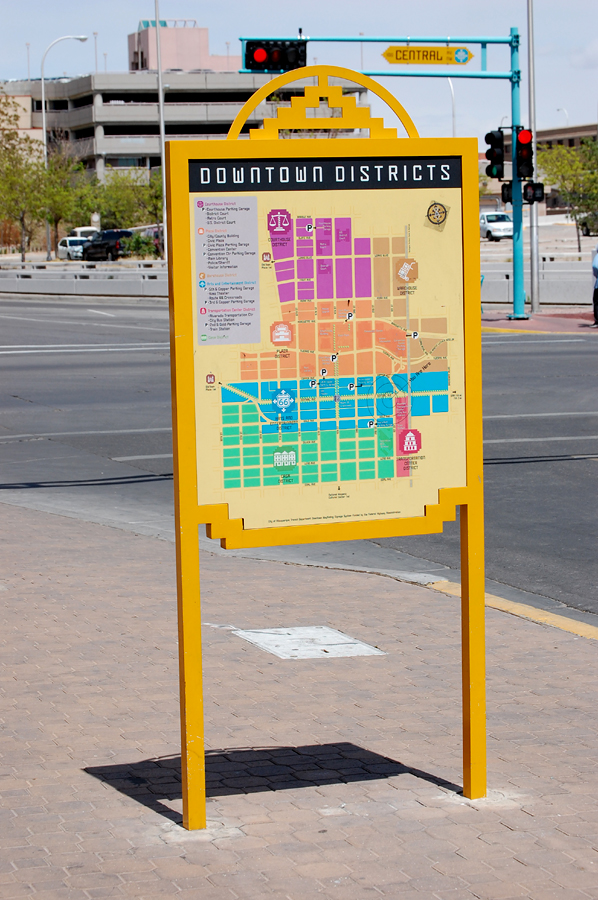
The city also uses pedestrian-oriented wayfinding signs. This is something I’ve long encouraged Toronto’s urban design department to consider. Below are info/map pillars. One side does have an ad on it, but it was one of only two pieces of street furniture with any form of commercial material.
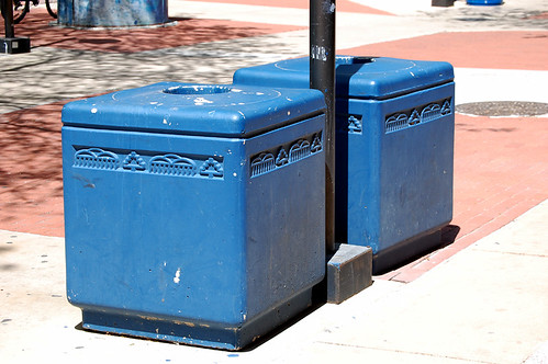
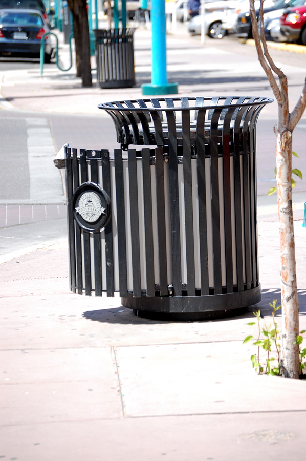
Trash bins that are sturdy, recognizable, and functional. Amazing! (For non-Toronto residents, our trash bins are horrible and will continue to be for the next 20 years, it seems.)
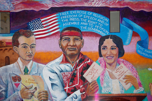
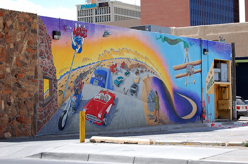
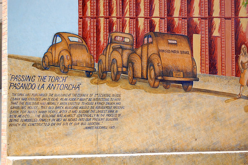
They also really like their large-scale murals. Each one shown was the height of the building’s main floor.
TOMORROW: “Denver’s 16th Street Mall”
all photos by Matthew Blackett
BACKGROUND ON MY TRIP:
My trip is a “driveaway†for a vacationing snowbird — I’m driving his car back home in exchange for paying my plane fare and gas expenses (read my first post for more info on what a driveaway is). It was arranged by my friend David Smaller and his little organization called Hit The Road. You can join the Facebook group to receive notices of upcoming driveaway opportunities.

6 comments
We have seen the enemy, and it is Jokerman.
*shudders*
What does the above comment even mean?
Jokerman typeface of the sign.
uh, I hate that font.
The downtown seems to be well equipped for both cyclists and pedestrians but your photos show few of either. Was this how it actually was there or was it a bit more vibrant than your photos suggest?
Oh, the font! Yes, it’s awful and illegible from a distance. It was one of the things I meant to discuss but it skipped my mind in my hotel room.
You were wondering about that one mysterious bike lock? I was just barely able to make out the name in the pic which showed “CRANKC” and what looked like the start of an “A”, and made a guess that it was called “CrankCase”. Turned out to be a good guess; check this out: http://www.bikeparking.com/crankcasesecurityrack/index.html
It’s… different. 🙂 Not cheap from what I can gather, either, but not horribly expensive (compared to some bikes, anyway).