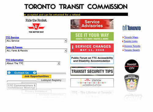
A year and a half ago, Spacing teamed up with Reading Toronto, BlogTO and Torontoist to gather ideas from our readers on how the TTC could improve its web site. Our efforts resulted in the TTC soliciting a much more robust Request For Proposal (RFP) that addressed a number of our concerns. This online discussion became a focal point at the inaugural Transit Camp in the spring of 2007, and continued to be a hot topic at the recent Metronauts conference (Transit Camp’s latest incarnation).
On Thursday, the media will get a sneak peak at the TTC’s new beta web site. Staff has been playing their cards close to their chest so we have no idea what to expect. A report from Spacing will follow on Friday.

12 comments
Your screenshot looks just different enough from how ttc.ca looks in my browser that I thought it was the sneak preview of the new site! That led to a split second of sheer horror.
Matt, I had the same reaction. Scary stuff…
Now lets make the City of Toronto website better too.
I’m so excited for this! It can’t possibly be any worse than it is now, so no matter what they did it will be an improvement.
I really, really hope for easier ways to look up how to get from A to B, but even if it was just less ugly it would be an awesome first step.
Design-wise, there is no possible way of being worse than the old site. I just hope they test it on a range of browsers.
I’m going to let Joe Clark tell me what to think about it 🙂
I just hope that whatever is presented, the design (not just the contents) will be up on a regular basis.
It might edify if commenters could sign off with examples of existing transit websites they like…
http://ratp.fr/
http://www.tfl.gov.uk/
The beta website is up for public review. It looks pretty non flashy, but DO go through the new schedule pages. That’s probably the only significant improvement I’ve yet to find
http://www.beta.ttc.ca
Well, I’m glum about it. The TTC should never have gotten into this business. They’re not a media company. They shouldn’t try to be. Rather, they should put the money into freeing the data.
Improve the underlying information infrastructure so that every last bit of useful data is published in a standards-compliant manner. Use whatever’s left over from the one-true-Web-site budget to launch a contest — or, hell, pay a few developers to come up with useful tools, if they really think noone would bite.
This Web site redesign short-term gain for long-term, well, nothing. Even our academic friends are now making this point. (Hey, Ed — Princeton! They’re legit! Now you can put it in your column!) Eventually the TTC will get it, too. In the meantime we have … well, a Web site redesign.
… and, in case it wasn’t obvious, please, let’s not start by making the City of Toronto Web site better. Let’s start by them getting their information out there. Um, let a thousand Web sites bloom?
Anyone know who did the redesign?