Will Alsop, the British architect who recently topped Fast Company magazine’s 10 most creative people in architecture, returns to Toronto to start his position as distinguished visiting practitioner at Ryerson University. He started it all off on Tuesday night, with a lecture to a full house of mostly students and faculty, about Preparing for Practice. While geared to those entering a career in architecture, there are things Toronto can learn, from this often controversial figure, about designing in this city of ours. He admits, during his first visit to Toronto, he “didn’t like it!” It felt like an unloved and uncherished city, but during the last ten years, it has changed for the better, a “sense it has woken up.”
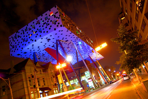
Although Alsop’s OCAD building is obviously a large statement in Toronto, he says, “it’s not always the big things you do in cities or towns, it’s also the small things that you have the influence on.” He urged students to have a healthy irreverence, question everything and “try to think what the opposite is of what you’re being told.” He lives by the words “individualism, diversity and naughtiness”, which are written on a bracelet around his wrist.
He believes the 80’s generation of architects are too conforming and are unfortunately in positions of power and unwilling to take risks, explaining that risk “is not about money, it’s allowing people to work, play and live in a different environment.” He uses words like curiosity, perseverance and humour as key elements in preparing for a career in architecture, but these ideas can be transferred to designers, planners and city builders currently in practice.
When asked about his future in Toronto, he mentions Keele and Finch, the two new subway stations he has been hired to design and says he hopes to “contribute to the city and other parts of Canada.” Whatever one might think of Alsop, personally or professionally, he might just be what Toronto needs to inspire its current and future designers.
Photo by John Vetterli


11 comments
I’d rather have architecture that conforms with the surroundings than have more whimsical cartoon kitsch like his OCAD building.
Conforming doesn’t mean bland, it’s often the subtle differences or bold interpretations on existing work that make a building interesting.
How do you conform in Toronto, Angus? If you can define that, you can define the Toronto Style, which nobody has been able to define until now: it’s a mix.
While the OCAD building certainly doesn’t “conform” to the style of the buildings that surround it (which are varied, anyway), it definetly does respect the character of the area.
OCAD or Alsop could have easily called for a clean slate demolition of the property. It would have been a lot easier design-wise, but also would have forced OCAD out of their facilities prematurely, contributed to several tons of landfill waste, and would have completely changed the existing streetscape.
Instead, Alsop addressed the design challenges of the existing site (with an ingenuity and cleverness architects too rarely exhibit!), allowed for the continuous use and retention of the older OCAD buildings, brought a new level of functionality to a previously over-worked, stressed location AND mantained the viewsheds and street-level experience of the area (while adding shocking pizzazz).
This (IMHO) is much more important than everything looking the same.
(Really, I’m just into effective and attractive adaptive reuse.)
How can you not respect OCAD for how bold it is in addressing site issues and making architecture work? What’s so admirable about Alsop is that he’s both a brilliant problem solver and capable of colourful and whimsical designs. With the exception perhaps of the pencil stilts, this is far from kitsch or starchitect pretension, it’s innovative and functional design.
But I do question this, to quote the article above:
He admits, during his first visit to Toronto, he “didn’t like it!†It felt like an unloved and uncherished city, but during the last ten years, it has changed for the better, a “sense it has woken up.â€Â
I think John Lyle or Peter Dickinson could have said the same thing. But perhaps Alsop was turned off by our often ugly streetscapes with the extremely dated overhead hydro wires and wooden poles blocking the view of the buildings lining the streets, commercial postering everywhere and lackluster street furniture.
Frankly, all architectural ego aside, I don’t even think Will Alsop would in his heart advocate a tyranny of “whimsical cartoon kitsch like his OCAD building”. All the less so if it’s lesser-gifted Alsop wannabes doing it…
I love this building. When I worked at City Hall and lived Queen West, I looked forward every single day to my walk past, the look up the street to see what it looked like given the particular sun/cloud combination of the day. One certainly wouldn’t want every building to be as whimsical, as it would kind of lose the significance. However, this is definitely a feather in Toronto’s often dull architectural hat!
Interesting thing: seeing the OCAD box as a banner image on another site, I momentarily mistook it for the now-gone Eric Arthur frontage added to the CNE Coliseum in the early 60s. (The pixillated-pattern thing, I suppose.)
I’m trying to restrain my frustration here. I’m a fourth year art student at OCAD, and to me, Will Alsop’s addition has made the school much worse, and is a terrible example of the direction architecture should take in Toronto. It pains me to see people defend its whimsical design without understanding just how impractical, symbolically divisive, and ugly the building is. Do we really want to design buildings for spectators rather than for the people they’re supposedly meant for?
What you may not know is that the “art” and “design” streams that make up the A and D of OCAD are kept literally divided. The design stream is is in the upper tabletop section, and is separated by two stories of air from the art stream in the building below. To this point, art and design students are never encouraged to interact, and since the construction of the building there’s been a growing animosity between the two streams. Funding seems to be going mainly to the design stream. The Sharp Centre for Design even looks like it’s sexually violating the building below.
The windows don’t open, and the floors are cracking. Ventilation is terrible. If there was ever a fire, there are only two exits, one of which is always locked. The walls inside are barren, they get dirty easily. The fancy blinds in the windows are always getting stuck. We’re seriously lacking in student space and the Sharp Centre offers virtually nothing in that regard. The school almost shut down our bronze foundry because of lack of funding. Ceramics is already dead in the water.
Sure, it’s whimsical and sure it’s bold and sure it jazzes up the streetscape. People on the street take photos of it all the time, I see them outside next to Butterfield Park taking the exact same photo over and over again. Do a search for it on flickr, you’ll find endless similar photos. But notice how none of those photos show the inside.
I’d be embarrassed to see more Will Alsop buildings in Toronto. It shows off exactly what’s wrong with this city: we love the idea of having a glossy and idiosyncratic image, even if it means marginalizing the desires of people like the students and artists. What a shame.
@SamPelletier “Do a search for it on flickr, you’ll find endless similar photos. But notice how none of those photos show the inside.”
How about taking some? If there’s a story to be shown, then show it!
I’d defend the inside of the box by saying an art or design school needs and empty box to work in – clean slates. Anything “designy” would be be destroyed quickly. People need blank walls to put stuff up on. I work up in the tabletop often enough, and don’t share Sam’s opinion of it.