
Although subway stations may not be seen as tourist attractions just yet, this may start to change. All over the world, transportation nodes are holding their own in the design and architecture industry, and soon Toronto will have six new stations by world-renowned architects Will Alsop and Norman Foster, which will hopefully compete. (Stay tuned for Spacing Radio’s interview with Alsop in January!)
Recently a number of creatively designed subway stations have come across our desks as Spacing, so to get inspired for Toronto’s new TTC lines and stations, we thought we’d share some of them with you!
In Los Angeles this fall, Lumenscape, a public art installation, was launched at the Wilshire and Western Metro Purple Line Station, serving as a bright gateway between the station and Solair, the mixed-use condominium building above. Designed by Rob Ley, of Urbana, and in collaboration with Lendrum Fine Art, the piece creates an “undulating environment of shifting coloured light.”

Often known as the ‘world’s longest art gallery’, the Stockholm subway system contains artwork by almost 140 artists. Many of the stations show the rock from which they are carved, like the one above, designed by Per Olof Ultvedt in 1975.
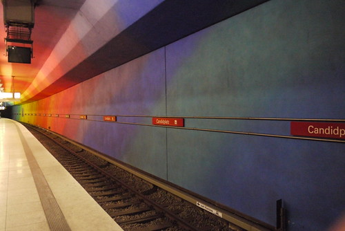
With the benefit of learning from others mistakes, Munich’s U-bahn system contains 98 stations, most of which started out quite plain, but have grown increasingly daring over the years. The colourful Candidplatz station was designed by the architectural firm Egon Konrad in 1997 and begins with violets at the norther end, turning to red, yellow, green and ending with dark blue to the south.

Norman Foster’s design for the Bilbao Metro system is unique in that it was designed as a whole. The stations use the full height and width of the tunnels, creating open comfortable spaces. At street level, the unique curved glass entrances, or ‘Fosteritos’, draw the crowds down to the trains.
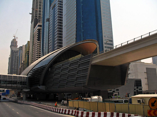
In Dubai, the world’s newest subway system was designed by Aedas and is fully automated. While the final rail network will contain 47 stations, the first completed section is the red line, which includes ten stations. As with many of the buildings in Dubai, these curved-roof transportation hubs have pushed architecture into a new direction.
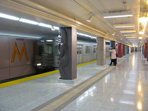
On home turf, the remodeling of Toronto’s Museum Station, by Diamond+Schmitt, has made it distinctive from the usually mundane TTC buildings. Iconic symbols of totem poles and Egyptian sarcophaguses provide clues to Royal Ontario Museum, which lies above at street level. The architects also worked with the TTC on lighting, wayfinding and furniture within the station.
Photos by Urbana, Milton Correa, Mike Knell, Foster+Partners, Paolo Rosa, and Wylie Poon

7 comments
I guess when you wrote: “Recently a number of creatively designed subway stations have come across our desks at Spacing,” what you really meant was that you read the following designboom.com article and decided to selectively plagiarize it.
Really, at least the person who brought this topic up on Urban Toronto two days ago had the good sense to explicitly credit the original article.
Original article: http://www.designboom.com/weblog/cat/9/view/8346/subway-architecture.html
Urban Toronto:
http://www.urbantoronto.ca/showthread.php?t=10692&page=6
Most of the Spadina line from 1978 was learning from past mistakes of building bland stations. They did and Eglinton West looks more attractive than that Bilbao station pictured. Yorkdale could hold its own with the best in world when the futuristic Erickson station had Michael Hayden’s neon art:
http://transit.toronto.on.ca/images/spare-0008-06.jpg
In Canada we also Montreal’s superb system where every station is unique.
I think that subway stations are excellent public spaces to invest in architecture and design. The fact is that subways are vital urban infrastructure and stations are neighbourhood hubs. It’s a good idea to emphasize the importance of the infrastructure with the architecture. So many people use them that’s one of the best ways to bring good architecture to the masses and inspire interest in architecture and pride in a city.
>The architects also worked with the TTC on lighting, wayfinding and furniture within the station.<
…all evidence to the contrary.
Montreal’s system is uniquely wonderful, with the sheer variety of station designs and installed artworks.
Lots more here:
http://www.metrodemontreal.com/index-e.html
I loathe the new Museum station design. Everything about it seems so fake, plastic and kitschy. It just looks cheap and tacky and I’m embarrassed for Toronto every time I have to get off a train there.
I really like the wall of concrete ribbons at Wilson Station, and the signature tiles at Leslie station.
What really gets me about Museum Station is that it was only half done. Rise to the concourse level and it is the 1960s again. Regardless of whether one likes or doesn’t like the new Museum design (I’m slightly in the dislike column), it is insane that we commission half-renovations and call them whole.
Agreed with the comments on the Montreal Metro, there are some gorgeous stations in that system. My personal favourites (of the ones I’ve seen, I’ve probably only been through about half of the network) are the light and airy Outremont and Agrignon stations, as well as some of the warmer, brick stations, like Mont Royal and Bonaventure.