
I’ve yet to hear a glowing review of Toronto’s new street signs which have been slowly rolled out across the city since 2008. These new versions have been replacing all of the distinctive pre-amalgamation signs of North York, Etobicoke, Scarborough, East York, York and the old city of Toronto. The new signs are much better at displaying their moniker and the one-off design is much easier for the City to manage and afford. But the nostalgic side of me wishes this wasn’t so.
Since any battle to preserve the old street signs is a lost cause, I’ve tried to imagine a few ways to enhance the new designs. The top plate of the sign — one of three separate pieces that make up the modular design — is primarily used to display the City’s logo, a BIA logo or neighbourhood name. Its also the lone area of the sign where creativity can be applied.
The image at the top of this post, and the three designs below, use Toronto Archives’ photos captured along Bathurst Street. The top image is looking east from Bathurst along College Street (you can see the spire from a building at Spadina on the left side as well and the clock tower of the fire station in the middle). Using images from the city’s past can help highlight a neighbourhood’s historical significance or long forgotten past. The street signs around places like St. Lawrence Market, City Hall, the Financial District, or the Archives itself would be good candidates for this kind of treatment.
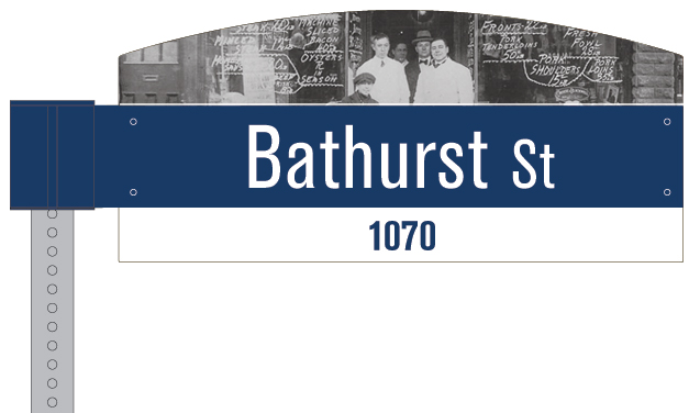
A family-owned meat shop in Kensington Market in the early 1900s.

A fruit and vegetable store in Kensington Market in the early 1970s.

Bathurst Station entrance and bus platform in the early 1970s.
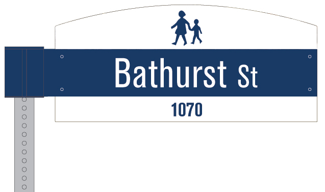
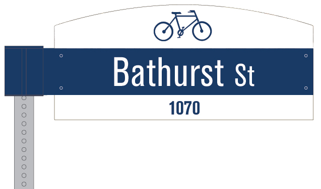
Another potential use is to display icons that help identify nearby use of the area such as a schoolyard (above) or a bike lane (below).
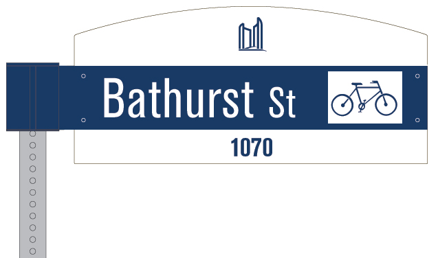
And another potential way to use the sign: add the bike lane icon to the end of the street name, which is exactly what Vancouver does.
Now, I throw it back at Spacing readers: what other ways can the City build on their current street sign design? What are other ways to use the top plate of the sign?


7 comments
I think keeping the neighbourhood name and traditional colours, with the bike lane symbol is the best idea.
Would like to see what the streets in Kensington Market, Yorkville, Forest Hill, etc. would look like.
Why the nostalgic picture? Why not just leave the old acorn style signs. That is nostalgia enough and it is real not a picture of what was that no one can see. The new signs look cheap already and lack character. The picture just makes it looks horrible and will fade over time.
Spend the money on better transit or bring back the acorn
I would leave the new street signs “as is.” They’re pretty straightforward and not very creative, but they are easy to read and basically get the job done. Rather than continue tinkering with the street signs, I agree with Chris re: spend the money on better transit (or public art and other more community-driven ways of expressing a neighbourhood’s past, present & future).
thanks for reigniting the debate, Matt.
I hate to say it, especially after all the money that has been spent, but I still think they should abandon these signs. The impulse is fine — rationalize the city’s signs, clarify the type, make a clear system for localization — but the design just doesn’t do those things. The type is too fussy and illegible, the (tripartite, banded) shape of the sign gets lost against disparate backgrounds, and the area available for “localization” is too small to deliver any clear message. (Maybe we just need to get all 70s and colour-code the neighbouthoods.)
I’m not one to get too nostalgic, but I would rather live with our current hodge-podge for a few more years than suffer the blandness and illegibility of the new signs for thirty. Let’s put a pin in them, and hire Erik Spiekermann or IDEO to do them properly.
would it even be possible for most people to make out the picture? i love the idea of including historic photography into the streetscape, its very creative and fun, but i dont think that is a good place for it, because it is small and up high.
i second the sentiment towards the old acorn signs. apparently they were too expensive to make though. so we are stuck with these ones for the next trillion years.
p.s- does anyone actually like the grey garbage bins? i think they are ugly and awkward. maybe lets cover those with pictures! that way the pictures could be quite large.
There’s some hope if you are looking to save your neighborhood acorn signs via local Ratepayers Associations. More info here:
http://www.facebook.com/pages/Toronto-Acorn-Signs/77355596501?ref=ts