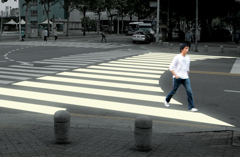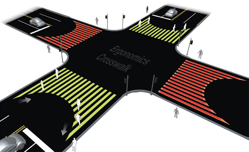
I recently came across an interesting proposal to improve the safety of pedestrians at busy intersections. Korean designer Jae Min Lim studied the routes pedestrians instinctively take while crossing the street. In most cases, people tended to walk outside the confines of the zebra-stripes as they approached the sidewalk.
Lim’s proposal — an idea that was short-listed in a recent Design Boom competition — is to round the edges of a crosswalk. In Toronto, this idea would be appropriate at intersections where right-turns on a red light are restricted or streets with heavy pedestrian traffic (but are not being considered for a scramble-intersection approach).
Considering that 47% of collisions between pedestrians and vehicles in Toronto happen at an intersection [PDF], experimenting with ideas like this to improve the safety of all road users may be worth exploring.


11 comments
I like the idea in theory, but was let down in the last image with the traffic line setbacks being so far. I’m not a driver– just a cyclist and pedestrian by choice, but I think the cars should stagger, the left lane having its normal threshold at the apex of the inverted U shape. Otherwise, you’re just making a bigger rectangle but demarcating a U shape.
Interesting, but the arc seems a bit naive – pedestrians (myself included) would still walk outside of the striped lines in order to take the direct line from one side of the street to the other.
I don’t get it. If you’re going to push the car-stop-line further back, why not fill the entire car-free area with zebra-stripes and let pedestrians cross how they’d like?
incredible idea – design outside of the rigid grid! design and unpredictability can be compatible
The traffic study is a very interesting and informative read. I’m glad to see that part of the blame is placed on the pedestrian and not just all on drivers. Of the 5 most frequent accident types, 3 of them can be attributed to the pedestrian.
Even though drivers have the ultimate responsibility to look out for all pedestrians (whether they are crossing the road legally or not), pedestrians still need to take responsibility for their safety, even when crossing a road legally.
When crossing an intersection, I always make sure to have eye contact with the driver making a right turn, so that I know that the driver is aware that I’m there. I’ve had too many close calls like that to risk crossing like that without making sure the driver is aware that i’m there.
I do believe that the crossing area at intersections should be made wider (but not necessarily as proposed above), to maintain a larger separation between stopped cars and people crossing the street.
Also, there should be better lighting at all intersections for night/inclement weather conditions.
But, also, pedestrians should always use the designated crossing areas and respect those areas, instead of making a crossing before the actual cross walk area. How hard is it to walk an extra meter or two, to be able to walk in the designated cross walk area?
brilliant.
I think what we really need in Toronto is an all-out ban on right-hand turns on reds. Too many drivers, especially outside of the core, come to a rolling stop when turning right on a red and don’t even look to their right for pedestrians; they’re looking left to check for oncoming traffic and will go if there are no cars coming. I’d be dead several times over if I asserted my right-of-way as a pedestrian in these situations.
It looks nice. But I agree with Josh. The curve seems to be just aesthetic. A nice aesthetic so maybe that’s good enough.
This is great! Close to my house is an intersection that needs pedestrian markings on the pavement that do not follow the traditional square box. I’m referring to where Bloor intersects with Walmer/Robert (Street View: http://goo.gl/GWfgH ). I wonder if a triangle-shaped pedestrian marking would work well, with the wide part of the triangle at the southwest corner and the narrower part at northwest corner.
I agree with Josh…
If you have to set back the cars to make your curve than all you’ve done is create a large area of wasted space. I suppose that area could act as a buffer zone between the car and the pedestrian. But only if you can keep pedestrians from using that empty space, which seems unlikely.
How silly. Pedestrians don’t walk in a U based on the paint on the sidewalk — they walk around the big bulky cars that are quite difficult to walk over. And no red turn on right is brilliant, thank God they kept it in Montreal.