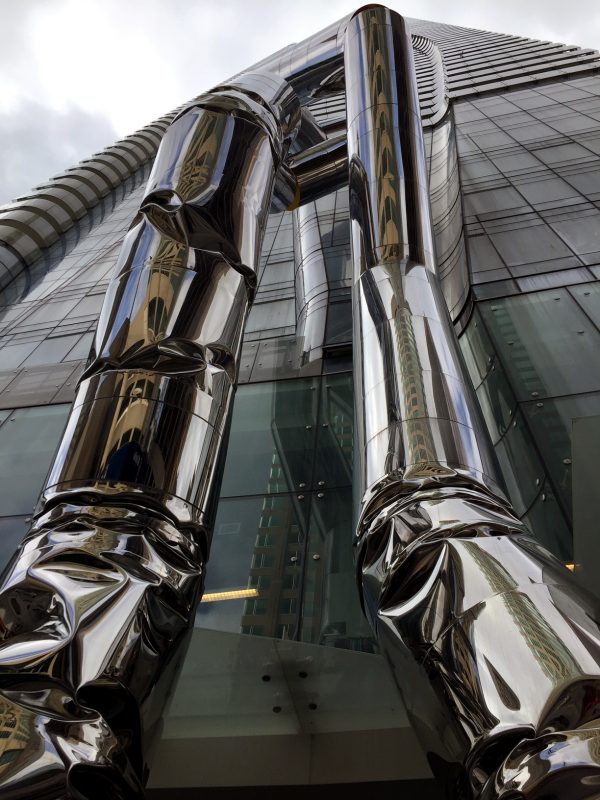
Outside of One Bloor East, two towering cylindrical figures slink around one another. The sculpture’s reflective steel encasement is contrasted with hints of red and orange that emerge at rupture points between the cylinders. The artwork, Safe Hands, is by Israeli-born artist Ron Arad and commissioned by Great Gulf, the developers of One Bloor East. With the sculpture reaching a height of 27 meters, it weighs in at over 32 tonnes.
Considering how big, shiny and central this sculpture is, it seems to have made very little impact on Toronto’s public consciousness. And I can understand why. When I saw the piece earlier this year, I had an initial reaction of strong dislike. To me, the work seemed cold and unresponsive. The tubular structure reminded me of indoor-plumbing, and the crushed steel made me feel as if the sculpture were apologizing for its own existence by unraveling towards the ground. My sentiments towards the artwork have now changed, but the question to ask of public art is not so much “do I like it?” but, rather, “what is it doing?”
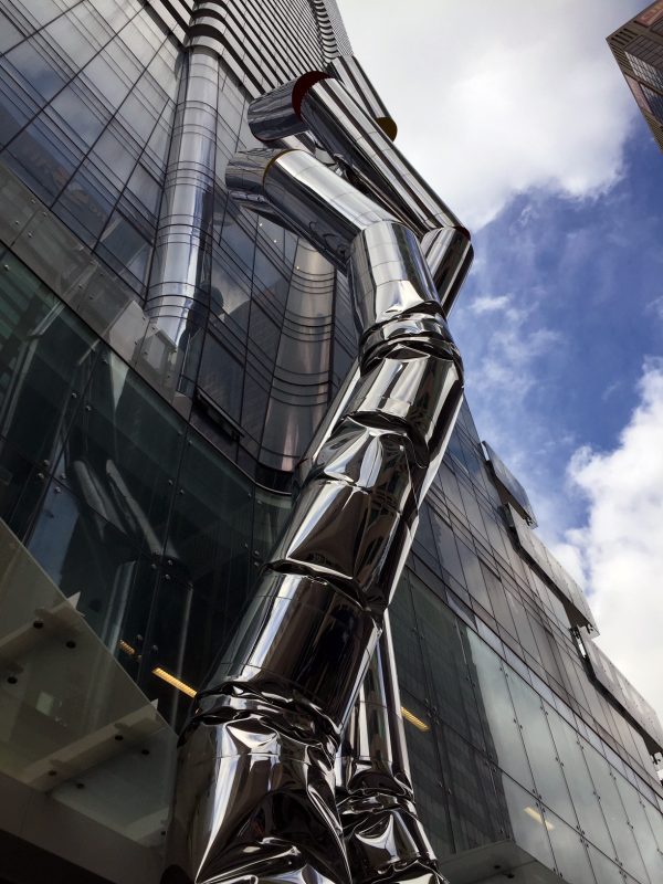
In a phone interview with Irene Szylinger, the public art consultant for Safe Hands, and Dragana Maznic, the design director at Great Gulf, both women were adamant about the weight and significance a public artwork would have in front of such a highly visible and much talked about development. “We were all aware that One Bloor was going to be the iconic project of Toronto,” said Maznic, a claim that could be contended. “It really required a piece that would merit that flagship project and the city. We were going to create a project that was unlike anything that had been presented to the city in terms of the creativity, impact, quality, and the experience [of] the residents”
Four artists were shortlisted for the public art project. The jury consisted of two representatives from Great Gulf and three external art experts.
Because of the wealth of factors to consider — from engineering, visibility and scale to the effects the piece would have on traffic — the jury reached an impasse when deciding between the last two candidates. It was at this point that Maznic suggested having the two artists introduced to the creative team of architects and designers — an extra step not usually taken in Percent for Public Art commissions. The jury hoped this meeting would enable the artists to gain an understanding of the creative vision for the development as a whole.
“We talked about the feeling we wanted it [the artwork] to exude,” said Szylinger. “You don’t tell the artist what to do, but you explain what you want the piece to mean and what you want it to stand for. At the time, One Bloor was going to be the tallest building in the heart of the city, so the artwork itself would have to be substantial and reflect the undulations of the architecture.” Once Ron Arad spoke with the creative team and came back with revisions to the work, it was evident to the jury that Safe Hands was the ideal structure for the space.
Both Szylinger and Maznic emphasized to Arad the importance of the Yonge and Bloor intersection and the gravitas of the project. “It was truly an ambition to enrich our city and to break the boundaries that were there before,” said Maznic, in reference to the artwork’s commission.
Stephen Richards, the work’s fabricator, was equally enthused about the piece’s realization. For him, the excitement arose from the project’s magnitude and the creative challenge posed by the artwork. In order to achieve the crushed steel effect that begins midway down the sculpture — an unprecedented feat for a structure of this size — Richards built his own hydraulic press, a machine that exerts a compressive force on materials. By creating this hydraulic press, Richards was able to articulate to the machine the exact form and shape the creases would take, creating a variation in the sculpture’s grooves and angles.
While Safe Hands has been up since February, the work’s unveiling took place on a beautiful Friday afternoon in early May. Politicians, journalists, artists and Great Gulf representatives were shuttled up to the penthouse suite of One Bloor. Madeline Zito, Great Gulf’s vice president of public relations, declared Ron Arad one of the greatest living designers of our time — a comment that made the artist chuckle. It was repeatedly emphasized that Toronto had now garnered the status of possessing a Ron Arad-designed artwork. Speakers at the event, like Deputy Mayor Michael Thompson and City Councillor Michael Layton, also made reference to the iconic status of the Yonge and Bloor intersection. Safe Hands was not only perceived as a reflection but also an affirmation of the locale’s seminal importance.
If one word were to describe this fanfare — from the work’s erection to the unveiling — it’s prestige. While the excitement surrounding the work has been earnest and sincere, it also felt rather ingratiating. The art’s importance lay not in the work itself but in its significations of grandeur and cachet. In a way, the dialogue surrounding the piece embodied some of the worst stereotypes of Toronto: self-conscious in its pretense and desperate for approval from some external source of authority.
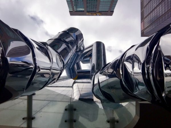
In a video shown at the unveiling, Arad declared that Safe Hands is a piece so large and so close in proximity to One Bloor that we have to reassure ourselves it will not topple over (in other words, we have to feel we are in “safe hands”). “The hardest part of this piece,” he said, “is knowing when to stop — to not make it too dangerous.” In reality of course, the sculpture is held up by a big steel column and filled with foam — incredibly safe and danger free. Yet with this explanation I came to realize that the perceived precariousness of the piece is undeniably its most interesting feature. With its slinky body and wrinkled legs, we get the sense that the sculpture is crumpling under its own momentous weight. It is this sense of precarity that gives the work its aura of playful, daring instability.
Ron Arad is indeed a multifaceted and innovative artist. He first gained recognition in the early 1980s for his Rover Chair, the base of which he acquired from a derelict British Rover Car 2000 in a junkyard. Arad has since gone on to design eclectic and incongruous pieces that range from sculptures to apartment buildings to sunglasses. In other interviews, Arad has emphasized his fascination with the potentiality that lies latent in substances of various kinds, remarking that there is “a kind of hybrid between the will of the designer and the will of the material.”
If there is one thing Arad dislikes, its being pinned down to a certain tradition or practice. Even when I tried to draw a connection between Safe Hands and some of his other public artworks — mentioning that the sense of movement evoked from Safe Hands is similar to some of his kinetic public artworks like Vortex or Spyre — he quickly dismissed the idea. “I don’t think there’s some sort of rule that public art has to move,” he said, equating the idea of a common thread in his artistic practice to a prescribed doctrine. This rejection of any kind of continuity or overall meaning in his body of work (whether or not it’s true) is what makes Arad interesting. Defiance, action, and curiosity are what drive his methodology, if he can be said to have one.
I’ve come to like Safe Hands because I recognize the enthusiasm and pride that people like Irene Szylinger and Dragana Maznic imbued into the art’s creation. I’ve come to like it because I appreciate the momentous work and ingenuity exerted by fabricator Stephen Richards. I’ve come to like it because I understand how it fits in with Arad’s larger oeuvre of loopy, daring, and at times cheeky artworks. The question is: should I have had to know all that backstory just in order to like this sculpture?
Considering the work’s looming and rigid presence, will others be able to appreciate the sculpture without knowing all this additional information? I’m not sure what the purpose of the artwork is, and I’m not sure what it’s trying to say: I don’t think anybody really knows. But I know that it’s there, it’s big, and, if anything, we could try to have a little fun with it.
Sarah Ratzlaff is Spacing’s public art columnist. Follow her on twitter @ratzlaff_sarah

5 comments
Great Gulf between Have & have-not,
enabled by ‘Political-Won’t’
Thx for this. Didnt know the background story. I like the piece. Think it works so well w its narrow street front footprint. Really one of the more successful public art works I’ve seen recently.
With most of Toronto’s Condo Art fabricated from metal tubes, sometimes stainless, sometimes powder coated, this object fits into the property management maintenance guide 101.
Of the broader public art movement, this falls safely into the digestible cookie category. Safe for teething children, void of any flavour, and easily packaged for shipping. With the cultural breadth of Toronto, alongside the economic strength of our developers, the city fails time and time again to be produce meaningful public art work. I can’t think of a more appropriate name than “Safe Hands” for an object as plain as this.
One of the most disappointing pieces of (public?) art I’ve seen anywhere in Canada. Of course they removed the parts that made it move–that would have made it too interesting and have cost too much to maintain. It’s difficult to render a piece of “public” art this ugly and meaningless but Great Gulf has managed the feat. Hopefully whatever gets installed across the street at The One will counterbalance the insipidness of this “safe” piece of “art.”
The only reason these buildings are allowed to be this tall is because the developers are required to contribute “public art” to the area. This piece of garbage by an Israeli artist does not support Canadian art or Toronto’s scenery. Instead we’ve paid an already rich artist for congestion. Thanks City Hall and Great Gulf for your garbage art.