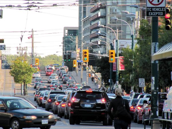
How does one know if the main street running through a neighbourhood, or on a route to work, is becoming more congested?
There is a steadily noisier drumbeat, brought to you by the political classes and the media and various astroturf organizations, that traffic is just getting worse and worse and worse. Even pop stars are complaining. Still, if your travel modes do include a car, there’s plenty of experiential evidence to be had. It just seems to take longer to get around.
As we all know, the chorus of explanations for said gridlock has also gotten steadily noisier: lane closures due to high-rise construction, lane closures due to roadwork, lane closures due to massive infrastructure projects. And, of course, bike lanes.
But there’s a weird empirical void at the centre of all of this shouting: it’s impossible for residents to know, precisely, if Street A has become more congested since last year, or five years ago. Consequently, we rely heavily on anecdote, personal encounters, and social media warfare: the pro-car crowd posts clips of empty bike lanes astride backed up streets, and the pro-bike faction posts clips depicting the opposite. None of it, however, amounts to hard evidence.
I’d argue this data gap has left Toronto that much more vulnerable to the Ford government’s (selective) attack on the city’s downtown cycling infrastructure in a way that recalls Rob Ford’s claims that the St. Clair West right-of-way will produce the traffic equivalent of quick-drying cement, thus eradicating all commercial life along the route (it didn’t).
It’s worth adding a few qualifiers to this notion of a data gap.
Traffic data does exist. The city’s transportation department collects reams of real time information on traffic volumes and operationalizes it to support the management of signalized intersections. The wrinkle is that the general public doesn’t have access to any of this material. Yes, there’s a ton of raw data that accumulates in the city’s open data library. But unless you have some serious coding and data visualization skills, none of it means much.
There’s definitely nothing on the city’s website that does for vehicle traffic volumes what the interactive heat maps published by the Toronto Police Service do with crime and 911 data, i.e., providing empirical snap shots of what’s happening in specific areas. “We don’t currently have a digital map showing travel times or traffic volumes,” a city spokesperson confirmed. “While we’re exploring which additional traffic datasets may be added to OpenData and building a Congestion Management dashboard to share additional traffic data publicly, we don’t currently have near-term plans for a map of the type you’re looking for.”
One could surely ask, why not?
The story is different for bikes. The city, to its great credit, has started to systematically collect — and make public — data on bike lane usage, some of it gathered from on-street counters. In the staff report that accompanied Mayor Olivia Chow’s response to Bill 212, various tables indicated how average daily cyclist volumes had changed before and after the introduction of segregated lanes at a range of points on both the Yonge and Bloor corridors.
Advocates and critics alike can make competing claims on social media or in council sessions, but hard data gives the public clear metrics on the usage and take-up of those lanes.
Again: why not cars? Or why not publish maps with even more integrated and location-specific data about through-put, i.e., real-time visualizations that show how many bodies — in cars and buses, as well as on bikes or other micro-mobility devices — move along a certain major street?
I don’t want to argue that we should be pitting vehicle through-put against cycling volumes. But easily accessible and up-to-date data on where vehicle congestion is happening and, even more relevantly, how it’s changing, would go some distance towards dissipating the political smog wafting out of Queen’s Park.
If we had that, we could ask whether traffic on Bloor or University is getting worse or better? Or how do bike-lane corridors compare to other arterials where the traffic snarls are caused by other factors — Gardiner construction, 401 on/off ramps, Ontario line work, lousy transit service, etc. Anything that peels away some of the subjectivity, and provides necessary context, would be welcome. This information shouldn’t just be the province of traffic engineers.
Indeed, the transportation department made a brief gesture in this direction not long ago by releasing a bit of travel time data to demonstrate that police and traffic agent measures to enforce the temporary Spadina bus corridor have yielded improvements. But the information came in the form of a press release, and seemed more like the exception than the rule.
It’s important, of course, to acknowledge that you can lead a mule to data but you can’t make it think. If the Tories have seized on the political dividend of cancelling bike lanes as a showy gesture to demonstrate that they’re acting on what is a region-wide congestion crisis, there’s little chance that hard evidence will turn their heads.
Still, we don’t live in a world of hard evidence about traffic congestion. We live in a world where the premier fantasizes about tunnels that should never be built and then identifies scapegoats, secure, perhaps, in the knowledge that voters don’t have the tools to dispassionately demonstrate both the vastness of the lie and the geography of the truth.
The City desperately needs a more empirical approach to managing congestion and optimizing through-put on busy corridors. But to get there, the mayor will have to pry all that data out of the hands of the transportation mandarins and let the rest of us have a look.


