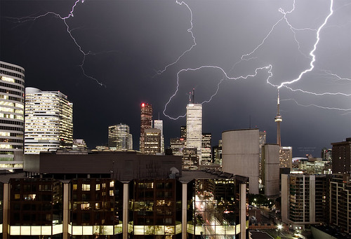
Sam Javanrouh, the world famous Toronto photoblogger and regular Spacing contributor, captured this amazing photo of the lightning storm we had the other night. You can see it bigger on his site or on Flickr.
Canadian Urbanism Uncovered
Read more articles by Matthew Blackett

Sam Javanrouh, the world famous Toronto photoblogger and regular Spacing contributor, captured this amazing photo of the lightning storm we had the other night. You can see it bigger on his site or on Flickr.
11 comments
While the lightning in this photo is fantastic, what caught my eye is at the bottom of the shot … the one floor of lit offices and the fact that the photo looks to be looking south from Bay & Elm, you can see a reflection up Bay street, and what may be the intersection of Bay & College. Very cool.
I think Sam may be incapable of taking a bad photograph. 🙂
Ditto, Joe. That reflection is teh awesomez.
Lightning is super hard to capture in a photograph so super kudos to the photographer.
Marvelous photograph.
Sam says the shutter was open for 10 seconds. He was lonly able to capture 10 photos with lightning out of 100 shots.
Poor CN Tower. Always taking the hit for us.
I like the way the CN Tower is in the photo, but isn’t prominent or the centre of attention — it more accurately represents to me how much space the CN Tower should take up in our minds. This photo points out to me that the CN Tower too often takes front and centre in photos of Toronto. I like the CN Tower, and can’t imagine Toronto without it, but occasionally it’s nice to see it put in its place. I made the photo my desktop.
It’s too bad about the Atrium on Bay in front — though it does provide a good reflection — what a hidious building.Shiney poopatecture.
Whatever, Shawn. Don’t pretend like you don’t secretly love Red Lobster.
This picture is amazing, but what’s the subliminal writing over top of the Ogers Centre?
follow this link Liz.
I sent a copy to my brother out west – his response was that he thought it had to be fake (probably all the lightning in the shot and the bright one on the CN tower). I gave him the link to the other photos to show how amazing Sam’s pix really are.
When I was in engineer school there was a co-op job working for the CN Tower on lightning protection, part of the job was photographing the lightning strikes which are apparently pretty much guarenteed in any electrical storm in the city. I can’t imagine any of the results were this beautiful.