Cross-posted from No Mean City, Alex’s personal blog on architecture
I’m happy to see that the Toronto Star has stirred up some debate about architecture. The topic: Will Alsop‘s design for the new Steeles West subway station. (The TTC website has only a big PDF of images. Check the CBC’s slideshow here.)
Christopher Hume calls it “a structure of enormous character,” and he points out – correctly – that the planning of the station as a piece of infrastructure, and the planning of the area around it, are far more important than what the architecture looks like.
I am a fan of Alsop, but I think this design is self-indulgent and frankly ugly. The interior spaces look fine – rational and well lit, with a sprinkle of Cor-Ten on top – but the exterior is a pointlessly provocative crumple. It’s an expression of the forms and materials that the architect is playing with these days, nothing more; the architecture is totally unbounded by any sense of place. It would go just as well on Mars.
So I have an argument with Alsop, and also with the attitude expressed by Hume that is making his building possible.
Hume writes that the station “will stand in stark contrast to the surroundings, which are barely suburban.” Many of the public comments on this design take this premise for granted: that the station and the subway are going into a vacant wasteland. And I think Alsop’s design itself, with his sculptural forms even more unhinged than usual, is driven by the same assumption.
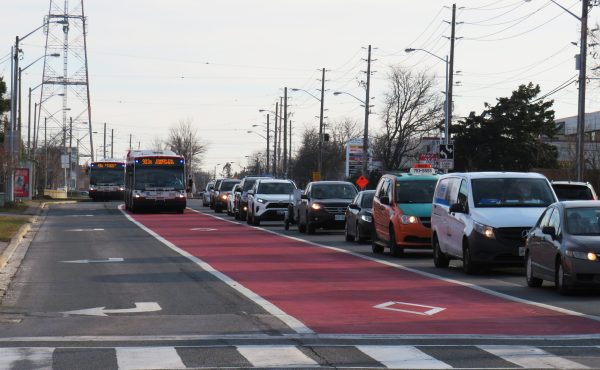
But is that so? The Steeles West station will be at Steeles and Northwest Gate (Google map), on the edge of York University’s main campus. Right now it looks like this:
This is not city, and by rights it should not have a subway. But that doesn’t make it tabula rasa. York’s campus is right there. And while the university’s architecture is an unfortunate mishmash, it began half a century ago with a set of ambitious modern buildings dropped into a field. The city is now studying them all for historic designation. Some have held up better than others, but their monumental brick-and-concrete forms are a valid starting point.
More recently, York has commissioned a few gorgeous and innovative structures. Hariri Pontarini’s Schulich School of Business, a short walk away, suggests a much more urbane reaction to suburban banality. They’ve created a complex of buildings that fight against Horrid Suburban Banality with tailored, glassy elegance.
There’s also the entry pavilion by Teeple Architects and a couple of other buildings that deliver pleasant (if cool and corporate) spaces and forms.
Why not use these as a jumping-off point? They are as relevant as the strip malls and warehouses across the street.
And more to the point, those strip malls and warehouses (and empty fields) will be gone within a decade or two.
The subway will bring some development to an area that is already, in the broader scheme of the city region, quite central. The real edge of the GTA is another 40 kilometres north of here. The immediate context of hydro lines and oil tank farms have helped make these sites unattractive to builders – but that will change. There will be something somewhat like a city here someday. It deserves our respect and forethought.


16 comments
That is why Alsop’s subway station is such a self-indulgent masterbatory design. Much more rational is 40 stories of residential on top of the station.
Steeles West station isn’t at York University, though. York University is getting it’s own station the design of which fits in with the buildings there. Steeles West can have its own thing.
Every time I see that picture, I feel like I should be at Canada’s Wonderland.
Toronto definitely needs more glass buildings!
Also more grey would be appreciated.
The building should follow the lead of York, because everyone knows
that York is renowned for its beauty…..
I have to agree with Alex. Any subway station should be built with the assumption that there will be mid-to-high-rises going up all around it, so it should minimize it’s footprint. The main entrance should be right at the sidewalk, and not take up too much room. Better yet, build an office building on top of it right now. The bus platform should take up a minimal footprint, and the acres of parking should be underground, with high density development (and perhaps a small park) above the surface.
What it does well is provide a recognizable portal for the TTC. Blending in with York’s mish-mash of corporate campus architecture is questionable considering it’s to the south for now. I agree that the TTC should be looking at integrating its stations with buildings wherever possible. Steeles W. is complicated by multiple bus bays, the underground station & subway, not to mention the nearby hydro corridor & massive surface parking lot. The TTC may want copy the temporary show rooms of condo developers and erect temporary station entrances wherever it is trying to sell the land.
I know Will Alsop a bit, and if it was someone else I would be nervous. But trust me, he knows what he is doing. His work may look self-indulgent, but he knows how to spice up a site on a budget, which is exactly what Toronto needs. His latest built project has gotten good reviews and has some similarities to the Steeles West project – see http://bit.ly/fUlxtN
“the architecture is totally unbounded by any sense of place. It would go just as well on Mars”
Why would we need to worry about the station conforming to any sense of place when the area it’s being plopped into has no “place” qualities to begin with?
Was there a public voting process involved in choosing this design? What do we know about the views of the people who will be entering and exiting this station? I doubt I’ll ever be one, so I don’t believe my opinion on the design should count for much – nor should opinions of others in my situation!
Between the pending heritage-ness of the original York U buildings and the general conscientiousness of what York’s been building since it started building again a generation ago, methinks the “unfortunate mishmash” argument is being deflated over time…
So what if some day — ten years away, even twenty — this place will look completely different? This station’s design speaks to how the area is now, and in the decades to come people will look onto this station and be reminded of just fast the neighbourhood has changed. Just like all the other Toronto stations do. Nothing wrong with that. In fact, I like it that way.
One of York’s buildings that helps address the “unfortunate mishmash” is Moriyama + Teshima’s Vari Hall. As a student, I disliked the original campus’ brutalist architecture, but Vari Hall brings the buildings down to human scale and gives warmth to the main entrance to the campus, while still giving a sense of gravitas and grandeur. Plus, there are really cool echo effects possible in the rotunda.
I like Alsop’s design; Steeles West is an area severely lacking in any whimsy, and this design could set the context for other architects to play off of in the future.
looks like the City recognizes that development should happen around the station and around York University to capitalize on the subway.
http://www.toronto.ca/planning/york_u_plan.htm
As much as I dislike the Neo-Expressionism vibes I’m getting from this proposal, the Alsop design still has more imagination than several dozen waterfront condos combined.
It’s a very distinctive design that will make the station instantly identifiable, which is a huge plus for wayfinding. If there’s one place that’s great for architecture and design, it’s a subway station because of its inherent accessibility and high usage. Investment in station design can bring great design to the spaces of ordinary people on a daily basis.
I found the final line of this article poignant:
“There will be something somewhat like a city here someday. It deserves our respect and forethought. It deserves our respect and forethought.”
This realization is critical. A subway station needs to be attractive and unique because it’s a space that should be associated with a neighbourhood and part of the city for generations. Stations are hubs of the city that need to have some character. Tens of thousands of people, if not hundreds of thousands, will pass through these spaces daily. Subway stations make impressions on visitors and set the tone for a city. Every subway station should be unique and distinctive in design, with art integrated in the interior and exterior architecture.
What this guy said:
http://news.nationalpost.com/2011/02/14/urban-scrawl-steeles-subway-—-‘architectural-wankfests’-a-failure-to-plan/