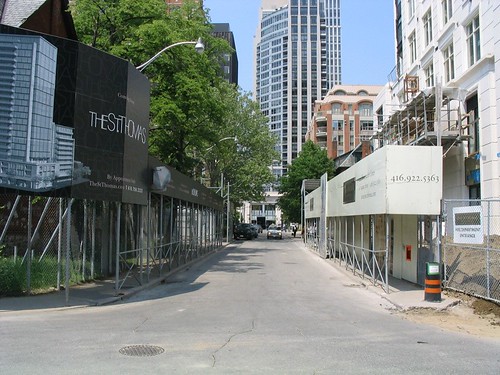
 Photo: St. Thomas St, Yorkville
A second construction hoarding was erected on St. Thomas St south of Bloor recently, across the street from an existing hoarding (which has since been taken down). For a short time, the two facing hoardings protecting the sidewalks appeared to resemble a street lined with arcades, in its small spatial scale not unlike many you will see in southeast Asia, such as this one in Singapore.
 Photo: Street/lane in Singapore
This small scale of space is a relatively infrequent occurrence in Toronto, especially as part of a public street. While we’re used to such small scales in our back alleys, those alleys are, with but few exceptions, the city’s backdoors – infrequently travelled and largely empty, with few uses facing on to them other than the occasional residence and dominated by garages or blank walls and service entries. They do not really form a part of the public face of the city or city life.
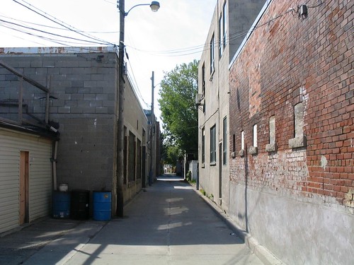 Photo: Laneway in the Junction
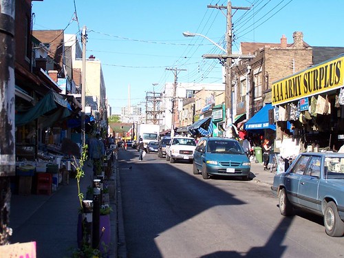 Photo: Kensington Market (photo by raptortheangel)
Somewhere approaching this scale of space that is part of the public face of the city is most famously exemplified by Kensington Market, where not only the buildings, produce and products are jostled up against the sidewalk, but the streets are narrow and bustling with people, and to add to the compression of space, filled with parked cars and delivery trucks and slowly crawling traffic. It all adds up to a very human (dare we say humane?) scale that somehow makes you feel comfortable, as though you’ve been enveloped in the city. In fact, Kensington moves beyond a sense of space, and somehow transcends that rather empty word, to have evolved a sense of place, one that is both undeniable and unique.
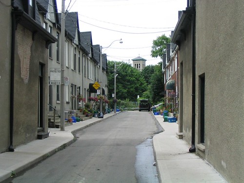 Photo: Wilkins Ave, off King St E, east of Parliament
There are a few other examples of small space in the city, but they tend to be rather hidden and brief moments – although that just makes them seem all the more jewel-like when you discover them.
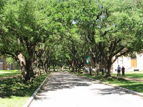 Photo: Tree-lined street at Rice University, Houston
While small space is not the only way to attempt to foster sense of place, I think that there is some connection between this sense of scale, sense of space and sense of place. Similar effects of scale can even be created by the canopies of closely-spaced street trees, as at Rice University (above), but can also be misguided in implementation as in this accident of line-of-sight where Casa Loma’s tower is perfectly framed by the laneway between Walmer Rd and Spadina Rd south of Davenport, which doesn’t so much benefit the laneway itself, but creates some sense of drama and intrigue for all those people walking along MacPherson Ave towards George Brown College.
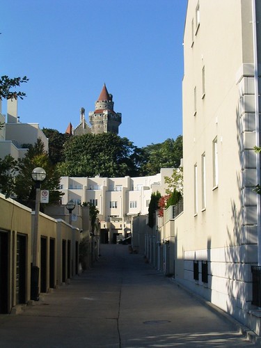 Photo:Looking towards Casa Loma up rear lane between Walmer Rd and Spadina Rd
Whether or not anyone agrees with me about the importance of small scale when it comes to sense of place, I think we can safely say that a key missing ingredient in the urbanities being created in suburban locales around Toronto (and the rest of north america) is the absence of small-scaled space. This absence has been compensated for in many different ways, but most notably (need I say, horrifically and ironically?) by the deliberately pedestrian scale of space of the “shopping street†inside the typical mall and, more recently, by the creation of “pedestrian-oriented†centres in suburban locales, usually surrounded by seas of parking and/or parking garages and huge arterial roads and/or expressways. These new “centresâ€, sometimes presumed to be the end of the mall (and often replacing them), are in reality the mall’s evolution into a more plausible (but still staged) “realityâ€, one that is once again based upon the smaller scale that has become nostalgically associated with our cities’ historic centres and main streets.
Whether this small scale can once again be more fully integrated into the urban environments we are building may depend on the level of commitment we as a society are willing to make to creating spaces and places planned and designed around people instead of cars. On this question the jury’s still out. Despite recent progress and a lot of talk to the contrary, the evidence on the ground does not convince.
crossposted to bricoleurbanism.org


12 comments
Where are pedestrians expected to walk in the Singapore photo?
It should be noted that while the structure of the shophouses in Singapore are much like those in your photo, that sort of narrow street is not the norm here either.
There are very few streets that remain narrow like this.
The structure of the shophouses, and the way they overhang the sidewalk, is a very practical structure. The overhang provides shade from the harsh sun and shelter from the frequent rains.
You might also have a look at the streets of London. While the buildings tend to be a little taller, the narrow streets give the same feel that you have described.
Unfortunately we need not look outside of Toronto to find examples of misguided “pedestrian streets” surrounded by oceans of parking and dominated by single use, single storey prefab buildings. Check out the redevelopment plans for the Don Mills Centre (former site of the Don Mills Shopping Centre, http://www.donmillscentre.ca), which promises to be a disappointing example of such misguided planning. It makes me sad to see such a large and promising site (with the planned Don Mills LRT line in the planning phase, and Lawrence Avenue to the north) being wasted with such poor planning. I find that there are numerous redevelopment sites in Toronto that could be the focii of new mixed-use, human scale neighbourhoods if only their owners had some vision. I urge anyone with the time to try and fight to have this (the Don Mills Centre) plan changed, at least so that it acknowledges the two major streets that it will abutt.
Hmmm…interesting analysis.
I wonder if part of the reason I like the St.George U of T campus so much is because of the way it weaves together large buildings with landscaping, narrower streets, courtyards, and pedestrian paths/sidewalks into something that feels like a small-scaled space—even when its packed with people.
I always thought that it was the landscaping and architecture that did it for me, but after reading this post, I’m convinced that scale plays a significant role…
great post, i agree wholeheartedly about the importance of small-scale spaces in developing a humanized sense of urban place. it’s a matter of democracy – allowing the little guy a hand in shaping the environment – which (surprise surprise) tends to enhance the aesthetic pleasure and liveability of neighbourhoods. if singapore is losing its small-scaled places, that’s a shame. but these spaces do live on and flourish in some other asian metropolises, and in other old world cities as have been mentioned.
Luke: Through the arcade created by the linked overhanging storefronts, I think. As Steven M pointed out, I also found this seemed practical for shelter from sun and rain.
I recollect an observation by Alan Jacobs of Great Streets that the more a city accedes to automobility the fewer and fewer the incidences of smaller lanes and streets of public spaces – and certainly we’re seeing some fussing about street width here in the amanglemated TO for “safety”, and we’re thoroughly dominated by suburban interests now.
Roy’s Square will disappear soon – sure we got quite a few millions for selling it…
There’s a few good examples in the Beach, including Sycamore, Hazel, Fernwood Park, Hartford, Windsor east of Blantyre.
On a broader level, the old city in general has a good foundation – in my neighbourhood, for example, the streets are the typical 8 or 8.5 metres wide, and the right-of-way is the typicale 20 metres wide, but the difference is that the houses aren’t really set back from the right-of-way so it feels as though the actual street is narrower (and the effect is augmented on streets with a tree canopy). In the suburban setting, the local streets have the typical 8.5-metre pavement and 20-metre ROW, but then there’s at least a 6-metre setback from the ROW to houses to fit cars on driveways. This can have a huge impact when multiplied by two sides of the street.
Re: Don Mills Centre – it could be worse. It could be Trinity Common in Brampton.
Ding! Ding! Ding! Ding!
Post of the year on Spacing wire!
Great analysis and really cogent, too. Small, tightly-knit alleys are the best urban spaces but too often, the planning movements of our day espouse this idea of creating public space through parks, squares, (ugh) plazas, and other empty voids that do not seem to animate their surroundings.
Here’s a simple rule-of-thumb: the narrower the street, the more vibrant it will appear even with less people. For example, just five people on that strip of Baldwin street you posted makes the street feel positively alive. In contrast, five people on University Avenue would feel horrendously empty – and it always does.
Second, a narrow, hemmed-in street gives off the feel of a dense, comfortable city without having to resort to overpowering scales like skyscrapers. For example, Baldwin street feels like a real canyon even though it is just a row of three storey houses. A Toronto laneway experience at nightime summons up almost preternatural emotions as you navigate a labyrinth of garages that jut out to street level in splendid silence. I only had one other urban experience that conjured up stronger emotional experiences and that was when I navigated Venice at night.
Good on you, Spacing. Keep on posting stuff like this. Stuff that matters.
I didn’t see Luke’s question, but yes you walk under the overhang.
Nearly all of the buildings abutting the street here in Singapore have these overhangs.
Great post!!!
Someone mentioned Roy’s Square and I thought I’d post a photo of it for people who don’t know it – it’s right at Yonge and Bloor, but is surprisingly easy to miss. Quite sad that it will disappear – an 80 storey building is a quite different scale altogether!
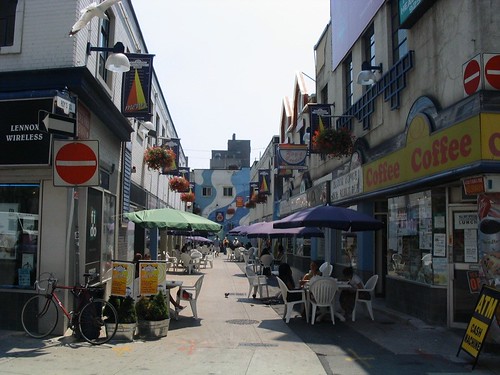
Photo: Roy’s Square, Toronto
Re: Singapore, it’s true most streets in old shophouse districts are wider than the photo I showed – maybe closer to width of Baldwin in Kensington, sometimes larger – almost all of these districts are kind of these islands in the city now as big avenues have been cut through and they’re surrounded by much larger development – I believe most of them are actually a kind of conservation district where the form/scale of them is semi-protected in various ways.
There’s similar (and very pressing) issues at play in Beijing with the rapid demolition and clearances of Hutong areas – the Hutong has a remarkably similar scale to some of the things we were talking about here and there have been some mixed successes at presevation from what I understand – the key problem being that the form of the Hutong makes redevelopment very difficult without total demolition but the current density is very low for central areas of a major Chinese city, so the pressure on them is intense.
A search on Flickr will be quite inspirational – one example:
Photo: by Jon ChristallÂÂ