

Just over a year ago, Spacing associate editor Shawn Micallef wrote two great posts (July 7 2006 and July 10 2006) about his visit to Chicago. My recent visit was for only a day and a half, so this post will stick to the downtown core (The Loop) and how The Windy City deals with street furniture.

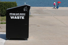 We’re always fascinated with the garbage cans of other cities, and like most civilized places, Chicago has chosen to keep its waste collection bins ad-free and designed them to be attractive and functional. Mind you, there were very few recycling bins to be found on sidewalks, though a few were scattered around Millennium Park. We did find a solar-powered trash compactor along the waterfront (right photo, click to enlarge).
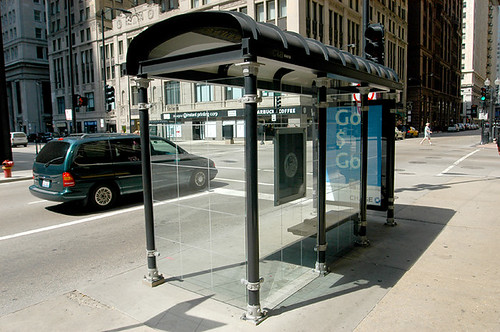
I don’t mind the design of Toronto’s current bus shelters (or the ones included in the new street furniture contract), but when I saw Chicago’s bus shelters I was pleased with their understated design (JC Deceaux provides Chicago’s street furniture and the company was one of the original bidders for Toronto’s contract until they dropped out days before the bid was due). It fits in well with the city’s Art Deco aesthetic and the other black wrought-iron street furniture.
It made me think that our local designs are trying too hard. Toronto doesn’t have a rich architectural history like Chicago and it seems we’re still searching for a Toronto-aesthetic (though I’m sure some would argue Toronto did have an aesthetic until its best examples were torn down in the ’50s and ’60s to make room for a variety of Brutalist and Modernist buildings).
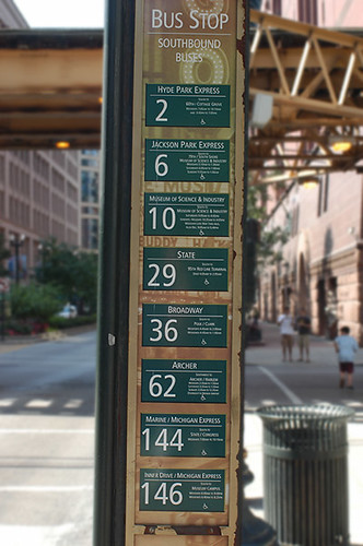
But the best little discovery was the info I found at bus stops. Obviously, a number of routes came past this stop, but the signage is clear and well-organized. Toronto could learn a lesson.

I was also impressed with the subway entrance covers. This is something that can be done over numerous stairs leading into Toronto subway stations. St. Andrew, Osgoode, St. Patrick, Finch, York Mills and Museum are just some of the stations I can think of off-hand that could use this feature (I know the idea was considered in Toronto’s street furniture contract).
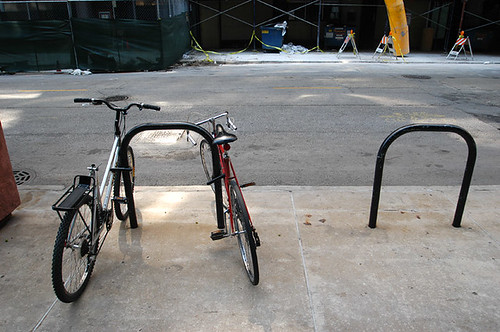
As much as I love Toronto’s ring-and-post design for bike racks, we witnessed (and experienced) last summer the ramifications of going with only one type of design. I like these Chicago bike racks for two reasons: its appearance blends in nicely with the other street furniture; while it occupies almost the same width as Toronto’s ring-and-post, you could theoretically attach four bikes to one rack (two locked to each vertical pole). Stockholm, Sweden produces a variety of bike racks that adhere to a consistent aesthetic that should be considered when Toronto rolls out its next generation of bike racks.
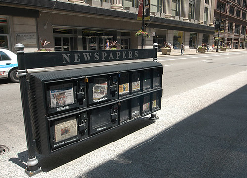
Torontonians will see similar newspaper boxes on our sidewalks once the new street furniture contract kicks in (we do have two examples of these at Yonge and Bloor). I’m still unclear whether Toronto’s consolidated newspaper boxes will carry advertising on the road-side of the structure, but none of Chicago’s did. I’m actually fine with these things — I find the lumping of multiple boxes around a utility pole to be sloppy and allows for any commercial interest to plop down hundreds of boxes without considering pedestrian, siting, or streetscaping concerns.

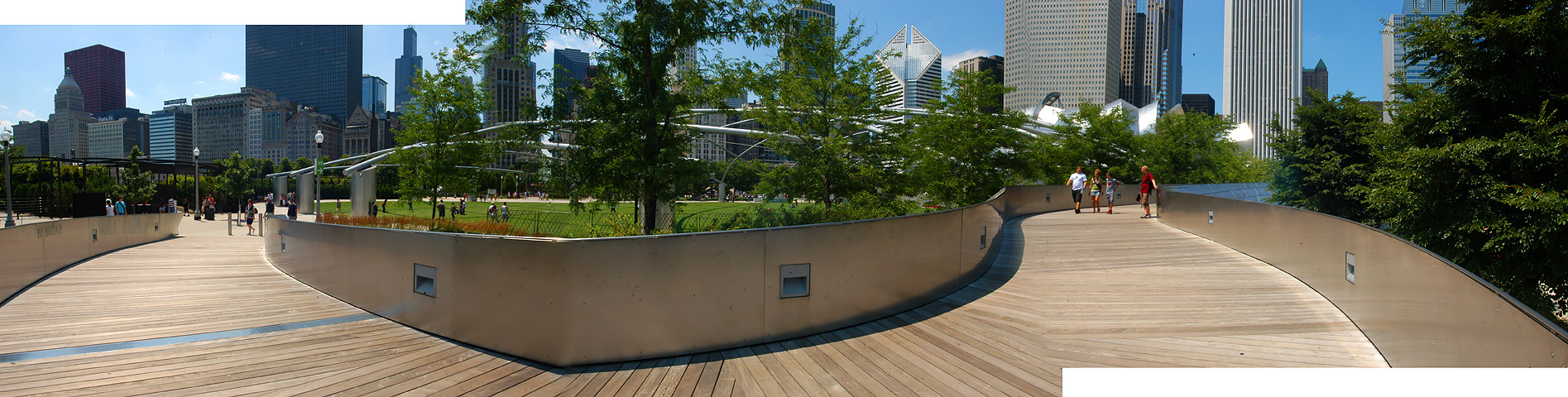
I was quite taken by Millennium Park, but my best moment came when I was walking across the BP Bridge (a lot of the park has corporate sponsors) when two kids approached us (pictured above). After they hugged me I took a few photos to produce this panorama (shown below — click on it to see larger version).
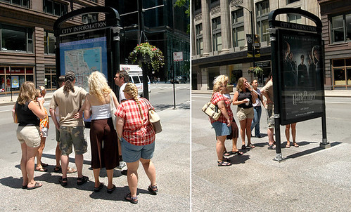
Just outside the hotel where I was staying was a map of The Loop and the central part of Chicago. It was similar to Toronto’s info pillars (ad-funded, gets in the way of pedestrians), but at least a passerby could easily find the map. The photo is evidence that no matter how much people love Harry Potter, a map is much more useful to seethan an advert when walking around a city.
photos by Bouke Salverda and Matthew Blackett

30 comments
s.b “wrought-iron”. “Wrought” is an archaic form of “worked”. Neat, huh? Courtesy of your friendly neighbourhood etymology enthusiast.
The posting badly needs a copy-edit.
Now, as for the “clear and well organized†bus-line listings: Why is everything centred (note the different measures of text blocks)? Why are they using fake small caps and tabular figures for a display type?
Because of lack of hierarchy and alignment, you have to read each plate separately. I also wonder why they’re separate plates at all. Combine them and you could get rid of seven wheelchair icons (are there any inaccessible routes?) and most or all rules.
aren’t the newspaper boxes above identical to the ones the city already installed at Yonge and Bloor, NE corner, and Bay and Bloor, SE corner?
IIRC, there is no advertising associated with those ones.
AFAIK those subway entrance covers on Michigan are the only ones, most of the subway entrances are just like Toronto’s, open staircase with a waist high concrete surround.
Ah, a way to dispense information without using monstrously sized info pillars! What a revelation.
Chicago’s streets look quite elegant — such a contrast to Toronto’s disastrous proportions and use of matte white-silver.
Erin, always liked “wrought” and its branch; to have “wrought” something always sounded much more impressive, much more powerful.
Sorry for the typos. etc. Another set of eyes were to go over this peiice before it went live, but that didn’t happen. I’ve tried to correct what I could find. Sorry for the sloppiness.
LOL! Matt, you might want to copy your own apology for the sloppiness. (See, I’m in a far better mood this week and more receptive to humour).
I should post some stuff about Chicago – like the over-the-top manicured gardens on Michigan Avenue. But street furniture there was good, but not great – a bit fancy and still inconsistent. The newspaper bins, for example, are only where the tourists go. A few blocks away, the mess of bins remains.
My understanding is that all of the street furniture pictured above is strictly limited to the areas where visitors might wander, and that the majority of the stuff in Chicago is, at best, nothing special.
And York Mills station doesn’t have any exposed staircases leading down to it. I’m not sure of what station you’re thinking.
Subway Entrances: Design Tender has already been let.
From the June 13, 2007 TTC Meeting:
It is recommended that the Commission approve the proposed locations and Architects to prepare design concepts for existing subway/Scarborough Rapid Transit (SRT) open stairway entrances as follows:
(a)Finch Station – Adamson Associates Architects;
(b)Lawrence Station – Zeidler Partnership;
(c)Kennedy Station – Stevens Group Architects Inc.;
(d)Ellesmere Station – Moriyama & Teshima Architects;
(e)Lawrence East Station – Moriyama & Teshima Architects;
(f)Museum – Daniel Libeskind Architects;
(g)St. Patrick – Frank Gehry Architects; and
(h)Osgoode Station – Diamond + Schmitt Architects Inc.
I also thought those bus route posts, at the very least, look suspiciously “downtown-improvement-esque”–how universal are they throughout the system?
Also serves as a reminder of how…rudimentary? That’s not the word…Toronto’s downtown-core surface transit options are. Bay bus? Yonge bus? Suburban express buses? Signage that worked-out might look rather superfluous here. (Though come to think of it, it *is* odd that Toronto’s never had much of a policy of indicating *route numbers* at transit stops, other than those oft-stolen schedule sheets, or in divvied-up situations like on Eglinton near Yonge…)
Considering recent events, isn’t it a bit curious that some of the priciest architectural firms on the planet have been hired to design what are essentially fixed awnings?
Toronto’s bike plan includes producing and installing a variety of bike racks, but like many other things not happening from the plan, this is just one more…
I saw the Free Hugs campaign near the Tribune building during my own trip to Chicago at the end of May. It appeared to be linked to a charity as there was a group of people wearing the same shirt, one of them keeping count of hugs.
Your folk however appear to be independents.
I was also very impressed by the width of the sidewalks. Both the roads and sidewalks felt wider than Toronto.
The transit seemed far nicer than Toronto as well. With an abundance of lines, and flexible ticketing, including visitor passes for 1, 2 or 7 seven days. Upon landing, the info-lady at the airport told us that the metro from O’Hare to the downtown loop would not take much longer than a taxi either.
Buildings in downtown Chicago are much taller than Toronto, and architecturally far more diverse as well. I want so badly for Toronto to get over its fear of heights.
Americans are very gregarious.
Cameron — I’m with you on the fear of heights. The taller the better, in the right spot.
I don’t understand why Toronto has the open staircase style subway entrances. Montreal has almost exclusively kiosks or entrances as part of buildings for all our Metro stations. The reasoning given by the STM is that because of the cold climate, it is best to have closes entrances rather than open which seems smart enough. Toronto has a climate just as cold and snowy as Montreal’s, I wonder why the TTC didn’t go the same route.
In the pictures and archive films it looks like they built the subway in the summer, so that’s probably why.
The bus signs are BIA-esque for sure. The conventional CTA bus signs usually have a lot of information on a regular metal sign – each route’s name, number and destination are displayed, as well as the accessible logo (almost all routes are accessible there), and the owl symbol for the all-night routes.
There’s a graphic of a standard bus route sign in the “riding CTA” webpage.
http://transitchicago.com/maps/riding.html
But while it’s a more extensive system, the L trains are shorter, narrower and less frequent than our subway trains. Waiting for a packed inbound Red Line train that comes every 10 minutes on a Saturday at Cumberland almost made Montreal’s Metro look frequent and spacious.
The open-style staircases are predominant along University and Yonge only — mainly because the line runs directly under the street in these cases and the cost of expropriating land for station building entrances would have been extreme, even back in the 50s and 60s. The stair entrances were built on public right of way, did not interrupt the significant number of buildings that were already built up onto the streets. Once the subway route deviated off from directly under the street, you had the station buildings (since the land was expropriated for subway construction already.
The Metro in Montreal doesn’t run directly under any streets, IIRC, so station building entrances were easier to construct for the same reason why Toronto has them where it does. There is one open staircase entrance I can think of in Montreal though, the replica Metropolitain staircase entrance donated by Paris.
I wish these photo-heavy posts could be put “behind” a link so that it didn’t take so long to scroll past them on the front page.
^And other people complain about the behind link and prefer them all on one page (me included). You can adjust your mouse wheel so it scrolls quickly — 2 seconds to get through this particular post.
Hmm, but what if some people like precision scrolling because it’s easier on the eyes when reading long blocks of text?
What are the benefits of having all entries in full on one page? I genuinely am curious … especially the age of obsessive tabbing (at least with many of the people I have come across) which makes cuts/links so much easier?
It would accommodate people with slower connections, who don’t want to load a dozen photos every time they visit Spacing, especially if there are a few entries on the main page that are photo-heavy (which doesn’t always happen, but can).
It’s of course up to the editors, but this is one vote for more “behind the cut/link” entries. Sometimes I want to skip entries to get to one to read updated comments, and scrolling forever is a bit tedious.
Re. the open subway entrances – one thing that baffles me is that the TTC uses really slippery tile on the stairs – in snow or rain, they’re very precarious – I’ve seen people slip and almost fall all the way down. I’m surprised they don’t use some material with better grip. It would be good to have them covered, if only for safety.
Gloria> I think clicking is more tedious than scrolling, and i’d rather things be on one page. My wheel is quick, but still feels precise. I suppose it’s personal, but i’ll often not click on the “more” of an article because I don’t want to have to click back to the main page. I feel like I end up flying around to too many places, and I generally already have too many tabs open as you mention.
“Toronto doesn’t have a rich architectural history like Chicago and it seems we’re still searching for a Toronto-aesthetic (though I’m sure some would argue Toronto did have an aesthetic until its best examples were torn down in the ’50s and ’60s to make room for a variety of Brutalist and Modernist buildings).”
So Victorian + Modernist doesn’t constitute an aesthetic? Any less than Art Deco and varied Modernist skyscrapers?
The bus sign is too olde-timey, not to mention fussy (a background image? really?) Better just to do something clean like Vancouver’s. Toronto doesn’t need anything complicated as either since, as someone noted, it’s rare you have to choose between buses (nothing like the list of a dozen or more routes one might see on Seymour or Howe in Van.)
When you think of Chicago I think of Art Deco, and I rarely think of another city when thinking of art deco (at least instantaneously).
While our Victorian architecture is identified with us, its also identified with hundreds of other cities, which is why every small town Ontario Main Street is quite similar. Our Modernist work is hit and miss. And we’re certainly not seeing an individual style emerging from our housing and condo boom.
But to each their own.
I really think once attention is turned to our suburban towers, Toronto will be known for modernism. I think we hit more than we miss.
I think you’re just saying that because you live in Ontario. Alberta or BC don’t have that red-and-cream brick main street feel. I mean, this is Vancouver city hall:
http://www.flickr.com/photos/smatts/122676523/
In terms of actual cities (and if you’re going to exclude small-town Illinois, you might as well exclude Peterborough) Toronto has historically been thought of as more Victorian than most, especially insofar as its built form matched its moral rigidity. Then come the Modernists… isn’t that the Whiggish story?
Come to think of it, I’m not sure I can think of more Victorian Canadian city (Victoria?) Winnipeg is Art Deco and Modern, Calgary burnt down after the fact-not that there was much there, Montreal is just plain older…
Oh yeah, and didn’t Buckminster Fuller already link our suburban towers to modernism?
https://spacing.ca/toronto/?p=1693
Time to re-reevaluate? 🙂
Yes, I say that because Toronto doesn’t look much different than Ottawa or London or Guelph or Kingston when it comes to an aesthetic.
I still don’t think your reasoning translates into an aesthetic that is widely recognized as a “Toronto- look.” Yes, we have a few specific styles, but we are not iconic of Victorian architecture the way Art Deco is associated with Chicago.
Fuller also wanted to build a pyramid at the base of University Avenue.