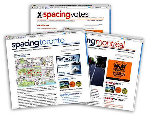
Spacing is happy to announce a few changes to our blogs. The most exciting change was announced earlier this morning: Spacing is expanding its presence into another great Canadian city. Say hello (or bonjour) to our new daily blog, Spacing Montréal.
Also, we’ve re-launched Spacing Votes to cover the Ontario provincial election. We’ll be covering Toronto-specific issues like the OMB, transportation and transit, the environment, and mixed-member proportional representation. Check in daily for news, analysis, and commentary.
But let’s focus on this blog: you may have already noticed that we’ve changed the name of this blog from Spacing Wire to Spacing Toronto. With the addition of Spacing Montréal, we felt it was a good time to re-brand this site and make sure that each blog is geographically rooted. Editorially, things will stay pretty much the same as on the Wire, with occasional cross-posting. We have plans to add other city blogs in Canada and the US to our roster in the future so we can gain a greater understanding of the complexities of our urban landscape.
Now, let’s look at the new features you will find on our blogs.
NEW NAVIGATION BAR

We’ve taken advantage of these changes to do some reorganization of our layout as well. We’ve moved the monthly archives and categories from the right sidebar to a navigation bar at the top of the blog (above graphic). Also on that navigation bar is “Browse By Writer,” a new feature that allows you to look up articles by those who posted them.
SOCIAL BOOKMARKS & EMAILING POSTS

Our posts are now much easier to share with your friends. At the bottom of each blog entry, above the comments section, is a link that allows you to send an email about it to a friend. We’ve also included functions that allow you to share Spacing blog posts on Facebook, del.icio.us, Digg, Stumble Upon, Technorati, and Treehugger’s social bookmarking site, Hugg. We hope these features will encourage you to spread the word about Spacing.
PROMOTIONS & ADS

We’ve added an advertising component to our layout. The space will be used to promote events, community organizations, paid commercial ads, and Spacing-specific projects and products.
LINKS TO OTHER SPACING BLOGS

Another new feature is the blog feed on the right sidebar. All three of our editorial blogs (Spacing Toronto, Spacing Montréal and Spacing Votes) will feed into one another so you never have to worry about missing a post.
HIGHLIGHTING THE ACTION

The right sidebar also includes four new features, three of which will help our readers discover where the action is taking place within the blog: “Most Comments Last 7 Days” ranks the posts that have garnered the greatest amount of discussion; the “Most Recent Comments” feature is self-explanatory; “Most Emailed Posts” shows the popular posts being shared amongst friends; and The Spacing Poll will appear later this week as a permanent and weekly feature on the blog.
RSS FEED FOR COMMENTS

There are a great number of readers who like the Spacing blogs to feed right into their web browser, so we’ve enhanced our RSS feed to make it easier to follow discussions by adding a specific feed for comments. You won’t have to change a thing if you currently have an RSS to Spacing. You can find these RSS feed icons at the bottom-right corner of any blog post.
The editors of Spacing hope these new features will help you enjoy the site even more than you already do. There will be kinks to be worked out over the first few days, we suspect, so please be patient if you run into any technical problems (or email us so we know about it).
COMMENTS
A special thanks to Michael Periera for all his hard work and technical skills in producing our new templates.

10 comments
Good to see Spacing branching out into other major cities (Vancouver next?). And the new templates look great, especially Montréal’s.
Some interesting changes that should be useful. The pull-down menus at the top need some work, though. “Categories” extends past the bottom of my screen, and I can see “authors” and “archives” doing that on lower-res monitors too (or, in a few months, for the “archives”).
You’ll need to fix a few HTML issues; your rollout isn’t a done deal yet. (You’ve got 61 validation errors, including fatal usages of images without text equivalents and the converse, spacer GIFs with alt=”spacer”, appropriately. Your new navbar should be styled text in an unordered list, not images. Among others.)
By relaunching without good compliance with Web standards, your risk being labelled a Failed Redesign. (Hi, Steve!)
You links to comments leads to Leave a comment, rather then the comments themselves, which is where most people want to go.
Bravo!
I love the new look already!
Lovin’ the new look. And as long as the content stays as great as it has been, I’m saying huzzah for the new changes!
Congrats! These are some wonderful changes and successes!
I’d love to see a Spacing Hamilton blog.
“Raise the Hammer” does a fantastic job of covering public space and planning issues in the Hamilton area -but a partnership with Spacing would enhance their profile. Would you consider approaching them?
We’ve blogrolled over to Raise the Hammer a few times….they do good things, I recommend people rss them (click on Rosalind’s name for the link).
Apart from their content, it impresses me they pull it off in a smaller market. Hamilton isn’t that small, of course, but it’s often hard to pull things off in a place the size of Toronto, so props to them.
LOVE THE NEW LOOK, BUT THE “CATEGORIES” LIST DROPS OFF MY SCREEN(?) I WANT TO SEE IT ALL!
KEEP UP THE GOOD WORK.