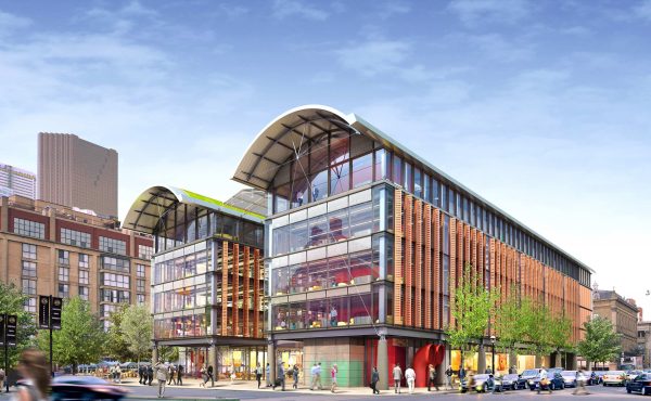
Our money is very important to us, and where we wish to store it is a constant work in progress by architects and designers. With many new concept branches popping up throughout the city within the past few years, it raises the questions: Why the radical change? Is it even that different?
Banking in Toronto:
Toronto bank architecture at the beginning of the twentieth century was one that relied heavily on a reference to classicism. Cultural attachment to Greek and Roman associations led to their symbolic use in early bank architecture. In many ways, early banks of heavy stone facades such as the Bank of Toronto (1905), designed by E.J Lennox were meant to intimidate and glorify, thus lending to a sense of security and confidence in one’s banking. As such, the early Torontonian bank patron would feel privileged to enter such a grand, lavish and ‘secure’ space – at least in theory. While many of the classical references remain in our modern structures, the purpose of bank architecture began to sway by the middle of the twentieth century. One of the earliest modern bank structures in North America – SOM’s Manufacturers Trust Company (New York, 1954) displayed this new movement of thought, which was described in Money Matters as an “all-glass display case for banking…[it] broke the masonry-fortress psychology of branch banking up to then. From then on banks all across the country became friendly.”
By the second half of the century, technology had become an integral part of architectural design, and had – in many ways – transformed its appearance. As such, banks could and most often did adopt these new industrial materials (glass, steel), with an intention of revealing their ‘sacred’ interiors to the public, and the new task of accessibility. The advancement of technological security systems lessened the need for symbolic assurance and heavy stone facades. Despite maintaining many classical components, criticism of early modern bank architecture formed, largely for its alleged portrayal of a bank’s business as a service rather than a ‘fundamental cornerstone of our existence’.
Today, Toronto banks compete against each other by expanding their services. Dog-friendly banks, multi-lingual services, self-service machines (including drive-thrus), extended hours, free coin-counters, and many other services are being added to the list. In contrast to creating a sense of privilege in their patrons in early bank design, banks today seem to be expressing a sense of privilege in servicing their patrons. This difference comes especially during a time of greater financial difficulty and a highly competitive banking industry, when the need for efforts and incentives in luring customers with all sorts of offers becomes elevated.
While today one is able to do the majority of his or her banking online, attention to bank branch design remains as a major task of building loyalty and recognition, which starts – in many ways – at the local branch. The five major banks in Toronto continue this battle, installing their recognizable branches, kiosks and atms in lesser-grandiose locations such as below condominiums, and inside grocery stores, as they campaign for depositors. Moreover, the growing need for ‘identity’ in a post-modern corporate world has left much of our former classical bank structures seeking new occupancy in the forms of hotels, the Hockey Hall of Fame, and fine European fashion houses (like that of Stephan Caras in a 1905 Darling & Pearson original on Queen East). Ultra high-tech designs with lighting effects, vibrant colours, and environmentally sustainable systems are beginning to form a wild range of new bank structures, linked most notably by their attempts to be different. On a global scale, some outstanding examples are Norman Foster’s designs for BMCE which include two modular headquarters in Casablanca and Rabat, and Emmanuelle Moureaux’s Sugamo Shinkin Bank in Tokyo. In Toronto’s financial district, this change can be noted (albeit in a much more conservative fashion) with the latest addition of the RBC Centre by Bregman + Hamann Architects. With a rapidly growing turnover rate in their smaller branch designs, it will be interesting to see what forms the next set of Canadian bank headquarter structures will take.
While symbolic and material connections help to make sense of the transition of bank architecture, one of the ultimate connections lies in its eager adaptability to sociocultural changes and needs.


