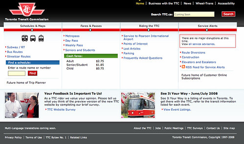
As mentioned yesterday, the TTC web site now has a re-designed beta version ready for public consumption. My initial impression is that it’s attractive and intuitive. Most everything feels logical — it also seems the feedback from Transit Camp was the basis for many improvements. There is a feedback/survey option that any of you can fill out.
Much of the site still needs content, but I feel the TTC is finally on the right track. It will no longer be an embarrassment to direct out-of-town friends to the TTC’s site.
Some interesting tidbits to know about the site and the planned roll-out of features:
• The site should be fully functional by early or mid-July
• The trip planner — a feature that most riders think is necessary — will be available as a beta version in early 2009, with fully functional planner ready for June 2009. TTC staff indicated that the data for a trip planner has taken much longer to implement than anticipated
• Next vehicle arrival will be available on the site in the fall of 2008
• Alerts about delays to specific routes or subways will be available for email or cell phones (this feature starts in the fall)
• The e-commerce store will be active sometime during the summer, allowing riders to purchase Metropasses online
• The site you see today cost the TTC about $400,000,but the added features of the e-commerce store, trip planner, etc., will add to that total.


25 comments
“Service temporary unavailable!
The server is temporarily unable to service your request due to maintenance downtime”
Oh, beta…
No fare information on passes or tokens. Web survey is broken.
Did this cost $400,000? Really? How much for the finished product?
Was this a beta posting? It seems to have been cut off at the end.
the $400k is for the final site
it appears that everything is back up there; what do you guys think?…..i kinda like it
David> its just your money why worry how much it costs?
It looks clean, it’s fast and efficient.
Wish the streetcar was the same.
Let’s see: $400,000 / “your salary” / “number of years for the project” = “number of people working on it”.
Do you own calculation.
Bids ranged from $109,000 to $990,000 and Devlin’s bid was actually $432,000. Devlin was the only compliant bidder; they won by default.
I actually like where the site is going. They seem to be making it much easier for newcomers to get to the information they need to know.
For frequent visitors there’s the search for a bus route feature which is nifty. It looks like they’re taking a couple of pages from the http://www.yrt.ca book, which is totally cool because YRT definitely got a lot of things right with their redesign last year.
Can’t wait to see everything finalized.
And for the record, implementing a ride planner definitely isn’t easy work. YRT had to give each and every one of their stops a stop number, posted on the sign at each stop. That way the user can enter the number of the stop they are at to find all the relevant details.
And I think soon they’re introducing a system that lets you use your cell phone to get route details too.
My initial impressions:
• The graphics are horribly lo-res. e.g. TTC logo
• The interface is cluttered and inconsistent, and there are too many menus. There are too many items for the page to be immediately useful.
• The main red menu with subway-map dots is a good idea, though it can be more visually appealing
• “Schedules and Maps” page is nice, especially the Subway/RT section
It’s a good change, but in my opinion, it’s should be called an alpha version.
Check out the information on the Spadina subway station. They still have the moving sidewalks listed. Apparently they’re both fully operational and have no service planned!
http://www.beta.ttc.ca/Subway/Stations/Spadina/station.jsp
Still a few bugs to work out, eh?
Overall, I think that the new site is substantially better than the old one. That said, there are a few things that I hope to see added before the beta is over.
-I’d love to see a regular feature on the home page that highlights work being done to plan/construct improvements to the system (renovations, new lines, new vehicles, etc.). Perhaps this could be bundled with information about upcoming public meetings and consultations, with links to more detailed project information. We might as well capitalise on the optimism created by a fresh web site to get people thinking about other improvements!
-I hope that the e-commerce section will sell TTC merchandise as well as just fare media; one day, the merchandise will actually be worth buying, and if there’s a market for it online then that could be the shove required to get some interesting memorabilia out there.
-a “print” feature for the schedules would be great, so that you don’t get all of the unnecessary graphics taking up pages and pages
Anyway, the real test of how good this new site is will be how well it is maintained, and how responsive it is to change and gradual improvement.
There are definitely some bugs. At 11:52 pm, the next eastbound 501 Queen streetcar from Roncesvalles is listed as “Tomorrow-1:15 am”.
Then again, maybe that’s not a bug — it could be some fancy probablistic system for guessing the habits of the Queen streetcar.
I’m actually pretty optimistic, overall: the site is deeper than it looks at first and has a lot of data that’s been pulled out of hard-to-access formats (e.g. timetable info and the “accessible alternative” info for elevators). As long as clutter doesn’t creep back into the home page over time, it’ll be a huge improvement.
“And I think soon they’re introducing a system that lets you use your cell phone to get route details too.”
GRT (Grand River Tranist) in KW has had that for years now. They’re just implementing a trip planner called EasyGo, and though it works it’s a bit flaky and poorly integrated into the site.
Each station page should have a link to a local map. The TTC could then sell space on the map to advertise a store name and maybe a link. They would of course leave out gas stations and parking lots, since they’re competition.
If that works, then each route map could be expanded to have hidden links of stores or destinations, which could also generate small sales.
The National Post today says the project was $8 million, including $400k for the website – what is the rest for? How much is support for the website? Anybody know?
Yeah, what is with the logo? Half a million dollars and they couldn’t even put up a decent version of the logo?
Has anybody tried it yet on their Blackberry or mobile phone?
I see that the poor souls who still have computer screens smaller than 1024 pixels in width (about 10% of users by the stats on the sites I maintain) have to put up with horizontal scrolling.
Wow.
If they really get all of those features up and running by 2009, I will be one incredibly happy camper.
I was up in Brampton last week, and ended up having to use the Brampton Transit. With one click I found their Trip Planner, and was so blown away by its functionality that I nearly cried. If you want to check out how it’s done in the technologically superior suburbs, go to: http://www.brampton.ca/transit/home.taf It’s not pretty, but it works.
And the above design complaints are valid, but I’m assuming that “beta”=”draft” and that by the time the final version is released it will be hi-res, bug-free and polished.
I’ve tried it on a Blackberry 7290 – not too bad although I would just dispense with the images and go with a stripped down text interface.
“Was this a beta posting? It seems to have been cut off at the end.”
— Fixed. Thanks for the catch.
Honestly, after the OLD site why is anyone complaining. When I first moved to Toronto and I went to find TTC info I kept looking around cause I thought “that CAN’T be the official site! it looks like a 5 year old did it!”…400k well spent in my mind.
What I’d love is if the TTC put their travel planner in a mobile/Blackberry compatible app.
Everything looks good, but the schedule is a bit too smart. It is only showing the next three buses, but what if i am planning my trip at a certain time?
Please let me know if there is a button for full schedule list, because i was just looking for 46 southbound @ 9:00pm weekday. And i never found it.