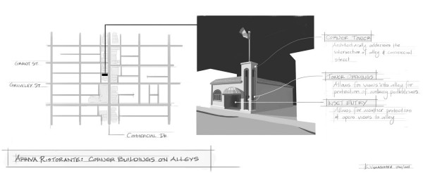
Walking along Commercial Drive between Graveley St. and Grant St. – one block north of 1st Ave. – one passes a relatively unassuming building. Located on the west side of the street at the corner of the mid-block laneway, it is known for the quality of the Italian food within, much more that the architecture that houses it.
Yet, despite all that is unremarkable about the building, the design of the Arriva Ristorante Italiano holds a wisdom that planners and designers can and should learn from – particularly with respect to how a building can meet a laneway with intelligence and dignity.
It goes without saying that alleys and laneways are at the bottom of the urban design hierarchy. Unnamed and often associated illicit behaviours and the “urban underworld”, the intersection where streets meet alleys are rarely the spaces worthy of architectural/urban design expression.
Street intersection and corners, on the other hand, have been home to some of the most significant buildings and thoughtful urban design throughout history. Entire books can be written on the diversity of design solutions that elegantly “turning the corner” at street intersections, and most, if not all, cities around the world have relevant examples.
Yet somewhere along the way, we seem to have forgotten that the intersection of alleys and streets are also “corners” and that they can – and should – be treated with as much care and thought as the major intersections of the city. Their urban condition shares many similarities with their larger and more popular siblings such as the fact building on alley-street corner have two faces fronting open spaces (street and alley, respectively). However, they are unique in many ways, as well – insofar that their use is often devoted to small numbers of pedestrians, cars and service vehicles and, in cases where they intersect commercial streets, the alleys often have a minimal setback to the adjacent building.
The designer of the Arriva Ristorante building negotiated these conditions by deploying two thoughtful design strategies described and visualized in the sketch notes above. First, he/she creating a two-story hollow vertical tower where the building meets the alley. Not only does this architecturally highlight the unique alley-street corner condition in a manner similar to the street intersections – yet at a fittingly smaller scale. But also, this gives the small building a distinguishing feature that differentiates it from its neighbours while tying it in with them – as the two story tower sits at the same height as the surrounding buildings.
Second, the designer inset the doorway, bringing the weather-protected “porch” all the way to the alley. Openings at the base of the tower allow for views to the laneway as one walks across it along Commercial Drive. This may seem like an irrelevant detail, but it provides a strong safety measure to the corner. Buildings typically pinch alleys at commercial streets since the edge of the lane is virtually at the building lot line. This condition is a safety hazard as one can’t see vehicles exiting until one is practically within the space of the alley. This dangerous condition becomes particularly evident with children as they – in the absence of the physical demarcations of the street intersection (i.e. curbs, etc.) – tend to race across the alley to see incoming headlights 5ft from where they are standing.
Although there definitely ways are ways that building can be improved, these two simple design moves that work at different scales of the city are worth noting. One critiques our misconceptions about urban form by adding a humble punctuation mark on an often unmarked corner, and the other carefully addresses the safety of the passers-by. With an increasing focus on making environments more thoughtful and pedestrian friendly, it is through carefully examining everyday (yet wonderful) buildings such as the Arriva Ristorante, that we can glean some insightful lessons.
***


