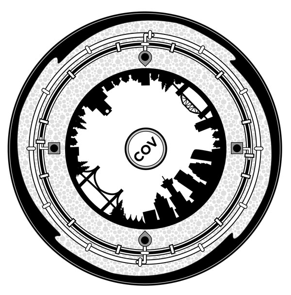
We’re happy to congratulate the Spacing Vancouver team of Caroline Toth, Brendan Hurley, and Erick Villagomez whose submission above was chosen as one of the finalists for the Ironclad Art design competition. Unfortunately, they did not win the competition, but being selected as finalists from over 1000 entries is a great achievement. Well done!
Here is the write-up that went with the submission:
Much like the veins and arteries the run through our bodies, many of the vital elements that allow cities to thrive are hidden from view – only coming to light as we surgically remove pieces of the city’s hard skin for repairs or maintenance.
In view of this, our proposal – a simple cross-section representing layers of the Vancouver – aspires to remind local residents of the connection between the buildings they inhabit, the hidden infrastructure below, and nature beyond.
The narrative starts at its centre and flows to the perimeter. The simplified cityscape of the inner ring references Vancouver as a whole, through its representation of iconic and vernacular built works. These sit on the hard skin of the city, below which the speckled earth lies.
Two pipes, representing the storm and sanitary sewers, inhabit this underground world and are differentiated by line treatment as well as the drop and rectangle end pieces.
Our journey ends along the perimeter of the design where four waves, representing the ocean, are caught in mid-break – a view common to those who frequent our urban waterfront edges and the final destination of the both the storm and sanitary sewer systems.
Through our design we sincerely aim to beautify Vancouver’s urban environment through a simple, memorable graphic expression, while speaking to – and sharing – our appreciation of the complex systems that are the life blood of our city.
***
See all the Ironclad Art entries here.


2 comments
Your design is nice, and references much more “Vancouver” than either of the winners. It’s too bad we’ll now be stuck with manhole covers that, according to several people, resemble “clip art”. What’s the point of holding a contest if they’re just going to pick some boring designs? Even the rationales provided are weak:
http://vancouver.ca/news-calendar/ironclad-art-design-challenge-winners-announced-at-gala-event-.aspx
Too bad we won’t be as interesting as Seattle:
http://www.seattle.gov/light/neighborhoods/nh4_art.htm
Thanks for the kind words, Rodney…….we were pretty happy with the result. Unfortunately, things weren’t meant to be.
E