For a larger image, click here.

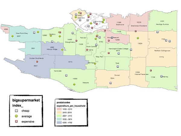
In the sunshine summer of 2013, I was summoned by my professor and given an interesting task: to roam the supermarkets and food stores of Vancouver to collect food prices. The individual prices of eight staple food items from 53 supermarkets were collated and analyzed via a weighted price index in order to compare the price level across the stores. With the help of a Geographic Information System software, ArcGIS Desktop, the results of this project was presented on layered maps.
In the map above, the city of Vancouver is zoned according to the postal codes that are shaded according to average food expenditure per household, in 2012. The number annotation shows the number of households within each postal code zone (the actual population within each area may vary according to the size of household). The 53 supermarkets are classified and labeled relative to their price indexes (price levels).
Graphically, there are two main findings in this map. First, though the red and yellow zones are densely populated, the number of supermarkets is negligible. These areas also represent the poorer parts of Vancouver. Therefore, a conventional food desert may be present in these zones. This is worth further explanation: we all know that food is a necessity in daily life. In economic terms, food could be defined as a ‘normal’ good. The demand for bread and butter increases as income increases. Hence, all other things being equal, the higher income neighbourhoods seem to have more supermarkets while the less fortunate population must travel further in order to reach reasonably priced and wholesome food.
A closer examination of the map reveals a surprising and contradictory trend to what was just explained, however. The relatively wealthier, less dense areas (the blue and ocean green zones) have comparatively fewer supermarkets too! A plausible explanation given by Prof Jennifer Black from the University of British Columbia is that this condition is due to urban planning factors such as land-use policies. Thus, the more single-family houses in an area, the further the residents may be traveling out to do grocery shopping.
Hence, this map not only conveys the distribution and general price level of the supermarkets but also highlights the potential areas of “supermarket shortage”.
***
This research could not have been completed without the guidance and help from Prof. James Vercammen from the Faculty of Land and Food System in UBC. Thank you very much.
**
Chen Zhou is a recent graduate from the University of British Columbia with an interest in the balance between economic development and environmental sustainability.


2 comments
Large supermarkets are nearly irrelevant to me. I live on Commercial Drive, where we have an abundance of small grocery stores, covering a wide range of prices and specialties. I buy something from one of the large grocery stores on your map maybe twice a year, either because I’m stocking up on cheap cleaning products, or because I need something late at night after the small grocers have closed.
I would interested to know how you selected grocery stores. Vancouver has many stores that specialize in one product (fruit & vegetable etc.) Also, your analysis does not include such supermarkets as Donald’s Market which is directly in the centre of an area you may call a potential “food desert”. The area around Donald’s (Hastings & Nanaimo) is rich with stores that serve the local market, but may not be classified as supermarkets.