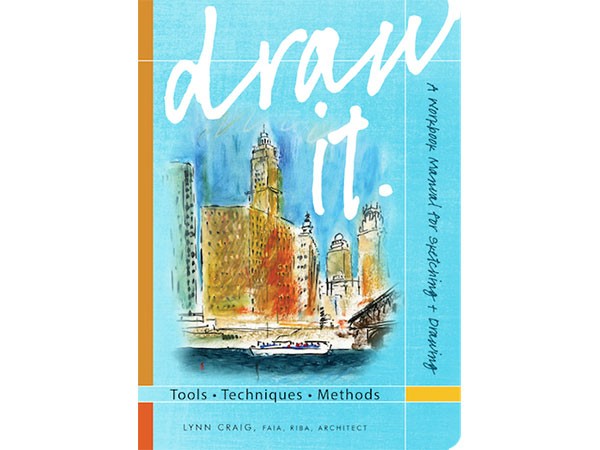
Author: Lynn Craig with Cary Perkins (ORO Editions, 2015)
Draw It: Tools, Techniques, and Methods teaches the user how to draw buildings, landscapes and analytically think through the design process of our drawings. The book is intended to be used as a portable workbook manual to be used primarily on-site, but also in a studio or at home.
Chapter One, Why Freehand Drawing?, gives an introduction on how and why to use the book. Lynn explains that the purpose of this book, is ‘to develop and expand your visual vocabulary’ and ‘to develop your skills in reading and recording the built and natural landscape.”
The didactic part starts with the Chapter Two Tools & Technologies The pages start with grey tone drawings to illustrate the tone and structure that can be achieved with the usage of each pencil (6B to 2H). This part provides the user with the basic techniques of drawing. Photographs of pencils and pens along the right sidebar make it quick to understand, which drawing & painting tools are used.
The next part deals with drawing techniques that can be achieved with colour tools such as crayon, watercolour or Prismacolour, as well as different paper types. This part also suggests what to bring to your on-site drawing session, such as a camera, shoulder bag and a folding chair.
Chapter Three, Methods, is one of the best parts of this book. It meticulously explains the rules of perspective, which are the most fundamental rules in drawing architecture and urban landscapes.
It starts with one of the most basic rules of drawing, the one-point perspective, and how to draw the horizon line and create a vanishing point. The tutorial continues through to a second section that deals with how to develop the perspective sketches into actual drawings using Prismacolour, oil paste and black brush pen. Craig suggests using human figures as measurements for the horizon lines. Consequently, how to accurately draw the proportions of human bodies occurs four lessons later.
The third section ends with a quick draw vs. slow draw exercise. Craig first gives a lesson on how to quickly sketch a live situation by drawing the basic silhouette of buildings, people and streets and adding colour and contour to them later.
This is juxtaposed with how to draw when you have more time. Here, small details (such as a cat and a birdcage in a drawing of a palazzo in Italy) or detailed elements of a facade of an Italianate building in Truckee California are included to add special character to images.
In the final Chapter (four) the user is encouraged to develop their own visual vocabulary of the built environment by using as many drawing techniques as possible to analyze a building and urban space. One of the best examples in this part is the practice of achieving depth in one’s drawings by using the simple, yet very pertinent compositional elements: foreground, middle ground and background. In this way, the drawer is able to create perspective (through overlap, etc.), drawing elements closest to them in detail while others get smaller as they go further away from one’s eyesight.
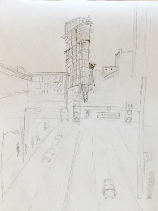
 Since this is a user manual book on how to learn to draw buildings and landscapes, I decided to try out the one point perspective sketch by doing an on-site drawing. Equipped with the book, a sketch paper block and two HB 2 pencils I went to Gastown. I chose Henriquez Partners Architects’ Woodward’s Building as my subject—it is one of my favourite buildings in Vancouver and is easily recognizable though its triangular Flat-Iron shape.
Standing on the pedestrian bridge over Cordova, I placed my horizon line at the top of my sheet, my vertical line crossing the horizontal line and drew my diagonal lines towards the vanishing point, in keeping with Craig’s suggestion. Having built the base of my perspective, I had a solid graphic framework to draw the Woodward’s Tower, and add silhouettes of the surrounding buildings, lights and pedestrians. After about 20mins, this was the result:
A great outcome for someone just learning how to draw…and a testament to the sound advice shared within Draw It!
Although its 5.75″ x 8.25″ dimensions makes it a great carrying size, at 1.27 pounds, I found the book rather heavy (in comparison, my blank notebook that I always carry with me, that only weighs 0.78 pounds). Personally, I found that this made it a bit difficult to carry around the city as suggested by the author. I also found that the stitch binding, although beautiful visually, made it difficult to keep the pages open without having to hold them down.
Having said that, Draw It: Tools, Techniques, and Methods is a very informative book with very effective lessons. The different levels of difficulty make this drawing book suitable for beginners who would like to learn the basic techniques of drawing as well as intermediate or advanced artists who are looking to refresh their techniques. Regardless of your level of skills, drawing is always a learning process and should be, above all, a fun exploration. With this in mind, Draw It is certainly a worthy guide on your graphic adventure.
***
For more information, visit the ORO website.
**
Ulduz Maschaykh is an art/urban historian with an interest in architecture, design and the impact of cities on people’s lives. Through her international studies in Bonn (Germany), Vancouver (Canada) and Auckland (New Zealand) she has gained a diverse and intercultural understanding of cultures and cities. She is the author of the book—The Changing Image of Affordable Housing: Design, Gentrification and Community in Canada and Europe.


