
Inserting new structures into older urban environments can be tricky. The rhythm of the street and its storefronts, sidewalk width, building height etc. all play a role in the success of any new building. But then, despite the best of intentions from the planners, it fails at a certain level.
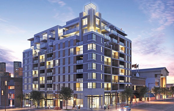
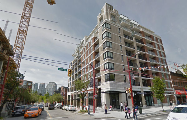
The Keefer Block at the corner of Main and Keefer, shown above, is a good case in point. The building has been designed to acknowledge its location with a lighter coloured brick element to turn the corner, topped with a large lantern and a corner entrance for the retail. Nice.
And then the retail client ignores it. Here, Starbucks blocks the corner entrance with tables and chairs – a small sign says ‘use other entrance’ – and a further storefront is taken over for storage and back of house uses.
Advertising for the Keefer Block featured all of the interesting retail in the surrounding neighbourhood and I’m sure, in the planner’s eyes, there were visions of interesting small-scale retail reinforcing the existing pattern of the street, but instead we got an essentially dead chunk of sidewalk—though through no fault of their own, the coffee company can’t put seats on the sidewalk.
This is where the concern lies as we see development in an area as sensitive as Chinatown: vision and reality end up being two very different things.
On the Keefer side of the building, more dead space is created because all of the envisioned retail space is eaten up by a generic restaurant which only opens late in the day. To top it off, the new neon sign for the restaurant is virtually unreadable from the sidewalk, due to its placement—let alone the lousy typography.
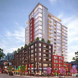 But this is not restricted to just one building. Across the street, Westbank’s 188 Keefer St. project suffers from the same problem.
The project promoted itself as “taking inspiration from the vibrant Chinatown neighbourhood [with] contemporary amenities, mixed-use retail and services at street-level…” Cool.
Illustrations of the proposed building showed active storefronts and a lively signage program. In reality, we got a street-killing bank branch that eats up most of the retail units on the Main and Keefer corner. And much the same thing will happen with the Bosa development, to the south of the Westbank project.
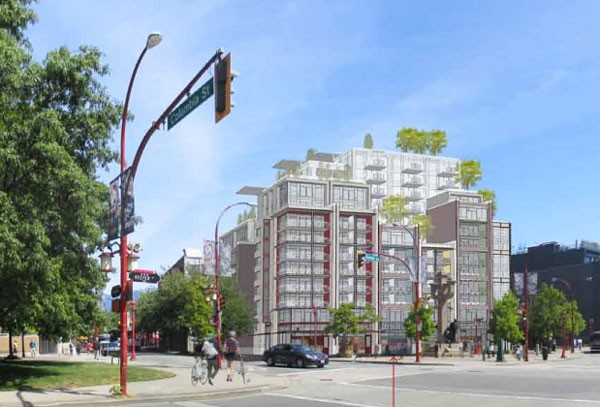
The debate over 105 Keefer at the bottom the street is interesting and very important. The height is a concern given the surrounding neighbourhood and proximity to the Chinese Classical Garden and there is the question of what amenities the development will return to Chinatown. Most important is how this building will relate to the surrounding neighbourhood, and like its Main Street counterparts it’s going to be the details that matter.
The developer is worried and has pulled out the stops. The proposed building is surprisingly detailed for a project only going through its first hurdle, a rezoning. Previous versions of the proposal got a bit silly when the drawings showed that the colour scheme was inspired by a Chinese film. Really?
Unfortunately, the architects have decided to go all out on the Chinatown character by “borrowing with both hands” as a design professor once observed, elements from the historic heart of the district. But what the developer and architects don’t understand is, if you are going to develop in Chinatown, understand the neighbourhood and get under its skin, don’t just slap on some character.
The revised building, according to the developer in the Vancouver Sun, has the “look and feel, the materiality, the detailing is much more sensitive to Chinatown [and] the retail’s been rejigged. It’s all 25-foot increments, and it’s conducive to what’s found elsewhere in Chinatown.”
The first problem, however, is how those 25-foot increments are going to be ensured when the next bank, generic restaurant or other large retail use comes calling. As we’ve seen, the design intent and reality are not the same.
And then there’s the character question.
The architect chimes in with the project’s “enhanced Chinatown character. We’ve put part of our building adjacent to the (1909) Chinese Benevolent Society building, and compared items. You can see (we have similar) recessed balconies, the 25-foot bay modules, the brick differentiation. You can see the pattern on the balcony guardrails, and the patterning on the window mullions behind. You can see the colour in the recesses of the balconies. You can see the parapets that extend above the principal parapet in front. The cornice line, you can see the two-storey expression at the ground floor with the retail. All of those things are directly informed by the Chinatown character.”
But what we’ve ended up with is a pastiche of bits of Chinatown’s unique society buildings pasted onto a condominium, without understanding the origins and purpose of what those buildings represent. Chinatown’s character is not the recessed balcony, despite the City’s own design guidelines for the neighbourhood. It is the cumulative affect of a wide range of architectural styles, eras of development from the early 1900s to the 1970s, and shops and services. There are only a handful of balconied buildings in the neighbourhood and every one of them was built for a Chinese society. No other building in Chinatown had a balcony.
The style originates in Guangdong province as a house form, it was adapted by various colonial powers, notably the British, as office and commercial buildings and brought here as an expression of both the home away from home and an investment for the society members.
The balcony represents the most important part of the building and, in the early buildings on Pender Street, there was just one balcony, which recalled the ancestor halls found in the clan areas back home. As later buildings had more uses, additional balconies were created. The combined Wong’s Benevolent Society building on Pender had a school on the first floor and the assembly hall on the top floor, similarly the Chinese Benevolent Association (CBA) had the Chinese hospital on the first floor, the CBA’s assembly hall on the second floor and a national organization on the top.
A few of the buildings were adapted from earlier structures and had the assembly hall added on top of the original building.
The society buildings have an impact far greater than their numbers, simply because of their rarity. Borrowing the form without function and using it as a style choice takes something essential away from the original. The society buildings need to be highlighted and stand alone for their uniqueness and not be lost in a sea of cheap knock offs.
105 Keefer is proposed for a site that was home to a Chinese theatre, a timber yard, wharves and the Vancouver Gas Company on the edge of False Creek. The building should draw on the past uses of the site, its unique siting and be the best possible development in Chinatown, not just another vague, awkwardly contextual building that offers no real value to the community. As UBC professor Henry Yu says “You can do amazing things with that site. It’s not being done with this.”
 Development happens. But for historic areas, or even just the interesting and odd places we have, throw out the rule book, find a way for the quirky to survive and provide space for future quirkiness.
***
See – http://topofmydesk.com/2014/12/24/oh-just-a-little-bit-of-change
Original Vancouver Sun story here – http://www.vancouversun.com/business/controversial+chinatown+proposal+rejigged/11438334/story.html#ixzz3waB0hOQr
**
John Atkin is a civic historian and author who organizes and conduct tours for groups and individuals. John has explored Vancouver like few others have and offers an interesting and offbeat insight to the city’s architecture, history and neighbourhoods. He has created, and conducts, a number of unique and popular walking tours throughout the City of Vancouver. You can visit his website to his tour schedule.

One comment
Great piece by John Atkin. So true of many areas of the City as well as Chinatown.
Want to see how he would write about Peter Cardew’s elegant mid century modern building next to the proposed ghastly Jenga building that looks like it will gobble up his smooth iconic building.
Where are these folks coming from? Ruining our smashing Vancouver buildings with supposed “stararchitecture”?