This article is a continuation of the editor’s experiences in urbanism from Montreal and Winnipeg during his summer visit (previously discussed here).
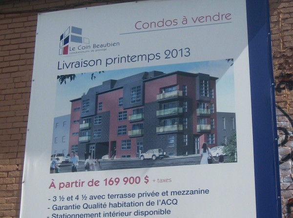
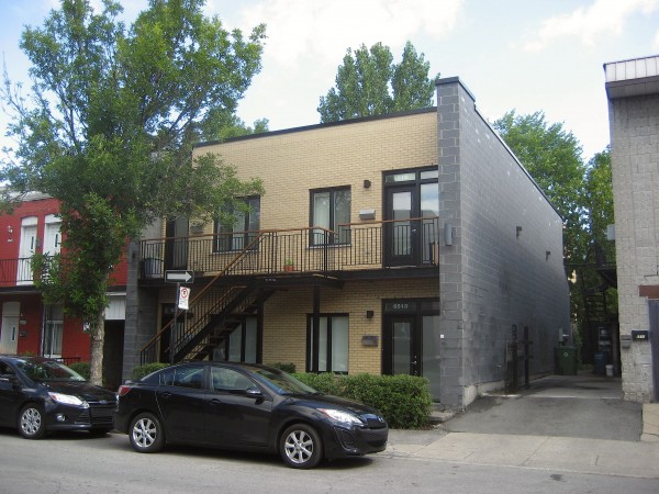
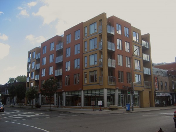
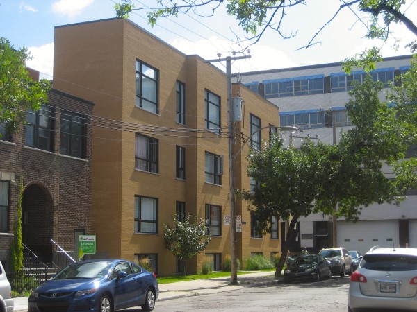
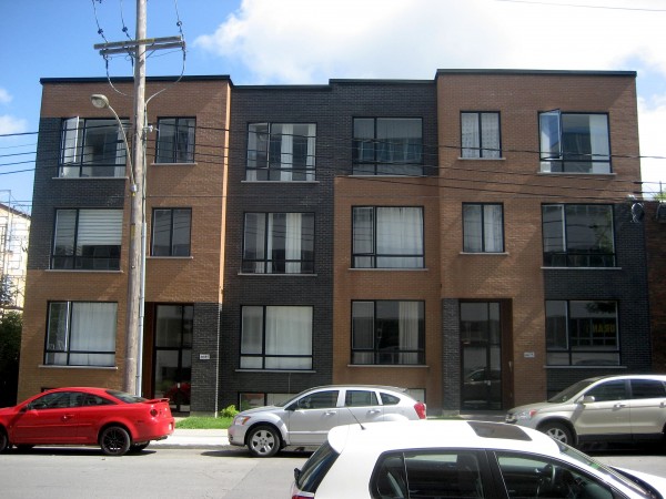
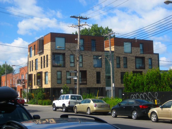
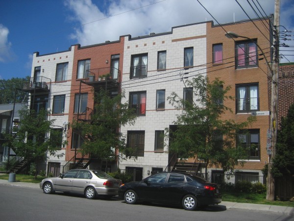
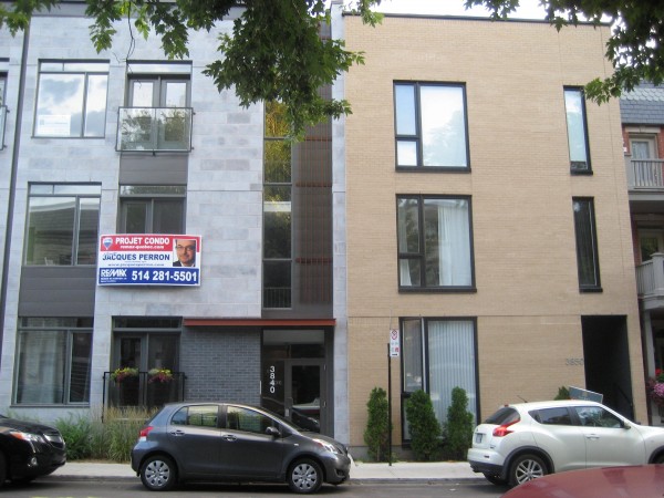
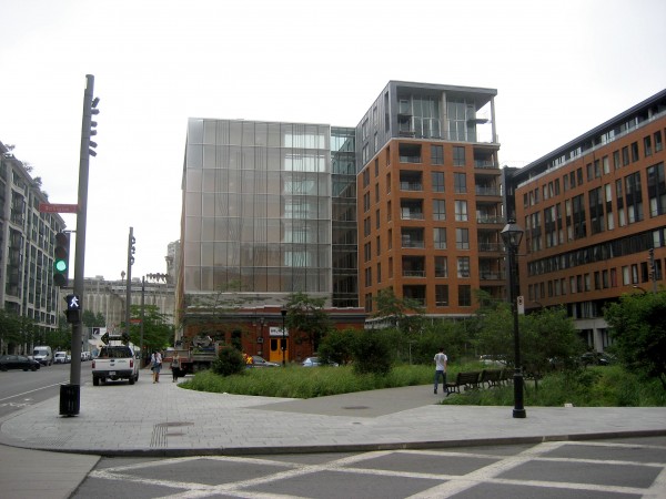
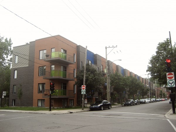
Contrary to popular belief, Montreal and Winnipeg are experiencing real estate booms with condo and apartment developments rapidly changing the character of their inner cities for better and worse. Despite the rent controls and cheaper/slower market, the design standards for new multi-residential complexes in both Montreal and Winnipeg are consistently higher in comparison to those found in Albertan cities. The following photosets showcase typical, low-quality buildings (and some higher) recently constructed in Montreal (Part I) and Winnipeg (Part II). I hope that the housing types and forms displayed here can aid future discussions on the state of urban design in Edmonton.
What do you think of these buildings? Are they relevant in Edmonton’s context?

10 comments
Relevant in Edmonton’s context? Certainly. Though in how many places could they actually be built? Most of these buildings are very urban in style, with very small or no front and side setbacks from the street. Edmonton’s default zoning for multi-family developments requires large setbacks from the street (usually filled in with lawns that no one uses).
Some of the examples above look like they were designed quite economically. Note the cinderblock side wall on your first example. Yet when it comes to the face it presents to the street, it is urban, sociable, and reasonably attractive.
This…this is exactly what I want to see eventually populate Queen Mary Park’s western edge along 119 Street/108 Ave. Comfortable, but with a clean urban/industrial feel. Zero lot line residential can go a long way in tying-in to existing commercial areas, particularly where the street wall is weak along pedestrian-oriented corridors.
Tom hit most of what I was about to say –
Noticed that each of the samples that you chose are only perhaps 1 metre or 2 metres setback from the street, which I think that is the real strength here is that they engage the street and really pronounce the facade of the building, all for the most part which are fairly simple and orthogonal, there’s nothing that screams signature architecture about any of these. Maybe a developer could get those built in the right area, but currently they must be up for a fight against development bylaw which is a huge deterrent.
These are the kind of buildings that I think are relevant to any urban context – though I think for the timebeing would replace aging stock in the inner ring of mature neighbourhoods here.
For perhaps a multitude of reasons, be it a conservative taste of Edmonton or a conservative nature of a risk averse developer, a lot of the multi-family I see here downtown has a neo-traditional feel to it, rejecting its urban qualities and masking them with an old country house type of feel. You could streetview this address if you’re unsure of what I’m picturing in terms of the multi-family that gets built: 10101-10175 111 St NW
Perhaps the brutal concrete we got downtown in the 70’s, or the rural / urban dichotomy of the prairie. There’s a feeling among a bunch of the multi-family here that it should present itself architecturally as a country house, or be setback deep into a faux urban nature of lawn and trees.
Definitely changing among the younger generation though. The market here feels slow to adapt to this at least among the bigger players. Some good smaller scale infill is hopefully seeding the precedents that others will soon follow.
Funny enough, I personally love brutal concrete from 70s architecture which helped me appreciate the more modern designs… rather than a reactionary return to neo-traditionalist designs.
I think all these buildings are rather ugly, but I appreciate the comments from others here (which make me dislike them a bit less). I’m probably looking for some colour too; every one of these ‘cold’ brick, concrete & glass boxes could use more, imo, especially during our sometimes brutal winters.
Indeed, the majority of these photos intend to represent a range of low to medium quality buildings that you can find in Montreal. There are only two buildings there (photos 1 and 5) that I would consider living in.
The point I am trying to make here unfortunately is that the design quality of many buildings in Alberta is even poorer than what is being posted above. I debate though if setbacks really do influence the look of the building.
They are relevant and could easily fit in well here in Edmonton as infill projects. Are they all award-winning designs? No, but they show you can build things in less-than-iconic locales and get something far different from the Venetian on 112th St or the like. Places like Oliver, Westmount, Strathcona, Alberta Ave, and Parkdale would benefit from this sort of infill over the typically Edmonton infill.
Although I will give kudos when due, Edmonton has improved in infill projects over the last 5 years. It just sucks to see that we’re in a special place in that there is high demand for new projects with the boom times, yet we continue marching to the beat of mediocrity, for the most part. Winnipeg does exceptionally well for new urban construction as a Prairie city.
I definitely feel that context of these buildings meets the needs of redevelopment in Edmonton. I just wish that the designs be more bold, or that they related to the area. We have let too many cookie cutters dominate our neighbourhoods, which intern makes it harder to integrate and convince communities on infill development into older neighbourhoods.
Well thats my feeling anyways…
I prefer concrete modernism / brutalism to the neo-traditional that you see here, but also think that there’s been a number of them that have been done really poorly, and that’s provoked a general rejection of high-rise concrete overall amongst Edmonton. That’s definitely reflected in the real estate prices of older highrise concrete construction here.
Regardless, I think the buildings would matter less if the streetscape is well defined and pleasant, something that is achieved and accepted more often with midrise construction versus highrise.
Don’t think that setbacks define the look of the building, but a continuous streetwall on both sides of a narrow street defines space – the type of thing admired in rowhouse London, on streetcar high streets in attractive parts of Toronto, New York, etc.
I am a Brazilian Architect and Urbanist, former professor of Architectural Design, living in Edmonton since 2008. I have no experience working with Architecture here but I would like to say a few things about some some of those pictures.
Why we see, here and in Brazil, lots of buildings (pastiche, cliché, sameness) flourishing around more and more? Basically for two reasons, I believe. Allow me to run some theoretical risks and speculate about some possible solutions.
First, the city needs better construction codes. Architects must work together (I know, that’s almost utopic) and help the city (province?) to create better construction codes.
Second, increase the number of Architects working for construction companies, and/or find a way to make some Architectural Offices more interested in work closely to construction companies (and vice versa) to help them to increase their awareness about Architecture. It’s important to help constructors and Engineers to understand that good Architecture is not just about better buildings and quality of life, but it’s about more profits too (no $$$, no innovation, no change).
Concerning about Architecture, there is a huge difference between brutal concrete and brutalist Architecture. The simple use of big, blind and dull masses of concrete without exploring volume and light will not create brutalist Architecture, just brutal buildings. I am not defending brutalist Architecture, mostly because most of that is in the past (even that I really like Tadao Ando).
Small lots are not an excuse for bad buildings. We just have to look at the great Architecture developed in Japan (and some in Europe) in small (and ridiculously small) lots to see how can be possible to have creative Architecture and variation, without having pastiche after pastiche. Lots of ‘new’ buildings that we see in Edmonton nowadays look like if some proto rationalist buildings were transferred from the Weimar Republic and reimplated here in Edmonton after a extreme process of postmodernist make-up.
One thing that I need help to understand is why a place that see no green for 8 months make such very limited use of colors. I understand that are cultural factors influencing the way that most of people can deal with color, but there is a natural need for color and the proper and extensive use of color is necessary in Edmonton thanks to the long winter. That’s not just about taste and culture, it’s about health.
When I see the buildings above I feel the impulse to say that some of them are good, because they are not bad in fact. The problem here in Edmonton today is that we see practically the same buildings replicated everywhere in Edmonton, with just very small variations. We buy on franchise shops, we eat on franchise restaurants, we live in franchise buildings, we receive francise education, we play francise toys and plays, we have francise thoughts. It’s a bundle nightmare.
The existence of a few of the same is not bad, but we cannot develop the proper sense of place if we cannot differentiate one place from another. There is no sense of scale or place any more.