
La transformation d’une rue de Montréal en décor de cinéma est peut-être anecdotique, mais toujours un peu impressionante. L’année dernière, une équipe de tournage avait transformé le Quartier Chinois de Montréal en celui de New York pour un film d’action de série B.
Cette fois-ci, je suis tombé par hasard sur le plateau temporaire du film Funkytown, un film québécois mettant en vedette Patrick Huard et se voulant une sorte de 54 québécois, se déroulant dans et autour de l’ancienne boîte de nuit montréalaise Le Limelight (1254 Stanley). Situé au deuxième étage de Chez Parée, son local est maintenant occupé par La Boom, une autre boîte de nuit.
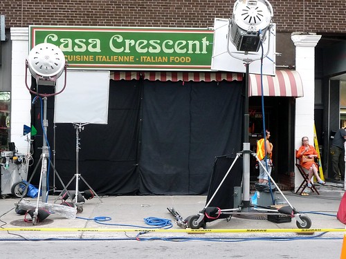
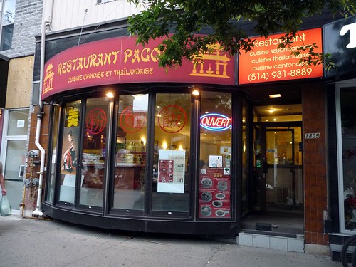
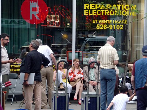
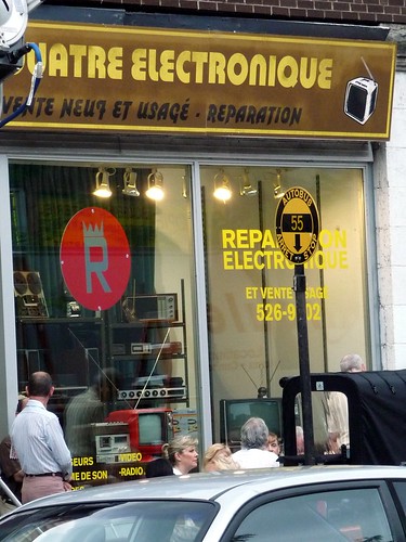
Pour les besoins du film, on a transformé le restaurant Le Paris en restaurant Italien “Casa Crescent”, avec les inscriptions très pré-Loi 101 “Cuisine italienne” et “Italian Food” à taille identique. Le restaurant où l’on avait soupé, le Prêt-à-manger, est devenu Restaurant Pagoda, tandis qu’un magasin de vêtements est devenu soudainement un magasin d’électronique rempli de tévés rétros.
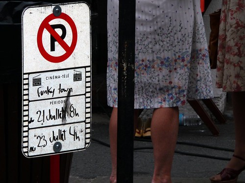
Ce sont, comme le récit du film (inspiré de personnages réels, semble-t-il), des commerces fictifs. La rue, ou boulevard plutôt, qu’on a voulu recréer est sans doute St-Laurent, à cause de ce panneau de la 55:
Les tournages ne sont pas rares dans le centre-ville même de Montréal. On profite par exemple de l’architecture particulière du Vieux-Montréal, des bouts néo-classiques et néo-renaissance pour nous faire croire qu’on est dans une ville de la côte Est américaine. L’édifice de la Sun Life qui donne sur le square Dorchester a déjà été un siège des Nations Unies pour The Art of War avec Wesley Snipes.
Les institutions éducationnelles n’y échappent pas : le Collège Jean-de-Brébeuf a servi au film Battlefield Earth basé sur le livre du L. Ron Hubbard avec John Travolta, tandis que l’Université McGill a accueilli Katie Holmes et Abandon, malheureusement un autre navet.
8 comments
I walked by the set as it’s on my way home from work — spoke briefly with a production assistant.
Me: “You know all the fonts on these signs didn’t exist during the timeframe this movie is supposed to be set?”
Her: “Yeah, I know…” (shrugs, but in a way that indicated that some higher-up didn’t care and it was a point of mild frustration)
I mean seriously, people. How hard is it to find archival photos of what Montreal commercial signage looked like in the 1970s? Heck, if you go to any east-end neighborhood you can still find tons of 1970s signage still in use (vacu-formed, hand-lettered or painted, etc) to use as a template.
Signmakers certainly did not have Arial (commissioned by Microsoft in the 1990s for Windows), the “R” is a squashed version of Bank Gothic (also 90s), the italian restaurant sign is in Arnold Boecklin, which dates to 1901 but was mostly a poster font…the electronics store sign is a mishmash of Blippo (which was a pretty avant garde font for the 1970s and wouldn’t have been used like this) and a “brush” font….and stick-on laser-cut vinyl lettering (which all these signs are made from) simply didn’t exist!
More realistic would have been “handmade” swash fonts like Goudy Fancy, Jolly Roger, or Steiner Special (all available at myfonts.com).
I love that old bus stop sign. I think we changed to the familiar blue in 1970 when the Montreal Urban Community (MUC)(a not so perfect set up that looks like sheer genius in retrospect of the mega city flop) was formed, but I could be wrong on that. My other guess would be when the Metro opened
The autobus stop sign was the first thing I noticed in the photo!
From what I recollect, this is the second version of the black and yellow autobus sign.
In Montreal Tramways Company times, a vertical white stripe approximately five feet long surrounding a pole indicated a streetcar stop.
When Autobusses began to be operated, an open-centred round cast iron sign was bolted to the pole at the Autobus stop, one of which is shown above the Inspector in this photo on Atwater.
http://www.stm.info/en-bref/882.htm
This Autobus would have three colours, Silver/Red/Toffee brown
http://busdrawings.com/Transit/Quebec/Montreal/
In 1951, when Montreal Tramways Company became the Montreal Transportation Commission, a new Autobus sign was developed, ( along with the ‘Impaled Arrow’ logo ) a flat sheet-iron Yellow disc which did NOT have the cross black stripe with the ROUTE number as shown in above photo.
In the first version of the Yellow autobus disc, the route numbers were around the outer rim.
Anyway, the familiar Yellow sign was replaced in 1968 or 1969 when the Autobusses began to be painted Blue/White, as were the Metro trains from new.
http://busdrawings.com/Transit/Quebec/Montreal/montreal5164.jpg
http://busdrawings.com/Transit/Quebec/Montreal/montreal15014.jpg
The last Yellow Autobus sign we knew of was in Pointe St Charles near the CNR shops c. 1972.
I located one of those cast iron Tramways Autobus signs on eBay in Lachute, and a friend purchased it, costing over $100. He has several of those Yellow discs he acquired in second hand and antique stores in Montreal.
That is so interesting about the fonts, AJ. It’s true, we are mostly ignorant about the evolution or invention of fonts through the years. But nothing situates a period or era more than a vintage font. I’d love to hear more.
Mark Simonson, a typographer, catalogs font anachronisms:
http://www.ms-studio.com/typecasting.html – the original article
http://www.marksimonson.com/category/Son+of+Typecasting/ – his blog category
Simonson notes that many times, retail and architectural signage was custom-made, hand-painted etc, so they’re not “commercial fonts” you can buy off the Internet. Certainly in the 1970s, even with phototypesetting being relatively common, most independent restaurants and stores would have engaged the services of a signmaker.
All you have to do is go to an older or poorer neighborhood in Montreal — say, Hochelaga-Maisonneuve, Rosemont, or Verdun — to find examples of 60s and 70s period signage. I’d say the easiest signifier was that there tended to be more “dimensional,” vacu-formed plastic signs that were then painted; there’s dozens of casse-croutes with those crude illustrations of a burger, hot dog and fries where one colour has faded over time, leaving them all an unappetizing blue-green shade, for instance.
Since Ontario never had sign-language-laws, there wasn’t the huge rush to replace all the signage in the 1970s, and so you see a lot of period stuff — quite a lot of Bookman Swash for things like hair salons and florists, for instance.
Sounds like a great film idea, have always thought it would be cool to experience Montreal in the 70’s, do they need any extras?
Bless you, AJ. I can’t count the times I’ve winced at anachronistic font choices in movies.
On dirait que plusieurs éléments ne fittent pas avec la période mais ça lair cool pareil.