
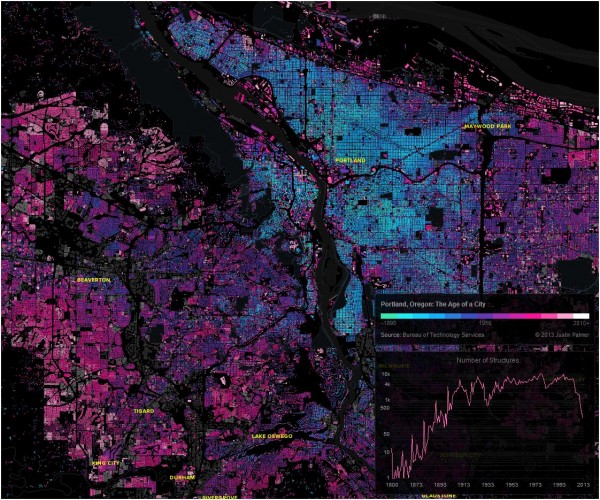

A brilliant map created by Portland resident, Justin Palmer, shows the colour-coded ages of 544,033 buildings in the Portland metro area of Oregon.
The project, titled “The Age of a City” draws its information from a publicly available dataset that pairs building locations with the construction dates. TileMill was then used to add colour to the map: the aquamarine hues show buildings built in the 1890s and onwards, purple shows buildings from the 1950s, and pinks are used to show buildings built from the 1970s while white represents the most recent years.
The creator points to some clear patterns that can now be easily observed; some are not too shocking but still fun to see mapped, while others reveal old trends in the city’s evolution and spark some interesting questions:
- The map shows that early development was planned along historic streetcar lines and, later, around highways.
- The dream of the ’90s is still alive in 75,434 structures. The 1890s haven’t fared so well, with only 942 structures still standing.
- The busiest year was 1978 with 10,265 structures listed.
- It looks like ’50s-era housing development relied more on the grid system, than say, the ’80s and ’90s where the cul-de-sac was seen more often.
- When the recession hit in 2008, you can see a sharp decline in new structures starting in 2006.
How can Canadian cities map their data to reveal similar trends? How can these visual mapping tools be used to plan for the future?
Via Architizer and The Atlantic Cities
Urban Planet is a roundup of blogs from around the world dealing specifically with urban environments. For more stories from around the planet, check out Spacing on Facebook and Twitter.