[Editor’s Note: This article written by Spacing Vancouver Editor-in-Chief, Erick Villagomez, was recently published in the August edition of Canadian Architect and we extend our heartfelt gratitude to Editor Elsa Lam and the rest of the CA staff for generously allowing us to republish it for our Spacing readers. We encourage readers to also visit the Canadian Architect website here, to read the article in tandem with the many wonderful photos that accompany the original piece.]
Canadian telecommunications superpower TELUS is no stranger to iconic buildings and pushing architectural limits. With its boot-shaped Brian Canfield Centre and the William Farrell Building Revitalization (that sports the country’s first double-skin façade), the company’s portfolio of strong architectural pieces is meant to reflect boldness and innovation. The most recent addition to its growing collection—TELUS Garden—aims to follow suit.
The ambitious project, located in downtown Vancouver, brings together developer Westbank, led by Ian Gillespie, and Henriquez Partners Architects (HPA), led by Gregory Henriquez, FRAIC. Although Westbank and HPA have worked together a number of times over the past 15 years—including on the high-profile Woodward’s redevelopment—they might seem an odd combination on the surface. Gillespie is a developer with a seemingly insatiable appetite for creating architectural landmarks: a repertoire that includes Shangri-La hotels in Vancouver and Toronto, partnerships with starchitects Bjarke Ingels Group in several cities, and, most recently, a planned tower with Kengo Kuma. HPA has its own following as a firm that is focused on the ethical responsibilities of the profession towards the common good.
Yet, in many ways they complement one another, as a duo that can balance form and substance, respectively. And based on the recent accolades for TELUS Garden, including a Lieutenant Governor’s Award, it would seem they hit their stride on HPA’s first office building.
Telus Garden recently garnered LEED Platinum certification, due in part to its many innovative technological and mechanical systems. These include a district energy system that recovers energy from a neighbouring telecommunications building, Vancouver’s largest solar panelrooftop array, and an incredible integration of passive solar and heating systems, including radiant ceilings. From this perspective, the building speaks to the power of early design-stage systems thinking. Yet, closer examination reveals a building that, at key moments, expresses the contradictions and dichotomies of its team members.
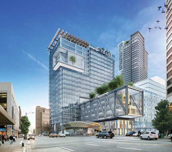
Located in downtown Vancouver, the million-square-foot complex is adjacent to the Busby-renovated William Farrell Building, filling in the rest of that city block around the existing Kingston Hotel. One of its most prominent elements is a 22-storey office slab that addresses West Georgia Street, the business spine of the downtown core. Also a part of the office building, sitting at a 90-degree angle to the slab, is a shorter seven-storey bar that frames a notch of open space at the site’s north corner. The complex finally includes a separate 47-storey residential podium tower at the block’s south corner, facing the quieter intersection of Richards and Robson Streets.
From the air, the site planning reflects the contextual sensitivity HPA is known for. Masses, voids, and land-uses are where they should be, speaking to the larger urban context and addressing West Georgia as a significant ceremonial axis. This is very much in line with Baird/Sampson Associates’ seminal 1982 study, Greening Downtown: Design Guidelines for Georgia-Robson Corridor. Added to this is the thoughtful desire to activate an existing laneway connecting Robson to West Georgia as a mid-block pedestrian spine, through the incorporation of small commercial frontages that spill out into it. Once the public art is installed—a series of sculptural lanterns for the alley by Turner Prize-winner Martin Boyce—this will be a unique contribution to Vancouver’s public spaces.
In three dimensions, however, the 47-storey residential tower overshadows its immediate Robson Street neighbours, despite a strong attempt at breaking down the massing and a well-scaled podium. Conversely, the 22-storey office slab is quite modest in comparison to other towers along West Georgia. Surely, the heights were a consequence of an economically driven mindset, reflecting the city’s outsized market for residential real estate.
The most prominent aspect of TELUS Garden is the seven-storey section of the offices—in particular, a large four-storey square extrusion that pierces the office slab and thrusts over part of Richards Street on one side, and Seymour Street on the other. Located three storeys above street level, the Bar (as it is called by the designers) is the most aggressive architectural move in the project, effectively taking up public right-of-way for private purposes.
The gesture is reminiscent of Thom Mayne’s cantilevered projection atop the University of Toronto Graduate House. However, where the latter has a larger urban logic and contributes meaningfully to the surrounding fabric—both in its light materiality and as a strong gateway element for the campus—the rationale behind the TELUS Garden gesture, and its relationship to the “good” of the city at large, is much more ambiguous. This leaves it open to interpretation.
At best, it can be seen as a playful architectural element that whimsically critiques Vancouver’s regulation-heavy context, and questions what many view as an overly conservative architectural and planning environment. At worst, it acts as a kind of architectural advertising through built form. Architectural showsmanship plagues many of our cities, but this instance is particularly dangerous in setting a precedent for encroaching into the street. By doing so, it overturns longstanding public realm practices that have made Vancouver a model
of successful urbanism.
Many observers in the local design scene are baffled by how the protrusion of the Bar into the streets was permitted without a larger discussion, especially given the many years the City has spent developing sensitive public realm guidelines, instituting an intelligent Urban Design Panel, and putting a diverse Development Permit Board into place. Regardless, it is clear that the decision requires a critical re-examination of the nature of public space in the city, and under what circumstances one could (and should) infringe upon the public right-of-way.
In contrast to its cantilevered faces, the view of the building from along West Georgia Street is more subtle and convincing, particularly from the west, where the dominant flow of traffic originates. Building on the existing rhythm, proportions and materials of other structures along the corridor—including the skewed Scotia Tower and Miesian TD Tower—the pristinely glazed narrow side of the TELUS office slab fits right in with the adjacent sentinels. A wonderfully subdued and well-scaled three-storey projecting accent, sitting between the 18th and 21st floors, adds delicate personality to the building.
Those who happen to glance westward along West Georgia may also notice that the accent sets up a big sibling-little sibling architectural conversation with Westbank’s Shangri-La Tower, five blocks away—the latter has a similar, albeit less well-proportioned, detail. This is HPA at its best, sensitively situating architectural pieces and elements that delightfully speak across scales of urban experience in a meaningful way.
Looking to the entry plaza, one also notices that the height of the seven-storey volume (which includes the controversial Bar), takes its lead from the historically significant Hudson’s Bay Building that lies kitty-corner to it. The result is a nicely scaled outdoor room on West Georgia. The effect is somewhat marred by the size of a gracefully arcing glass, steel and wood canopy sitting within the void—beautiful in itself, but too large relative to its enclosing boundaries. A tightness and feeling of visual clutter result. Here, the well-meaning desire to add a scalar element to meet the street perhaps found an overly exuberant formal expression.
The long east façade of the office slab is a relatively monotonous wall of glass along Richards Street. Fortunately, the care with which Henriquez articulated the residential tower—in particular, the saw-toothed façade of its podium—offers a good contrast along this edge.
The project’s most consistent expression is in the interiors for the TELUS offices, where office of mcfarlane biggar architects + designers (omb) pushed standard workspaces above and beyond the norm. TELUS occupies the entirety of the Bar and nine levels of the tower, with the bulk of its operations accommodated on the second through ninth floors, and executive offices on the upper two levels.
As one would expect, the heart of the interior design lies within the Bar, where omb has reinterpreted the cantilevered language of the building proper to fit out the multi-storey “Sky Gardens” that overlook Seymour and Richards Streets. Glass- and wood-walled meeting rooms float above raised gardens planted with live trees and shrubs; these are the project’s most dynamic interior spaces. The design of these “Sky Boxes”, taken in conjunction with HPA’s wise decision to maximize the use of clear glazing throughout the shell, allows the experience ofmerged public and private realms to resonate strongly here.
The accessible and simply landscaped roofs of the Bar—designed as a collaboration between omb, HPA and PFS Studio—take this even further, merging interior activities and exterior spaces in a simple, meaningful way. The east-facing roof deck along Richards Street even includes a small organic garden whose products are donated to the local Covenant House, integrating a noble desire to give back to the community.
A variety of solo and collaborative spaces for contemporary office workers are interspersed throughout the floorplates, ranging from standing mobile workstations to formal meeting rooms and lounges, and offering varying levels of acoustic and visual privacy. A palette of natural materials, clear layout, thoughtful lighting, subtle accents and well-curated art fuse to create an unexpectedly modest working environment: one that speaks very well to an integrated design approach and to TELUS’s vision of innovation.
It is a design truism that one should embrace missteps as a part of the design process. This can certainly be extended to ongoing developer-architect relationships, as the partners learn each other’s strengths and weaknesses on a project-by-project basis, and work to calibrate their skills in the future. As the first office building by Westbank and HPA, one can certainly take away many positive lessons. Given the down-to-earth nature of HPA, one is certain that both parties will also be mindful of improvements that can be made in the future: particularly around bringing more awareness to the long-term implications of design decisions on the public realm. Certainly, the decision by TELUS to approach the duo is well-justified, and the company’s commitment to delivering courageous, important works of architecture and design should be applauded.
Ultimately, TELUS Garden remains one of Vancouver’s most important recent projects, as the bumps above Seymour and Richards serve as reminders to be vigilant about critically assessing what we hold dear about the public realm. To many, they will also recall a (hopefully brief) moment when promotion was given too much license over public interest.
***
To read the article in tandem with the many wonderful photos that accompany the original piece, visit the Canadian Architect website here.
**
Erick Villagomez is one of the founding editors at Spacing Vancouver. He is also an educator, independent researcher and designer with personal and professional interests in the urban landscapes. His private practice – Metis Design|Build – is an innovative practice dedicated to a collaborative and ecologically responsible approach to the design and construction of places. You can see more of his artwork on his Visual Thoughts Tumblr and follow him on his instagram account: @e_vill1.


