
By the time you read this, HRH Prince Charles will have already cut the ribbon on the first phase of the $110.5 million architectural rejuvenation of the National Arts Centre (NAC), in Ottawa, Canada. Other reviews will have been published, and images of its shiny new atrium will have been broadcast across various digital platforms. The building everyone loved to hate in Ottawa will now be a hometown favourite, and the city will laude and be lauded for it over the coming months.
These were but a few of my predictions for the reception that the new NAC would receive. Yet leading up to this much anticipated ribbon-cutting, talk of modernist heritage, the ideologies of Brutalism, and Canada’s architectural identity and legacy in light of our sesquicentennial, all become part of the conversation, as questions were asked about how best to bring one of our nation’s most important cultural vessels into the next one hundred and fifty years.
Donald Schmitt of Diamond Schmitt Architects was the one to ultimately be tasked with these questions in 2011, when the project received the green light to both renovate existing interior spaces, as well as add a 60,000 square foot addition. Over five and a half years later, the centre of Ottawa is drastically changed at both an urban and architectural scale, but did we really get a legacy project, architecturally speaking?
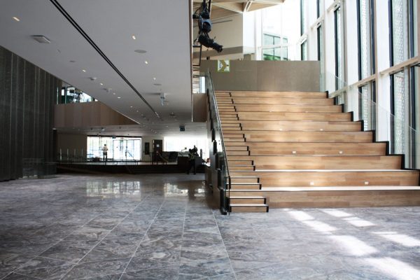
In the eyes of the NAC, and most likely much of the public, this is exactly the project that was hoped for. Large expanses of glass that lead to transparencies and natural light, and a “grand stair” that acts as both riser seating and access to the mezzanine above –complete with a catwalk, skylights, and bar-countertop-styled hand railings– the new addition checks all the formulaic boxes of what one might imagine a fashionable space in 2017 to have.
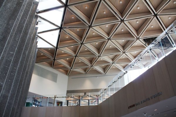
More significantly, it makes use of a very Canadian and restrained luxury of materials; from the beautiful triangulated Owen Sound quarried limestone floor tiles, to the hexagonal Douglas Fir wood ceiling coffers, and perforated, bronzed aluminum exterior fins and cladding. Additionally, many important services have been added to the building, including drastically increasing the previously desperately small number of washrooms, improving the overall accessibility of the site, and the creation of new public, educational, and event spaces.
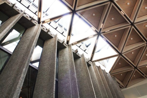
It keeps strictly to the original building’s fully-ingrained geometric design logic and detailing of the hexagon, matches its exterior proportions of the various masses of each section of the complex, and opens up the Elgin Street Façade (in addition to nicely widened sidewalks and better lighting at night), while making its northern and northwestern exposures a practice in contrast through the extensive use of glass, compared to the previous use of concrete.
Thus, it is “contemporary”, and it is “animated”, but it has all been done before.
Originally opened in 1969, a two-years belated centennial birthday gift to Canada, and designed by Fred Lebensold of Affleck, Desbarats, Dimakopoulos, Lebensold, Sise, the existing building was a brutalist masterpiece. But as this has already been detailed and discussed at length, this review will focus past this perhaps most important of questions as to whether or not the addition compliments or weakens the original design.
For the NAC was always slightly flawed. It turned its back on the city, but only because it was responding to Greber’s plan for Ottawa to turn its most important faces towards the canal. It was designed for the car, but only because that was how the buildings of the future were imagined in the 60’s. And it was dark, dramatic, and inwardly focused, but only because that was how the country was shaping its most important cultural spaces at the time.
Fifty years later, many feel differently. But did the NAC really receive something different when many of its features bear a striking resemblance and sense of copy-and-paste to other Diamond Schmitt projects?
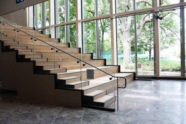
There is no question that Diamond Schmitt know concert halls. But if you look at the use of light-toned wood, glass curtain walls, feature stair, and extended catwalk, the NAC seems simply to be a stunted version of Toronto’s Four Seasons Centre for the Performing Arts, itself a highly successful building. This is most clearly seen in the “grand stair” that is meant to be the centerpiece of Phase One of the redesign. Unlike the Four Seasons Centre, however, where you are greeted by the striking stair upon entry, the NAC’s is oriented in reverse, leaving you to see its underside (which floats above a secondary stair to be discussed later), before becoming peripheral, and only finally fully revealing itself once you are halfway into the space, if entering from Elgin Street.
Additionally, while both the NAC’s and Four Seasons Centre’s stairs are positioned next to a curtain wall, meant to animate the street and allow those moving through the building to become a performance in itself, the NAC’s stair is largely obscured from the street due to multiple trees that lie in-between the building and the sidewalk, in addition to the building’s own aluminum fins that project from the façade at an angle. The space is beautifully lit and shadowed due to these features, but the dramatic animation of the interior to the exterior that takes place in Toronto is hard to image here.
But what is most confusing is how the addition claims to be responding to the original building’s low ceiling heights, which were seen as a negative design move, despite the fact that they give the brutalist structure a great sense of intimacy. It is ironic, for the proportions of the first phase of the addition are one of the most troublesome parts of its architecture.
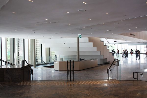
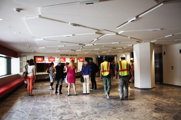
With the new main pedestrian entrance being located off of Elgin Street, an important move in the overall realignment of the site, you now enter the Centre via a multi-storey tower, officially known as the Kipnes Lantern, and meant to mimic the tower that once stood on the site when it was occupied by City Hall. However, at the ground level, you experience this vaulted space only as a single-storey room, with a surprisingly low ceiling height.
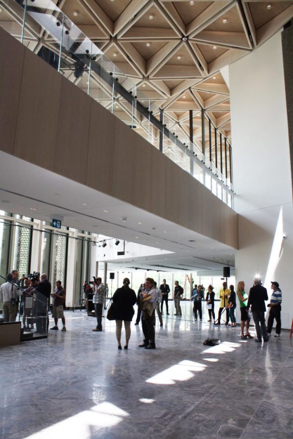
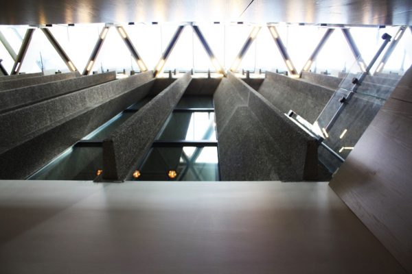
As you continue from the street to the theatre, you enter through a second set of doors into the main atrium, while remaining compressed under the low lying ceiling. Relief only comes slightly, however, as you descend four steps into the main space, which despite creating a small spatial change due to your descent (and significantly to the right of you in a narrow multi-storey space that connects the new addition to the original building, lit by skylights above), the majority of the atrium’s height is cut short by a catwalk walkway that runs the length of the space, and also borrows heavily from the Four Seasons Centre. If you then continue past the “grand stair”, which itself is open to above, the ceiling height once again drops to not much more than a standard single-storey, in an area that offers panoramic views out towards the Chateau Laurier.
This is all the more confusing, not only because it was meant to counteract the original scale of the existing building, but because it is also a space meant to hold performances. But with such low ceilings in a large majority of the new ground floor space (spaces on the upper level set open this fall show much greater proportions in the design renderings), performance types will be limited.
In addition to the heights of these new atrium spaces, the vertical circulation of the extension feels to be an after thought. While working with the challenges of an existing building that cascades down a sloped site and that originally relied on a highly terraced design, the new orientation towards Elgin results in the new atrium level coinciding with the middle of the main auditorium. As such, the original lobby space is a level below.
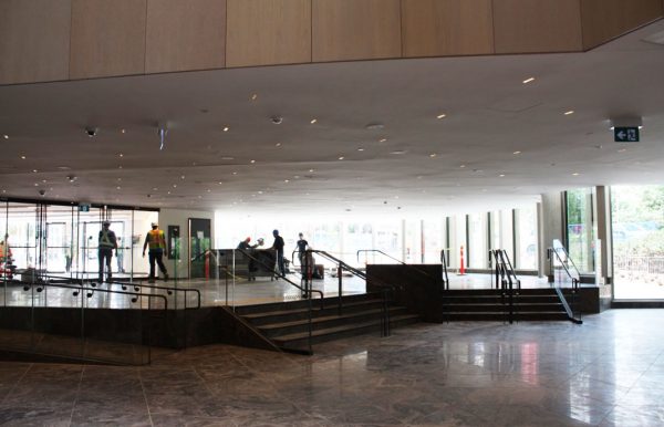
However, rather than using the “grand stair” as a way to connect the old with the new, in order to reach the canal-level lobby, one must either enter into the original building through cuts into the side of the concrete structure before taking an existing stair down into the space, or by proceeding down a secondary stair tucked underneath the “grand stair” and behind a information desk. (It is important to note, however, the importance of this design detail that creates a threshold between the two spaces, through the use of cutting through the original concrete fins).
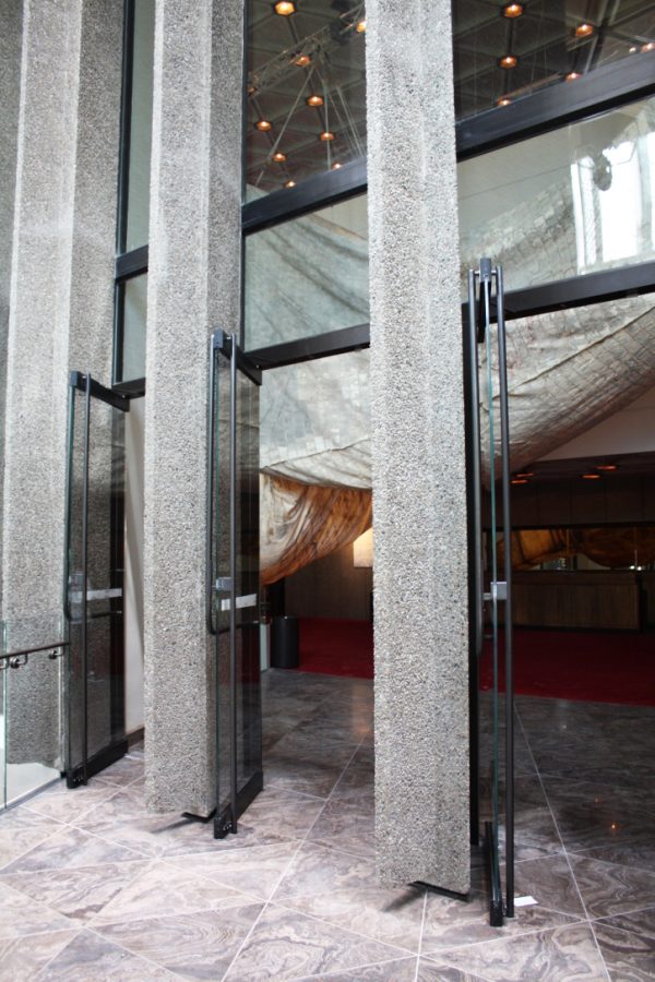
Yet, while the first route of circulation seems almost grand, the latter is perhaps the most likely to be used, as it is one of the first elements that greet you upon entering the building, at least visually. It is also this stair that will be used to reach the new, squatted box office space, which you must pass before wiggling your way down an extremely narrow hallway that leads to additional building cuts through the concrete fins and expanded washrooms. But why the box office is sunken down a storey and not at street level is also unknown, and seems to be a missed opportunity to actually encourage the purchasing of tickets.
Yet what the new addition lacks in dramatics in terms of its architecture, it attempts to make up for in its new digitally enhanced LED-lined glass panels that flank four exterior sides of the hexagonal lantern.
While only seen in its trial settings, the screens are extremely bright at night and when not being used to advertise upcoming performances or broadcast live shows from either the NAC or from across the country, and potentially the globe, they are planned to be used for national holidays with screensaver-like graphics of falling maple leafs or blowing tulips. There is also the small concern that up to 10% of the expansive screen space can be used for corporate advertisement.
The most disappointing element for the potential of this cutting edge technology, however, is that if it is in fact a performance being shown, there is little to no public space for one to actually sit and participate as a spectator, as is the case in examples such as Vienna’s opera house where a screen faces out onto an open plaza. Diamond Schmitt Project Architect Jennifer Mallard explained this was due to the tower’s “marquee” nature. But are we really interested in drive-by or walk-by theatre?
It must be said, however, that it is still too early to make any definitive judgements about the success of the building as a whole. For not only have two phases of the rejuvenation yet to be completed (both renderings and photographs of the upper level of this space show dramatic ceiling heights and views both within the space and out to the city), the public has yet to pour into the building for more than a few days or been able to inhabit it the way they see fit, and logical.
The intentions are there, and have always been. It is understandable that those governing this change wanted to create a space that seemed more approachable and open to the public through its architecture. But are glass, and wood, and staircases, and catwalks, and pop-up coffee shops, and electrical outlets enough to draw people in for an afternoon or to purchase a ticket having never done so before?
These are important question, for the renovation of the NAC is an extremely important project not only for Ottawa, but for the nation; being the largest government investment in an architectural project marking Canada’s 150, and for a Centre that claims that, “Canada is our stage”. For while some of the detailing is beautiful, such as the hexagonal coffers and polished flurry cut limestone, and with the promise of the upper levels looking to be much more interesting spatially, first impressions matter.
Overall the National Arts Centre’s architectural rejuvenation is nice enough, but it is predictable, having been done before, only better. For there is a banality and lack of originality that seems to short change what was meant to be a national space of significance and legacy.
Hopefully Phases Two and Three will change this.
One comment
Very good piece Kristen. I was hopeful that there would have been a greater understanding of the so-called Brutalist design intent when DSA was appointed (without competition) a few years ago. Some architects are not as well versed on understanding architectural history beyond material and spatial references. They don’t have architectural historians on their teams to properly approach historic/heritage buildings and places. In this case, we have a national historic site (as is Confederation Sq., Chateau Laurier etc.), yet I didn’t hear of any discussion with the HSMBC about the impact of the addition to the building’s existing values – perhaps they did deliberate about the values of the place. It’s unfortunate that Fred Lebenshold was not still around to speak to his original concept. These buildings were total-works, and that is certainly not conveyed in the addition. It takes extreme delicacy to insert a new program while also respecting the original design.