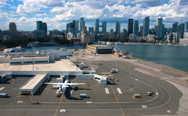
The Star‘s Christopher Hume writes that the addition of a Sobey’s supermarket to the Queen’s Quay terminal is helping wake up the “sleeping beauty” that is the Waterfront. The addition of the supermarket shows a dedication to turn the Waterfront not just into a tourist attraction, but also a neighbourhood where people live, work, and play.
Both The Star and the National Post (whose story seems to only be available in last Friday’s print edition) have thrown their support behind the West 8 design proposal for the Waterfront competition. They say their design will most successfully draw people down to the Waterfront because of its emphasis on pedestrian and cycling passageways, as well as a huge green presence. While I’m partial to the P.O.R.T. design myself, I’m coming around to West 8 the more I read about it. The main problem most critics of this design find is the huge maple leaves in the inner harbour, a symbol that for many is cliched and, well, cheesy.
Speaking of cheese, The Post has launched a competition to redesign Toronto’s flag, which it criticizes for overuse of the aforementioned maple leaf. They’re going to forward winning designs to the Mayor. If you’ve been dying to win yourself a National Post mug, this is your chance.
Happy Victoria Day!


6 comments
Leave it to the Post to …. do something bothersome. I like the current flag — it’s iconic, shows city hall, and they make a T — T for Toronto. The post hates Toronto — and as far as i can tell, hates Canada, so this isn’t so surprising.
We must remember that the flag was something of a “Toronto Unlimited” of the 1970s–a hyped embarrassment pretty much swept under the carpet until, post-amalgamation, it was decided that Toronto needed a flag, and there was this thing sitting in cold storage for a generation, so…why not? IIRC it used to be said that turn it upside down, and it becomes two legs + a fig leaf…
I’ve hated the current flag for YEARS.
It looks like a maple leaf going down a toilet.
On a side note, when amalgamation went through, I e-mailed the city about getting my hands on one of the Metro flags. (I figured they were all gonna be thrown out.) I didn’t get a response, but a few weeks later a package with one showed up in my mailbox.
I rather enjoy the flag…it’s blue, a colour Toronto loves (Maple Leafs, Blue Jays, and harks back to a little Tory Toronto tradition that seems to be quietly forgotten often). The strips could be city hall, but as a friend once pondered their echoing of the Humber and Don rivers, and the leaf being the central city…I thought it was a bit of a stretch, but I liked it.
Didn’t Bruce Mau do a total redesign of all Toronto branding only to have it shelved.
Urk
I believe it used a mosaic green pattern in the version I saw.
Quite lovely actually.
And heck, it’s paid for already.
2 points if anyone can find an image.
I tried to enter the contest, I prepared a graphic, but when I submitted my entry to the address given, it bounced several times. My suggestion was that the 600 year White Rose of York set on a red field would be an attractive and appropiate flag for Toronto (previously York)