
Joe Clark pointing at what he considers the worst sign in the TTC system.
Earlier today, Joe Clark hosted a tour of the messy and inconsistent TTC signage and tiles in its subway stations, a topic that he has written extensively on his website. Reading Clark’s comments on his website and interested in TTC design and way finding, I made it out from my home in Ward 9 (yes, I live north of Highway 401!) to listen to what he had to say in person.
Our tour started at Victoria Park at 2:oo PM, and then visited Main Street, Pape, St. George, Spadina, and Bathurst Stations. Victoria Park and Pape were especially significant as both are due for much needed major renovations, under the first phase of a station modernization program. Victoria Park will undergo a major renovation that will involve the demolition of the old bus bays and the building of new, bright entrances. But many fine examples of the 1960s-era steel enamel signs will see all removed. Pape Station will also get a major facelift, and will be the first of the 1960s Bloor-Danforth Station to have its tiles replaced by artificial stone wall treatments. (Eventually, with more station modernizations, there will be multiple station styles in the once-consistent Bloor-Danforth subway.)
The tour group saw many examples of bad and inconstant signage, dating from the old enamelled metal signage with the old TTC subway font, to the current “fake Helvetica” In the picture above, Clark is gesturing towards a sign at Bathurst Station, which directs the public toward an elevator for westbound trains, buses and streetcars. The problem here, is that buses (the 7 Bathurst) run northbound from Bathurst, while streetcars (on route 511) run south. And of course, even the suboptimal Sheppard-era signage convention is ignored – there should be a thin red stripe with the green to signify access to surface routes.
The turnout was very good (50 joined) and everyone seemed to enjoy themselves.
UPDATE: Clark is hosting another tour of the Yonge-University-Spadina Line on Sunday, November 6.
Quoting Clark: “Meet inside Lawrence West station at track level. (Get it right: It’s Lawrence West on the Spadina line, not Lawrence on the Yonge line or Lawrence East in the Scarborough RT.) Don’t be late.”
On the itinerary: Lawrence West (he calls it the ugliest in the system), Dupont, St. Patrick, Osgoode, Rosedale, Bayview (on the Sheppard Line) and Eglinton. More details here.
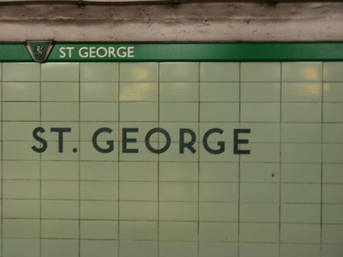
St. George was the testing grounds for Paul Arthur’s pictogram-based station identification system, an experiment that has been left alone since the installation in 1993. It features the first overhead next station signs as well as its own unique typeface. As a result, St. George is an interesting, but confusing, mish-mash of sign styles and font types.
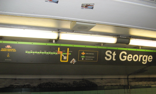
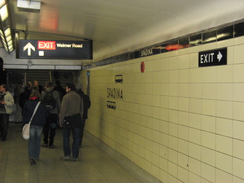
Spadina Station had two particularly comical errors. On the platform level of the Bloor-Danforth line, the TTC built a new secondary entrance at Walmer Road. Unfortunately, the TTC also forgot to remove the old exit signs that point toward the main exit at Spadina Road as well as the bus, streetcar and Spadina Subway connections, even though a new exit was now available. The picture above also illustrates how the text in the new Sheppard signage blurs.
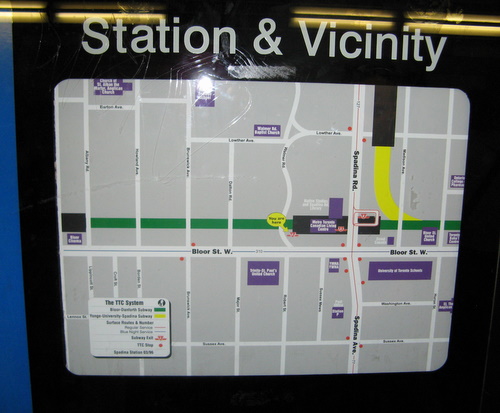
Inside the new Walmer Road entrance, a local station map still shows the 77 Spadina Bus feeding into the station (replaced by the 510 Spadina Streetcar in 1997), even though the new entrance (with the artificial stone tiles slated for the Pape Station renovations) was opened in January 2001. But there’s a “you are here” decal at the Walmer Road entrance (larger version here). The route 77 number has since been recycled – it is now associated with the Swansea Bus, which runs out of Runnymede Station.
A few more pictures from the tour:
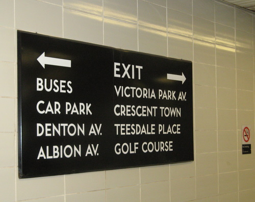
One of the elegant vintage 1960s signs that will be removed with the Victoria Park station reconstruction.
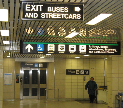
Somewhat confusing signage at Main Street Station. At least this overhead sign in the middle ground does not direct passengers to eastbound trains, buses and streetcars. Also note the mismatched tiles around the elevator retrofit.
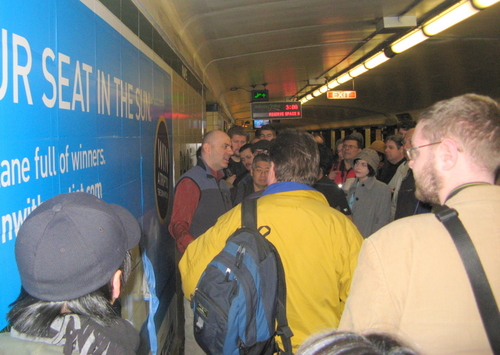
At Pape Station. Note the ugly vinyl ad that helps to ruin the simple aesthetic of the tile scheme. The distinctive tile pattern here at Pape will be removed in favour of artificial stone.
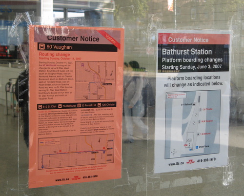
Examples of temporary notices taped on the window at Bathurst Station. Note the customer notice on the right, showing the temporary bus bay layout is now out-of-date – the salmon-coloured notice on the left says that the 90 Vaughan bus no longer serves Bathurst Station.

26 comments
Good shots there, Sean. (Which one were you?)
The Walmer Rd. facings might be a lower grade of structural glazed tile or artificial stone or something else. Lemme ask.
Now, “artificial stone†at Pape station? Over our dead bodies, right?
I was the one that pointed out the out-of-date Spadina Map (green sweater, glasses). We also met on Queen Street last month on Shawn’s walk. I learned quite a bit from the tour, and would look forward to next Sunday’s tour, but alas, will be in Baltimore instead.
I encourage you to get out to Wilson (my “home” station) and see that monstrosity. It is bad in every way – the complete lack of accessibility, poor signage, faded back-lit photos, and even a lit box sign for one of the bus routes with a TimeLine number decal! On my way home, I have to use four (four!) separate stairs and/or escalators to get from subway train to westbound bus. And if you think Victoria Park is hard to find the entrance from, try locating an entrance from Wilson Avenue.
Perhaps I should go in depth as to why I consider it the worst station in the system on this site one of these days….
I just recently read Joe Clark’s very extensive rundown of what a disaster TTC signage is and my mind was boggled at how terrible it is. I’ve only rode the Toronto subway a couple times (and was too distracted by how awesome the “TTC Font” is) so I can’t really speak from personal experience but based on what Joe wrote it sounds pretty dismal. After reading the article, I looked around the Metro here in Montreal and made comparisons and found that the signage here is very very simple. There are a few problems but nowhere near as bad as what Joe described. I wonder how Montreal managed to get it so right and Toronto managed to get it so wrong.
“I made it out from my home in Ward 9 (yes, I live north of Highway 401!) to listen to what he had to say in person.”
Why is this relevant?
Ah, a bit of an inside joke. There are some people out there who have the impression that all the people who are involved with Spacing live within a two-kilometre radius of either the Gladstone/Drake or Sneaky Dee’s and are regular patrons of each.
As for the rest of the post, what did you think?
As Joe pointed out, many of the temporary posters (route detours and such) that are currently taped to walls or windows could be accommodated by permanent display space in each station. It seems a simple improvement.
Bathurst is one stop where such a board had been erected, at the top of the escalators where humans and pigeons often wait for their next vehicle (or meal). I believe it had a diagram of the bus/streetcar bays and a corkboard-type space for posters — but the whole thing has since disappeared.
Any clues what’s up?
As a once-removed friend of Spacing, I know that the editors and writers are from all over the city. Scarborough, Etobicoke, Downsview, and I believe a majority of the editors live east of Yonge.
Tis true, Alison. Three of us on the west side, ad 5 east enders. Blog contributors are from all over the city.
I hope someone pointed out the crazy backward route map on the St. George Bloor-Danforth platform. (Westbound, I think — I assume it’s still there, I haven’t actually visited it in a couple of months.)
Yeah, E. Landlady, somebody did point it out, but we were already hauling ass offa the platform when it happened and I don’t have a mental image. Can you dig up a photo and explain what’s wrong with it?
The “backward” map at St. George is a replacement for the original, which was copied from the standard route map. The issue was that the map showed the eastern half of the BD, but “directionally” it went west, with Kennedy at the western end of the map, thus “confusing” people.
Next up, what exactly is the difference between “fake Helvetica” and real Helvetica? Even “fake” Helvetica beats Univers and Arial any day.
No, fake Helvetica beats only Arial. Univers is its own branch of the grotesk family tree. I’m sure you’re familiar with it from the Montreal Metro.
The “Helvetica†used by the TTC is actually Swiss 721, the unlicensed clone by Bitstream from the very late 1980s. Like all the Bitstream clones of that era, it is faithful to the original (though you could argue about their Palatino version). From a quality standpoint, Swiss 721 is as good a(n) Helvetica as you could get at that point in typographic history.
It is, nonetheless, fake because it wasn’t licensed from the designers or rightsholders (currently Linotype), and the TTC is only using it because they got it free with CorelDraw. Oh, and they think it looks like New York.
All this is allowed to happen because, while one may copyright a font file as computer software and one may patent a typeface design in the U.S., neither the U.S. nor Canada permits copyright registration for typeface designs. Hence you can clone the font, change the name (a trademark), and change a few control points in the outline font and voilà  , you have a cloned typeface that is legal for sale here.
Joe,
Thanks for the explanation. Basically to the naked eye then it is Helvetica, but not exactly. I also find the use of the ampersand in the newer TTC signage strange and inconsistent as well. In some places the word “and” is used. I don’t know if the TTC sign manual explains the usage of one over the other. I personally prefer the use of the word “and” as in “To Street and Buses”, or “To Streetcars, Buses and Street”. Isn’t the ampersand generally used to group items together (e.g. “salt & pepper) that are generally associated rather than in a list? Does anyone know the specific “proper” usage of the ampersand?
That vicinity map at Spadina station has more than one error. In addition to the use of 77 Spadina (unforgivable given that the streetcar had been running for four years when the exit opened), but look at the reference to the Bloor blue night service: route 310?
Bloor Blue Night is route 300. 310 refers to Bathurst, I believe. Unbelievable.
if you look at the station vacinity map, you’ll see it’s from march of 1996.
zzzzzzzzzzzzzzzzzzzzzz
Wally works for the TTC?
“neither the U.S. nor Canada permits copyright registration for typeface designs. Hence you can clone the font, change the name (a trademark), and change a few control points in the outline font and voilà  , you have a cloned typeface that is legal for sale here.”
That last point about “changing a few control points” flies in the face of the concept of a ‘derivative work,’ and is simply not true in the USA (see for example Judge Whyte’s summary judgment in the Adobe vs SSI case) and seems very unlikely to be true in Canada.
We think Swiss 721 dates from 1982, actually. Helvetica itself was designed in 1957, and Massimo Vignelli’s New York subway signage, the unattributed source of TTC Sheppard-style signs, débuted in 1972.
Hence, in its new signage “standard,†TTC brought itself right up to date with the middle of the previous century.
Oddly, that‘s when the subway opened. Why not keep the original stuff, I ask? Nobody else has it.
Yeah, and it didn’t work in the Swifte case, either, Tom, which was, as you know, a major lawsuit alleging copyright infringement that was settled out of court (and nobody can legally talk about it, but of course they do and have).
Anyway, I would be pleased to see a Canadian type designer take a derivative font reseller to court. This is, however, a tad off topic.
Second tour is scheduled for this Sunday, November 4, at 1400 hours on the nose at Lawrence West station.
So trying to get interested in this topic. Truly surprised that no one has caught on to the travesty of street signs in Toronto.
Wally, ol’ pal, have you tried Googling? Won’t you be surprised!
We did a V2.0 yesterday (November 4), with a complement of 26. Another roaring success.
Fun tour, and yes it would be great if we kept the “Toronto” style of the type and tiles for future renovations. Joe is right! These tours were fun. Are we doing another one anytime soon?
What a horrible map at Spadina. Is is still up? So the 77 bus is still there. Don’t use it for confirmation of your information for transportation from Spadina Station.