
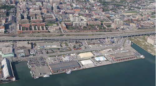
Last night Waterfront Toronto unveiled the submissions of three finalists vying to design a new public space at the foot of Jarvis Street, part of the under-construction East Bayfront community. Detailed descriptions of each of the submissions can be found on the Waterfront Toronto website, or by visiting the rotunda at Metro Hall where the design panels for each firm can be viewed until this Friday, January 25th. As is increasingly the case with these competitions, each of the designs is impressive in its own way, and choosing an obvious winner is a daunting task.
( Click on images for larger versions )

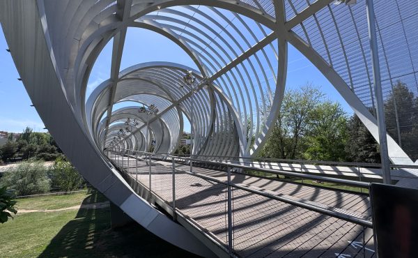
West 8 + DTAH, the team already responsible for redesigning the Central Waterfront, has perhaps the most eye-catching proposal. With two 28 metre-tall arms capable of being manipulated into different positions stretching from the public square, this design has the potential to create a new icon on the waterfront. It also displays the connectivity and poetry of landscape design that often sets West 8 apart from its competitors; the “quilting” of the tiles in the public square, for example, is inspired by the quilting patterns of the indigenous Canadian art. They have also maintained the double-row of trees along the water’s edge that characterizes the Central Waterfront design, a simple but effective way of “greening” the foot of the city.
Claude Cormier Architectes Paysagistes Inc. has created a very different design, called “Sugar Beach.” Drawing inspiration from the Redpath Sugar Factory that sits on the opposite side of the slip, this design makes link with the industrial heritage of the waterfront by connecting it thematically to the nearby factory. Echoing the nearby HTO Park, this proposal also features an urban beach, an increasingly popular public space in large urban centres. An interesting feature of this proposal also features straight lines of lighting that run along two rows of trees to create an ambient atmosphere by night while avoiding creating light pollution.
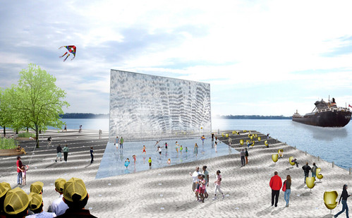
Janet Rosenberg & Associates’ proposal is entitled “Weatherfront.” The name comes from a huge installation by environmental artist Ned Kahn, a kind of pixellated wall that reflects different weather patterns occuring along the waterfront. This might sound a bit esoteric, but the effect is actually quite impressive (and can be viewed on the proposal’s accompanying website). There is also a ground-lighting strategy that will change colours with the season, displaying “cool” colours in the summer and “warm” ones in the winter to create the desired atmosphere. Perhaps the most encouraging aspect of this design is its emphasis on using the public space as a site for environmental education. Few public spaces incorporate creative education, but this proposal shows how effective such spaces can be when art, education, and design are all united with the purpose of environmental education. This ethic is also evident in the firm’s commitment to use native plants, renewable energy, and storm water management as part of the design.
Regardless of which of these entries wins, it’s encouraging to see the attention to detail that’s being invested in public space planning for the waterfront. For more information, visit the links above to view the design panels of each of the finalists.
10 comments
Can you fix the link for the West8 + DTAH image.
I would like to see the model.
Thanks.
I like the Sugar Beach design best, by far.
I think the Weatherfront is by the far best. The massive artpiece is so striking..just by watching the video it shows that this can be iconic part of our waterfront!
Given that there is some, minor, sugar released into the air by Redpath (primarily during unloading).. Sugar Beach is the most appropriately named.
Weatherfront… is it digital, or is it just another form of the, for lack of a better word, sequined store front like Pizza Pizza used to have on their Yonge/Elm store?
I like that, Sugar Beach. Perfectly referential name, and sounds good too. Like that sweet (no pun) and tender Sugar Mountain song by Neil Young.
janet rosenberg strikes again with yet another banal landscape. This time it features an energy consuming kitsch piece of screen. Doesnt Toronto have enough digital media crap? Its a waterfront, a natural space.
West 8 took a page from one of their earlier designs in the 1990s. “eye-catching” doesnt necessarily mean useful or good.
Claude Cormier’s design seems a bit more sensible + sustainable as it doesnt include useless chairs + ‘dazzling’ screens, or gardens that require maintenance. instead, they have created a space we can use, something unique and meaningful.
Hey James, the screen in Rosenberg’s design is not digital. It composed of tiny metal discs that respond to the patterns of the wind blowing over the surface. The environmental artist on her team–Ned Kahn–has done several of these installations, mostly with buildings. They are quite beautiful. Check out Ned’s site for more. http://www.nedkahn.com
what is amazing is that there doesn’t seem to be a limit as to costs.Yes there is bidding but looking at the waterfront budget it comes in close to half a billion dollars.And the results so far don’t seem to give us value for dollar.However I would like to see only Canadian artists submit work for any Toronto project,especially if we are going to pay for the results.
I still remember being involved with the early waterfront projects and they seemed fun.People crowded the waterfront and had fun.Now every project seems to forget people participation.Places to eat,chat get involved and yes even shopping would be a nice addition.
I like the Janet Rosenbery & Assoc. proposal the best (the art piece certainly would have made signifcant impact visually) but once again we’ve decided to play it safe and go with the very boring “Sugar Beach” concept:
http://www.newswire.ca/en/releases/archive/February2008/01/c6393.html