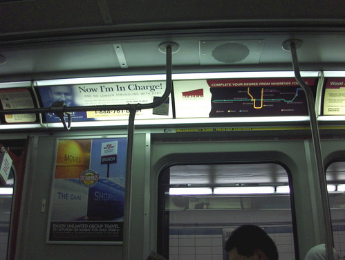
You may have seen these two TTC-themed ads on a subway recently (apologies for poor photo quality). The ad on the left is for the TTC Day Pass. We have criticized the TTC’s wonky marketing department in the past, but this ad is a great improvement and works because it uses the good design elements of the TTC itself to “sell” it to Torontonians. “The Game” panel even uses the TTC’s unique font, though unfortunately the other panels use the altered font. Too bad because these are the very tiles the TTC can now destroy if they so choose — yet they are iconic and attention grabbing because they are as familiar as our living room. Good work, TTC, for using these great tiles while you still can.
The Memorial University ad along the top is also a unique and clever use of the iconic subway map, with stops that include “Technology” and “Business Administration.” Certainly Toronto’s many Newfoundland ex pats would be pleased if the Bloor-Danforth line extended to Port aux Basques or St. John’s. What is curious though about this ad, positioned to look very much like the official TTC maps above the doorways, is how the TTC reconciles allowing it with their previous harsh treatment of Robot Johnny and his celebrated anagram remix of the TTC map, going so far as to send him a cease and desist letter. The anagram map did not even make a physical appearance on the subway itself. The argument was that stations named “Mush Miller” and “Valid Elvis” would confuse riders. The question is, wouldn’t “Newfoundland Studies” station do the same thing to a befuddled public?


20 comments
I had been thinking about this one myself.
The difference here is that the University ad puts money in the Commission’s pocket. Robot Johnny’s poster didn’t.
Their excuse for ordering Robto Johnny to remove the “anagram remix” is, as you pointed out, nullified by the Memorial University ad being accepted by the TTC.
It is even more laughable because it certainly would be more confusing seeing the university’s ad actually on the subway car rather then going to a site and clicking a link. Even more confusing when you notice that several subway cars don’t even seem to have the TTC’s subway plan in them anymore.
Of course, from a system that believes we are all mouth-breathing, knuckle-dragging troglodytes who they need to protect themselves from, it isn’t surprising that they would think that we would be confused after visiting a non-TTC website with an explanation as to how the graphic is a fun artistic recreation and downloading it. I for one thank god that the caring angels at the TTC are looking out for poor befuddled me who can’t figure out the difference from reality and internet fantasy.
Whew! I almost went crazy looking for Gino’s Snot. I didn’t even realize that it isn’t a real station.
I wondered this myself, and there is in fact yet another ad (or maybe two) that use very similar subway layouts, one points out College Station as being the location of whatever they’re advertising.
However, I think the TTC’s response would be that no copyrighted material was used (whereas the TTC’s logo was used in the anagram map.)
But I think it’s pretty obvious that if you give the TTC some money, they would probably let you do anything with a subway map.
The College Station ads are for ServiceOntario. They also have maps inside College Park directing people to the exact location.
Nice ad for the day pass, too bad that the pass itself makes little sense. When a family wants to travel somewhere on a Monday or any other day during the week, they cannot use the pass. The TTC should encourage families to get out of their cars EVERYDAY of the week and not just on Saturdays and Sundays.
There’s a big difference between the design for the Memorial ad and Robot Johnny’s map. I find it hard to believe that someone could confuse that for the real subway map. Granted, I also find it hard to believe anyone would have had issues with Robot Johnny’s map, but I can at least see how they tried to justify their reaction.
You might want to try a bit harder diagnosing the fonts in the wall advertisement here. (Also, describing it as “the ad on the leftâ€Â had me looking at the wrong ad.)
I had a similar thought in terms of the day pass ad. I thought it was a great use of the iconic tiling that we all know so well.
Now if we could just get some decent T-shirts…
I wrote this earlier on someone’s Facebook account before realizing it was posted here!
The map for Memorial is a paid ad. As well, they have that rather strange dip in the Danforth line, I guess to make it look not too similar. Robot Johnny’s map did look very similar to the TTC, even though I though it was cute and a bit clever. That’s probably their justification.
I liked the Montreal Metro gum ads that were up during the winter. I wish the Metro ran to Toronto, New York and Miami!
https://spacing.ca/montreal/2008/03/19/photo-du-jour-if-only-the-metro-got-you-all-the-way-there/
MIX 99.9 also had an ad a few years ago that had a portion of the subway map on it and “99.9” substituted for the station names. This is actually one of the best ads they TTC has done lately. Nice comeback from the UFO Flying Buses from a couple of years ago.
The TTC has its good ads and its bad ads. The weekly pass ads with the streetcar in the driveway “own the TTC for a week” was pretty good, though that came out at the same time as the awful tax credit “O Canada!” ads.
The original “it’s big, it’s real, it’s headed our way” message with the old buses and subway cars with the replacement costs in the rollsigns was very well done, but the later variations, like those UFO buses, were embarassing. At least the safety messages were directly copies from New York – to the point, but not patronizing like many of the TTC messages are.
These ads, and the recent TTC Info ads (the telephone cords looking like part of the subway maps) were also very well done, but there’s currently the poor “where no streetcar has gone before ads” are way too busy, with a photoshopped crowd against a CLRV on top of a Transit City map. Are they advertising Transit City, or is it a union “feel good” message? Everyone knows CLRVs aren’t going to be running along Sheppard or Jane, and it must be somewhat fustrating for LRT advocates, who have been reinforcing the difference between LRT and streetcars.
Although the post refers to the “iconic” tiles and notes that “these are the very tiles the TTC can now destroy if they so choose”, it should be noted that they’re all post-1970s tiles (Bloor redesign; Dundas redesign; North York Centre?), not the original 1950s or 1960s ones.
I agree that the TTC gets points for the Day Pass ad, but what they really get bonus points for is making the Dundas vomit-yellow tiles look half decent. The accurate fonts are a plus (although I thought I recalled the ad using Univers on North York Centre, when it is actually Helvetica… the photo resolution is too low to see here).
Brent> Moving car, low light, poor camera and not wanting to make a scene taking pictures was the culprit.
Joe> I’m not a font expert, so this is the extent of my diagnosis. If you know of a font expert, they are welcome to continue where I left off.
I remember Dominion Stores also had a ‘subway map-themed’ ad several years ago, but I’m sure they weren’t the first come up with that idea.
Joe> I’m not a font expert, so this is the extent of my diagnosis. If you know of a font expert, they are welcome to continue where I left off.
I believe Joe would be that font expert 😀
I think Joe knows I know. Everything is very Meta & interactive today.
The Day Pass vs. “Where No Streetcars Gone Before” ads are where you can tell the line between in-house graphics production and outside firm production. I think you can guess which did which. The outside firm has always been pretty competent in what they do, and all the examples people have listed above as “good” TTC ads were produced by these firms. All the “bad” TTC ads were done in house, and as someone said, the UFO bus was pretty much the low of the low. They only have a couple graphic designers in the marketing department (at least when I was at the commission) and they’re typically overworked already in producing various graphics materials and a lot of these ads are probably thrown at them on top of their day-to-day duties. That being said, it’s not an excuse for embarassing and bad graphics. I know plenty of people who can put together something better than the ‘bad ads’ in less than 10 minutes. I think they just need some fresh minds in there.
I find it amusing they warped and stretched “Brunch” on the pylon sign when they did a fairly decent representation on the other three. If text size was an issue they should have just used a picture of the overhead door signage instead and altered that.
Finally, Mix 99.9 had the wall at the Bloor-Yonge Concourse wrapped with a TTC Subway Map replaced with artists names a couple months ago (before the most recent “Mach 3 Disposable” station domination campaign [lets not get me started on that one]). I had the same thought of the anagram map.
The “UFO Bus” ad that Sean mentioned, in case you’re not familiar with it:
http://299bloorcallcontrol.com/2008/05/05/ttc-bad-ad-redux-jesus-the-ufo-buses/
Good (?) to see those UFO ads again. I hated them when they first came out. Now that I see them again, they almost (almost!) seem so bad that they’re good. Like in an Ed Wood type of way.
Funny you guys have those Memorial University ads as well. I saw them in Calgary on the C-Train (Calgary’s LRT) as well. They used the official map of the C-Train, but it was a slightly outdated version.
Lawerence> There is artist Simon Patterson who used the London Underground’s iconic map to list philosophers and writers and etc.
As far as I know (somebody correct me) the Tube did not get cranky.
http://www.tate.org.uk/servlet/ViewWork?workid=21700
A metropolitan transit authority should know it’s own mythology.