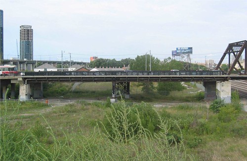
We’re going to try something new here on Spacing Toronto — a “virtual charrette” — though it often happens quite naturally on many posts due to the quality of our readers’ comments. The term “charrette†comes from the carts used to collect the drawings submitted by students at the Ecole des Beaux-Arts in 19th century Paris when given a design problem to solve within an allotted time. Inevitably the assignment resulted in a burst of intense activity. Today it describes the brainstorming process often used by architects and designers to develop, usually face to face, specific design solutions, and often with public input. Spacing is organizing a virtual charrette to collect the best ideas for creating pedestrian amenity on top of and under the new Bathurst Bridge. Submitted as comments, suggestions, or links to examples or photos of other projects, they will be passed along to the designers, similar to the “virtual input” given on the TTC website redesign process mentioned yesterday.
The project and its challenges were described in a post I made in March (along with some great comments). Tell us what you’d like to see incorporated into the designs related to lighting, sidewalk materials and site interpretation. Where should the crash barriers that are required on the bridge be placed to separate road, bike and pedestrian traffic? Should they be between cars and pedestrians, or on the outer edge (see both Jersey and Pennsylvania Barriers as example)? If the barriers are close to the roadway, how should they terminate safely, but elegantly, without resorting to the giant beanbags and sand-filled barrels found on 400-series highways? Are pedestrians treated as second-class when the barrier meant to prevent a car from flying off the bridge allows that same car to sweep the sidewalk clear of whatever unfortunate folks are in the way?
Should skateboarders share the sidewalks or the bicycle lanes? What kinds of materials might improve the walks and railings? Would turnouts with plaques to explain the overlook make for more interest? Walking under the bridge at its lowest point, what’s the least headroom you’d feel comfortable with? What other safety features are most important? Given that nothing will grow under the bridge, how should the surface of the ground be treated to encourage a welcoming atmosphere, day and night?
Both “expert” and “armchair expert” opinions are welcome, staying true to the charrette ideals. Please post comments below, for all to see, and discuss, rather than emailing. The first Design Review Panel for the Bathurst Bridge will be held on June 26th (a public meeting), so there is time for suggestions to inspire great design.
Photo by TCHC. With files from Stephen Otto.


26 comments
Great idea (the charette)
My first thought is that while superior design is a must, that this is not the place to go modern.
ie. no humber pedestrian bridge here, it would be wildly incongrous to more historial bridge to the north.
2)The feature colour in the design should be black, as it resembles the existing bridge and most treatments of historic lighting/railings are done in black.
3) I would prefer to see any car-related barrier go between the sidewalk and/or bike lane and drivers. This frees up the sidewalls of the bridge for something much more aesthetic and has the side benefit of improving pedestrian/cyclist safety.
4) I want something fairly dramatic, though it shouldn’t overshadow the existing north bridge.
5) I think to add a splash of colour, hanging baskets should be integrated into the lighting poles , as is done in many parts of the City now. I can’t think of any bridges we adorn with flowers here, but many cities do, and it can be really attractive, and soften the hardscape; the sidewalls can also be used this way. (compliments to Owen Sound for a nice example)
6)Lighting treatments should be pseudo-historical. I really like the street lights installed in the Junction on Dundas W, I think they make the boldest statement of any in the City.
7) Seating areas on the bridge may not work, but a southern entrance plaza would be a great opporuntity for a community meeting place and to highlight Fort York. But an outlook for rail fans on the bridge might be good too.
8) The northern bridge presents a good opportunity for architectural lighting (ie. floodlight the metal truss after dark)
Three words for the architects to consider
Connection – Continuous flow from Fort York to the Waterfront trail and hopefully someday the new Toronto Museum
History – steel, wood and stone will help connect this new bridge to the past
Sightline – Height to the pedestrian paths would provide a great view of the lakefront, skyline and Fort York
James–re “this is not the place to go modern”: it depends. Re your invocation of the Humber bridge, I sincerely doubt that anyone with their ego in check would suggest a melodramatic above-road-level superstructure that’d compete visually with the existing truss–but I wouldn’t rule out a creative “contemporary” treatment of the underspace, either.
Indeed, given the relative importance of the location, it seems to me that hanging baskets and Junction-esque lightposts would seem, in practice, a little too parochially Business Improvement District-esque for comfort.
Has anyone done a study of “bridge underspaces” around town? Often, they’re the most unsung echoey places of urban melodrama–I think back to something like the Eglinton bridge over the Humber back on the Mount Dennis Jane’s Walk a month ago; sure, you have to think beyond the dicey rep for dope-smokers, graffitiists and odd vagrants, but…
City speed limit should avoid the use of those barriers mentioned. Just use the bridge joints as a sort of speed bump. Also if the sidewalk is made a bit higher than normal, it would serve the same purpose as a barrier.
Armchair expert here – one of the design elements should tie into the railway traffic (freight and passengers) that pass by here every day. Perhaps a visual element on the inbound to city side that echoes the downtown up ahead and likewise something on the outbound out of the core side that echoes a suburban or perhaps commuters of the past and present.
I really like the idea of using lighting to highlight design elements and of elevation of pedestrian walkways or a 2nd walkway to uplift the visual experience of walking across this area of the city.
Let’s leave the history alone, and not produce poor imitations it. The new bridge should be contemporary, but it should interact with the old bridge and not overwhelm it.
I always wondered why the word “charette” was used for these things – thanks for the explanation.
I still say get rid of the bridge.
Okay – maybe that’s a bit of hyperbole, but I do believe that it is essential that the bridge connect with the new Douglas Coupland park below on the east side of Bathurst. Ideally this would come from filling of the underside of the southern portion of the bridge and raising the topography of the Coupland park on the East side of Bathurst so that the bridge would effectively only extend over the railway tracks. After the railway tracks, people would be walking down a treelined street bordering a park rather than a bridge.
No matter what design features are added, a ~150m bridge extending almost to Fort York Blvd is considerably more daunting than a ~50m bridge over the railway tracks followed by a treelined Bathurst street bordering a park. Per the current plans, a resident of the King West Neighbourhood would have to walk all the way down to Fort York Blvd to access a park that begins at the railroad tracks.
Filling the land on the East side would leave some question as to what to do with the West side of Bathurst. The topography from the west side has some historical and architectural merit with the impressive uphill view of Fort York. I would not suggest filling the West side in, but lots of alternatives exist for use of this space. (A couple of suggestions, though there are plenty of alternatives: (i) a bike/walking path running outside Fort York between the railway tracks and the fort from the ramp currently connecting to Bathurst to the Park at the Garrison Road entrance to Fort York, and (ii) if the space under this portion of the bridge is filled, the possibility of combining a rock climbing wall with the retaining wall that would exist on the West side of Bathurst).
At a minimum, I would suggest a ramp or staircase from the bridge immediately south of the railway tracks to the Coupland Park on the East side.
The Cityplace neighbourhood is already at risk of being disconnected from the rest of the City. We should do everything we can to encourage design that promotes connections between the King West Neighbourhood, Cityplace and the Waterfront.
It’s a tough puzzle to crack. Here’s what makes it hard:
– there is nothing dynamic to bridge over. No river, no deep gorge. It’s a rail overpass – bor-ing.
– the bridge is close to the ground, limiting your options. No arch or underslung truss.
– we are talking about a side span. Who cares about the side span? The existing truss is going to remain, so that’s the focal point by definition.
I could go a couple of ways on this:
1) It’s a nothing side span, so make it disappear as cleanly as possible. This is essentially what the current bridge does. Thin prestressed concrete deck, matching metal railings and lights, etc. Put all the pizazz into the restored truss, as others have mentioned. You could even make that thing light up like the towers of the GWB (google images for “George Washington Bridge night”). Essentially this approach says that the best new bridge would be to bring out the jewel that is already there.
2a) Make this section the focus of attention by removing the centre support, thereby making THIS the main span. The underpass will be more open and inviting, and the span above can now grab some attention with, say, a truss that plays off the (now side span) existing one. I can think of some fun contemporary truss shapes, like one that looks like a twisted mess of a fallen truss – think Chinese Olympic Stadium, in steel. Piece of cake with laser-cut steel and 3D Ramsteel/SAP90/etc. software.
2b) If cable stays are more your thing, remove the centre support and then copy this similar-size bridge from Boston – Arthur DiTommaso Bridge (google for images). However, this would look bizarre next to the existing truss, which is why I favour 2a.
Remember when you went underneath the bridge and saw the tag “Triforce sucks?”
That is the name of an anonymous crew who threw a rave under the bridge.
Okay, not so anonymous 😛
Kevin’s point is pertinent, because what some are overlooking is that in recent years, the “underbridge” hasn’t been mere waste space, but a de facto arts and creative space on occasion. Plus, it maintains something of the existing historical topography in this critical Fort York/Garrison Creek zone–under that circumstance, how is “filling in” the approach any more sensitive or less oppressively barrier-like?
So, what’s the matter with viewing the “underbridge” as part of the lower-level park-space continuum, and a place of creative opportunity in and of itself? Regardless of how “demonstrative” the structure overhead is…
I’m with rob – create an embankment except over the tracks. I would terrace the slopes with bike/pedestrian paths, vegetation and sculptures. Given the topography it’s not like you lose much in sightlines, and it allows a reduction of the monolithic road/path width at grade.
An ambitious approach would create an amphitheatre “bowl” on the east side terracing for informal events such as Adam/Kevin talk about. The road barriers could be acoustically enhanced to reduce park noise, perhaps being “living walls” of willow/earth/willow reinforced with hidden metal rails. The west side would depend on what would integrate with Fort York.
The embankment is interesting, and would solve some problems. What it would do, though, is bury and obscure the Fort’s historic earthworks. Only from under/by the bridge do you get a sense of the scale of those walls, and what attacking soldiers had to deal with.
I like the idea of separating cars from pedestrians and cyclists with a higher than normal curb rather than a “wall”.
I agree that the underside of the bridge should be as attractive as the top. I assume the path which runs on south side of rail tracks will continue from Spadina (where it now ends) though City Place and the TCHC development to Fort York (and beyond. Obviously it will go under the bridge. It should be possible to easily get up from the track level to the street level – pedestrians and cyclists.)
The older(northern)bridge (renamed the Isaac Brock Bridge recently) is a real jewel. I hope this project will see it painted and lighting it properly is a great idea too.
All great ideas, but I am still sceptical.Spacing keep track of every idea and see if any are “adopted” in the final design.
.At least people can feel that they contributed.
What Rob may not have understood is that being able to pass under the bridge is vital to the creation of an east-west pedestrian and bicycle trail system running from Simcoe Street west along the yet-to-be-constructed Northern Linear Park to Fort York, and thence either southwest to the Martin Goodman Trail or north over a footbridge east of Strachan, across the rail corridors and on to Stanley Park, Railpath and Trinity Bellwoods.
Think of it: 1.5 km off-road trail out of the downtown.
The Douglas Coupland-designed park is not immediately adjacent to the bridge, but a block or two further east in the centre of the Railway Lands West neighbourhood.
Steve
I see what you mean but would a bike path under between the embankment and the rail track be sufficient to preserve the concept and the connectivity? Essentially you would be relocating the bridge piers say 10 or so feet south and beginning the embankment there with the bike/ped paths along the embankment ascending to the bridge and descending to the east-west trail. All this of course dependent on finding a design sensitive to the Fort York lands as Shawn noted.
As those who’ve “used” it for creative (however defined, but at times quite legitimate) purposes can attest, there’s an inherent drama and poetry and openended purposefulness–and a distinctly “urban” one, at that–to the Bathurst approach’s underside that’d be only weakly reflected through walling/berming it off on behalf of an embankment/amphitheatre scheme. I’d look upon that as “opportunity”, on top of the historical respect it pays to the Fort York/Garrison Creek environs–perhaps an open-air hypostyle-hall to thrash about in, with studios and facilities added?
I’m not sure whether the years of debate over and pathologizing of the nearby Gardiner has jaundiced some to the tantalizing potential of that which lies beneath an overhead roadway…
Mark,
A bike path between the embankment and rail track would maintain limited connectivity, but the housing on Block 36 of the Railway Lands and proposed public library at the northeast corner of Bathurst and Fort York [olim Bremner] Blvd. are both intended to take advantage of views over the lower-level park on the east side of Bathurst through and up to FY.
As well, there is an intent to continue in a line under the southern-most end of the new bridge the existing walkway at a lower level along FY Blvd. west of Bathurst. Currently it dead-ends near the circular steps at the Bathurst corner. Depending on where people want to walk or bike other paths may cross the under-bridge area too. A berm would kill these possibilities.
Finally, the park sits where Garrison Creek entered Lake Ontario so offers chances to interpret the Ravine Battery, Russell-era blockhouse, head of the Queen’s Wharf, Grand Trunk Engine House, etc. that once stood there. Topographically, it is related at its present level is related closely to FY and is part of the FY National Historic Site.
My feeling is, there’s a perception/fear here that the under-bridge is destined to be dead, dumb, purposeless space–and that it stands in the way of clear street-level access to Bathurst. But who says you can’t have a bridge *and* “connectivity” from above–it already exists, remember, in the bridging pedestrian connector to Fort York.
Don’t automatically think everybody will have to be shunted southward in order to access the park–especially as the continued development of the railway lands shall presumably lead to alternate means of access that do not necessarily involve Bathurst proper…
A virtual charette is a great idea and there are lots of interesting comments here. But I’m curious: did the project team encourage Spacing to gather feedback at this point in the process?
With a design review only three weeks away, I’d expect the designers have already picked a basic direction so that they can move into more detailed design. I’d be surprised if they can use general feedback at this point: even if they agree, would they have time to recast the whole design with the review panel meeting looming?
As far as I know, there hasn’t been any new info on this project since March, which puts us at a real disadvantage from the project team (who, presumably, have spent the last two months working on this). It seems to me like March would have been a great time for a virtual charrette, and later this month would be a great time for a virtual design review based on what’s presented to the panel. But in between (without a specific idea floated for us to look at), I’m skeptical how useful our input can be.
Matt> The matters we asked for comment on are at the level of detail where there is still time for input as this is far from settled. At a presentation last month by the engineering /architecture firms involved, most of the focus was on the general type of bridge and superstucture underneath. There will be two design reviews, on the 26th of June and one later in the summer.
The project team did not ask for this virtual charette, but we presume they’re following with interest, and will be directed here as well. I’m on the Fort York Management Board as well as the Pedestrian Committee, both of which have an stakeholder interest in making sure this bridge is well done, which is why we’ve been able to dedicate a number of posts to it, and will make sure the suggestions are heard.
Bathurst is the north-south bicycling connector I use between the west waterfront and work at Queen and Spadina. Just about any improvement in the bridge structure to make it more bicycle-friendly will help. This is the only place where I sometimes head for the sidewalk if it’s congested northbound.
The real design issue for making the bridge bicycle-friendlier is at Lake Shore and Bathurst, just beyond the bridge’s south end. The streetcar tracks in the intersection make it very tricky for southbound bicyclists, because some of the curves run at shallow angles right where a cyclist would travel.
Whatever bicycle facilites are placed on the bridge, the southbound routing has to put cyclists on a safe trajectory for the tracks at Lake Shore.
Shawn> Thanks. I do hope to see more of these, and the more effective you can make them, the better.
If you’ve got suggestions to make it better, please suggest. It was an experiment. I’m going to chat with some of the ‘wiki, opensource, ‘camp people and see what interesting technological solutions they might have to make these better.
My biggest suggestion was to coordinate with the project team on timing. (I’ve worked in jobs that dealt with public input to projects and know that there are specific times when the window for certain kinds of feedback closes. It was always frustrating to get great feedback when it was too late to use it.)
If there’s someone on the project willing to answer questions, even better. And you might want to experiment with wide-open vs. one-issue posts to see which way attracts more input.
Beyond that, I’d keep it simple. Maybe a blog post isn’t the optimal place for this kind of discussion, but it does keep it somewhere people visit often. If the technological solutions mean a separate site, I’d worry that a lot of people wouldn’t make the jump (or would only go there once, missing the cumulative effect of brainstorming).